Introduction to Initial Letters Manual

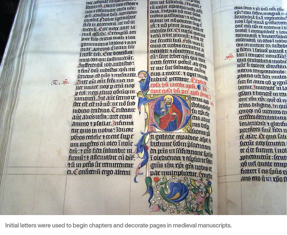
Initial letters are the doyennes of type. Even before Gutenberg invented the craft of typography, fancy initials were used to begin chapters and decorate pages in medieval manuscripts. While Gutenberg didn’t create initial letters to complement his fonts, he left a space in his typeset pages so that these typographic embellishments could be drawn in later, by hand.
And just about every type designer that followed Gutenberg added initial letters to their palette. Caslon hand-cut decorative initial letters to be used with his standard types. Bodoni developed a whole range of outsized letters that complemented the weight and proportions of his text designs. There were initial letters in Garamond’s fonts, as there were in Janson’s and Baskerville’s.

Initial letters probably grew out of medieval scribes’ desire to glorify and add visual beauty to the “words of God.” Their goal was to raise text to the level of art. Today, initial letters are used for the same, although less ethereal, purpose: to add beauty or emphasis to the beginning of a page, chapter or paragraph.
Two Kinds of Initials
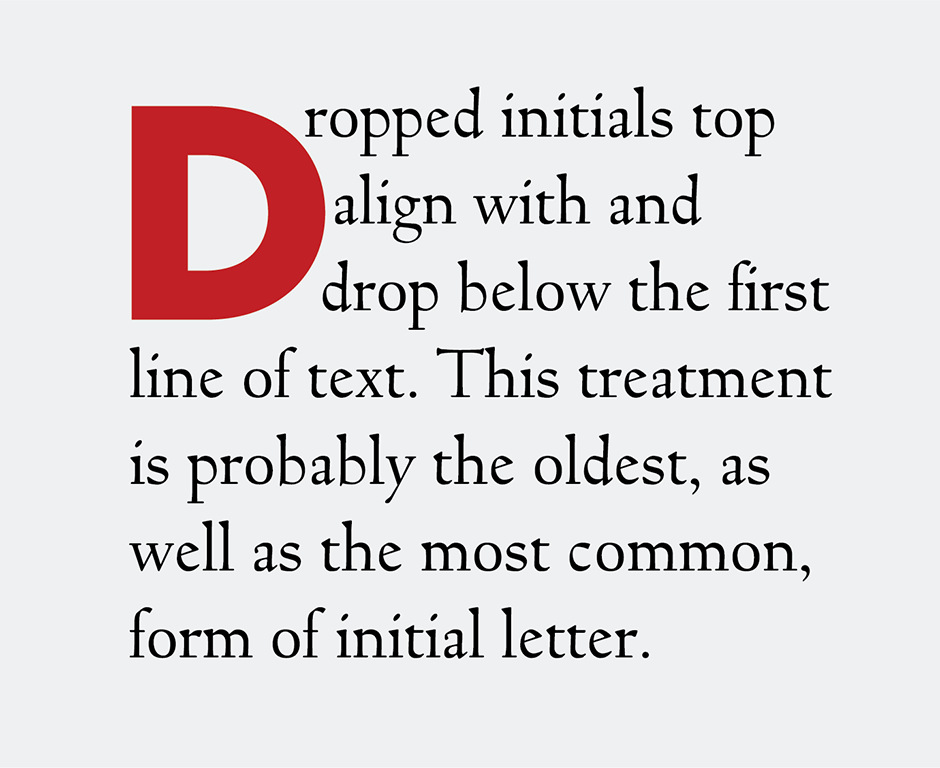
The oldest form of initial letter is the “drop cap.” Here the letter is set down within the copy, not rising above the top line of the text. The other style is a “raised initial.” This variety rests on the baseline of the first line of copy and rises above the top of the text block.

Raised Initials
Raised initials are the easiest to set – just align the baseline of the initial with the first line of text copy. Sometimes the copy to the right of the initial letter needs to be kerned to the left to ensure that the first word is read properly. The letters to watch for are the same ones that would usually be kerned in normal text copy: T, W, V, Y, etc.

Dropped Initials
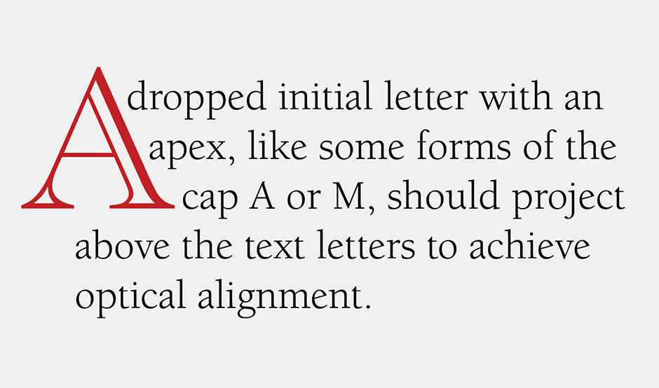
Setting dropped initials can be a little more challenging. They should fit snugly with the surrounding copy, and the top of the character should align optically with the top of the opening word or words of text copy. If the initial letter has an apex, like some forms of the cap A or M, they should project above the text letters to achieve optical alignment. The base of a dropped initial letter should also appear to align with a line of the text copy. If the base of the initial is pointed, as in the V and W, then the points should project below the baseline in order to achieve visual alignment. For the same reason, the bottoms of round letters like the C and O should also fall slightly below the lines they align with.

Have Fun
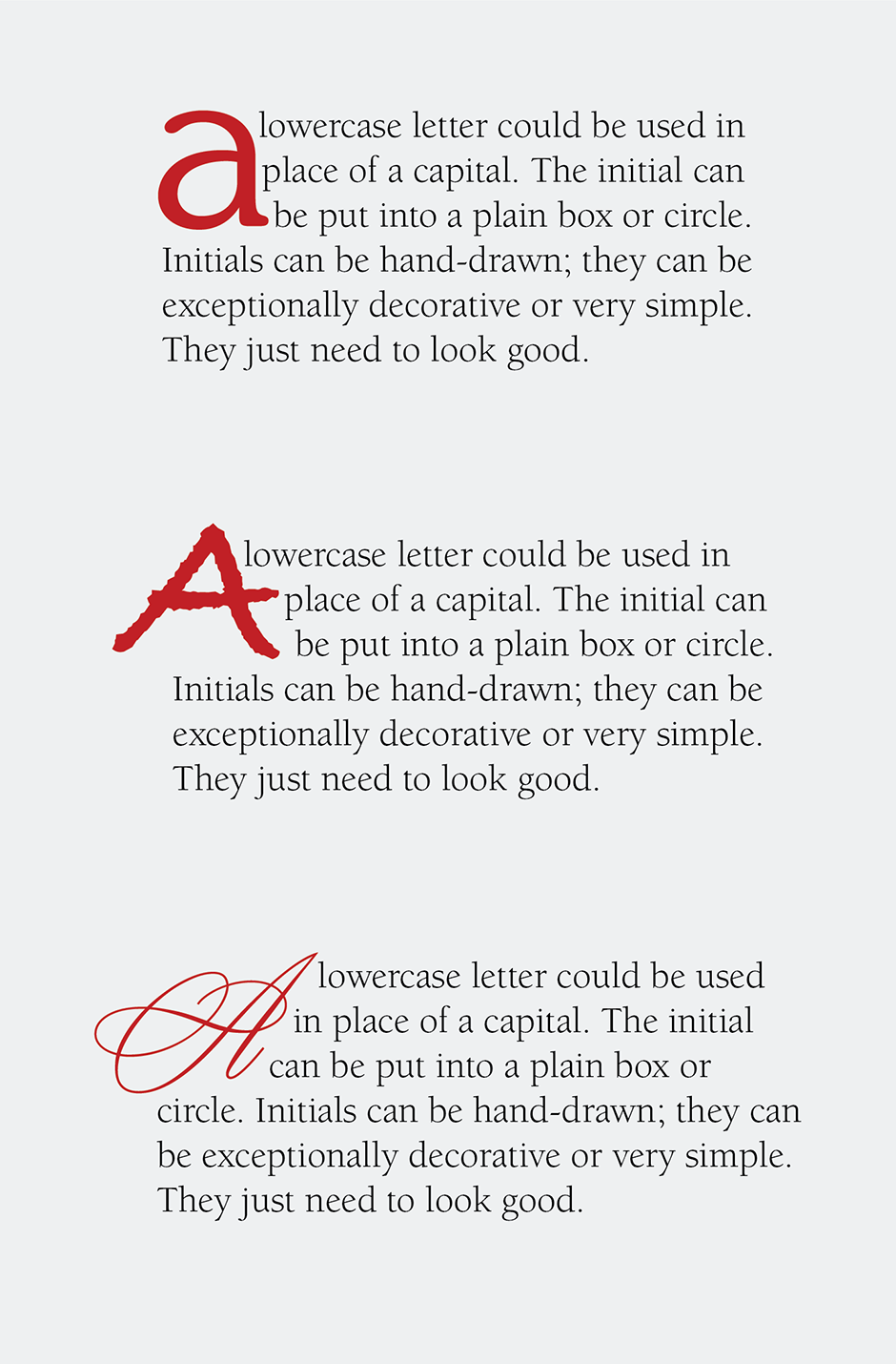
It’s OK to be creative with initials. Try putting a subtle ornamental scroll before the opening initial. Maybe a lowercase letter could be used instead of a capital. The initial letter can be put into a plain box or circle. Initials can be hand-drawn; they can be exceptionally decorative or very simple. They just need to look good.

While your next project may not be as lofty as that of a medieval scribe, a sprinkling of initial letters may be just what you need to elevate the end results.
Typefaces used in this article:-
Download a pdf version of the Introduction to Initial Letters Manual


