Making Corporate Documents Lively
Designing boring corporate documents got you down? Faced with designing yet another brochure for your company’s line of augers and pumps? Maybe the sixth in a seemingly endless series of product specification sheets is making you think twice about the vitality of your profession.
No worries; typography can spice up your life – as well as the projects you work on. Try some of the typographic tricks below and you’ll start having more graphic fun – and be creating documents that will make people take notice, read, and take action.
Do the unexpected
Using an unexpected typeface or combining unlikely typefaces almost always creates memorable typography. The only problem is that it could be memorable because it is bad typography. “Unlikely” and “unexpected” can be good qualities¬ – “inappropriate,” however, is not.
One unexpected trick that almost always works is to mix the italic from a serif typeface with any other design – even a sans serif. The combinations work surprisingly well.

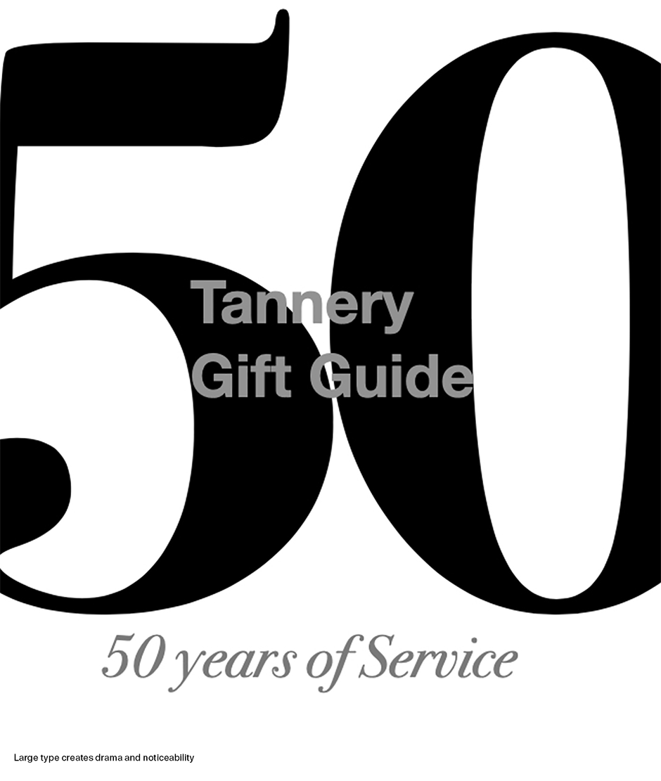
Supersize it
We are used to seeing big type against a large backdrop but, when it fills a small format, the type can transform into an engaging and dramatic graphic illustration. Sometimes, if all you are given is text copy and a small budget, very large type can enliven the piece and give it drama beyond the allotted resources.
Play with punctuation
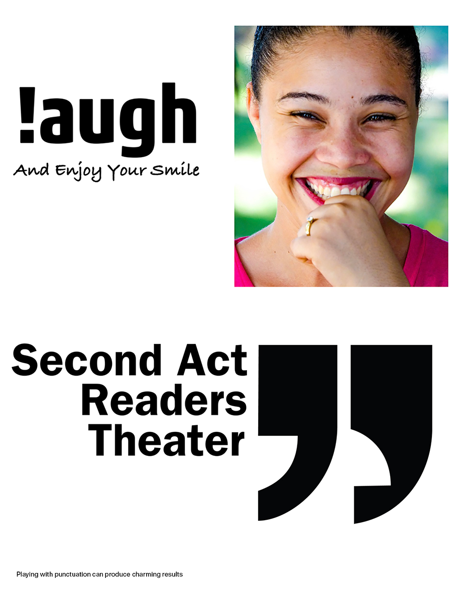
Exclamation points, question marks, quotes, commas and other punctuation marks can be powerful and versatile graphic images. The key is to use them in unexpected ways. We are accustomed to seeing exclamation points at the end of a sentence, but if one is used to replace the letter ‘I’ in the word “laugh,” a charming and engaging graphic message is the result. Open your mind to the possibilities.
Make white space your friend
Avoid long lines of type and deep paragraphs and give pages lots of “breathing room.” White space invites the reader into the cover of a catalog or brochure and helps to focus attention on the type and images.
Use Both Sets of Letters
All cap headlines, subheads and blocks of copy are deadly dull, difficult to read, and take up valuable page real estate. Always try to set cap and lowercase headlines and subheads and use small caps, when you have to, in text copy.
Make a shape
Using type to convey a message and create a graphic shape is great typographic trick. The shape helps the message become more inviting, engaging and memorable. Sometimes pouring copy into the desired outline can make the shape. Sometimes the type in a block of copy can be colored or tinted to reveal a shape. Other times, a line of text copy can become the outline of a shape.
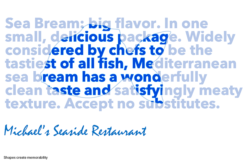
Remember, though, that creating a typographic shape is only part of the process. Ensuring that the copy is still easily read is the other part. Text and spacing may need to be manipulated to maintain the shape’s integrity and content readability. It may take some fine-tuning to get the copy to space well and look even on all the lines.
No doubt about it, typography can be a graphically fun and stimulating design tool. It takes common sense and a careful eye, however, to create communication that is inviting, makes an impression, focuses attention and engages the reader – ultimately giving life and personality to the printed word. Typography is fun – but good typography is not always easy.
Download a pdf version of the Making Corporate Documents Lively manual.


