Seleccione este tipo de licencia cuando esté desarrollando una aplicación app para iOS, Android o Windows Phone, y vaya a incrustar el archivo en el código de su aplicación móvil. va a incrustar el archivo fuente en el código de su aplicación móvil.
Contane Text Cnd
por Hoftype
Estilos individuales desde $0.00 USD
Familia completa de 20 fuentes : $198.00 USD

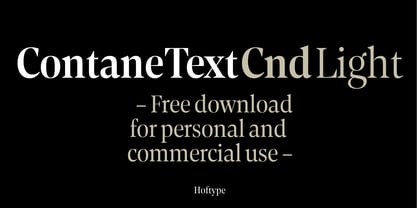

Contane Text Cnd Fuente La familia era
diseñada por
Dieter Hofrichter y
publicado por
Hoftype. Contane Text Cnd contiene
20
estilos y opciones de paquetes familiares.
Más información sobre esta familia
- Aa Glifos
-
¡Mejor PrecioPaquetes de familia
- Estilos individuales
- Especificaciones técnicas
- Licencias
Sobre la familia Contane Text Cnd Fuente
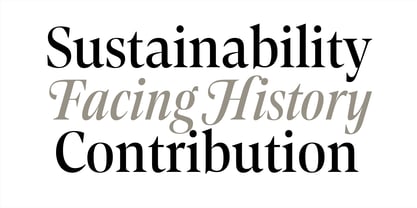
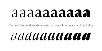
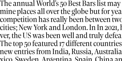
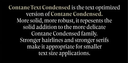
Contane Text Condensed es la versión optimizada para texto de Contane Condensed. Más sólida, más robusta, encarna la adición de potencia a los miembros más delicados de la familia Contane Condensed.
Las líneas de pelo más marcadas y las gracias más fuertes también la hacen apropiada para aplicaciones de menor tamaño de texto.
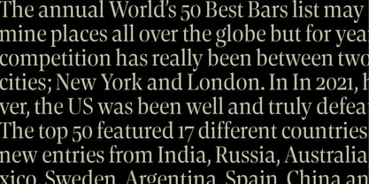
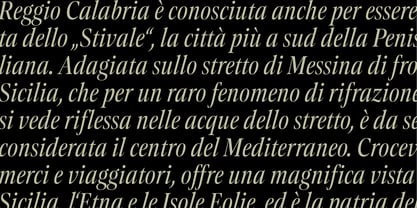
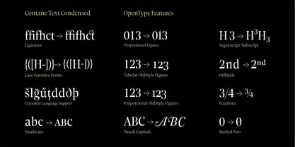
Contane Text Condensed admite hasta 80 idiomas y su formato OpenType permite una amplia gama de aplicaciones tipográficas. 20 estilos ofrecen una fina graduación de los pesos. Todos los pesos contienen versalitas, ligaduras, caracteres superiores, cifras de alineación proporcionales, cifras de alineación tabulares, cifras proporcionales de estilo antiguo, cifras de alineación de estilo antiguo, símbolos monetarios coincidentes, números fraccionarios y científicos, flechas coincidentes y caracteres alternativos.
Diseñadores: Dieter Hofrichter
Editorial: Hoftype
Fundición: Hoftype
Propietario del diseño: Hoftype
MyFonts debut: Mar 1, 2022
Contane Text Cnd
Acerca de Hoftype
El diseñador alemán Dieter Hofrichter puso en marcha su fundición en 2010. Desde entonces, ha seguido centrado en el desarrollo de texto fuentes que integra la rica historia y tradición de la tipografía con estilos contemporáneos. Con sede en Múnich, su primer tipo de letra en MyFonts fue Impara, una sans serif con ductus de trazo vivo y marcadas características humanísticas que es una representación de la frescura lineal y la elegancia clásica. Desde su debut, ha seguido produciendo caras serif de gran belleza y calidad. Capita, una de las más vendidas de la fundición, es una fuente autodominante con un estilo fresco que evita la aspereza de muchas gracias planas. Dieter también ha tenido éxito con uno de sus diseños más recientes, Mangan, una fuente de texto que combina la racionalidad clásica con el diseño contemporáneo. "Una de nuestras intenciones es utilizar los conocimientos de la historia de la tipografía para crear tipos contemporáneos", afirma Dieter. "La conciencia de estilo y muchos años de experiencia en el diseño tipográfico son nuestras cualificaciones para producir tipos funcionales y utilizables de alta calidad".
Seguir leyendo
Leer menos