Select this license type when you are developing an app for iOS, Android, or Windows Phone, and you will be embedding the font file in your mobile application's code.
Amico
by Hackberry Font Foundry


- Aa Glyphs
-
Best ValueFamily Packages
- Individual Styles
- Tech Specs
- Licensing
Per Style:
$12.49 USD
Pack of 8 styles:
$99.95 USD
Amico Thin Set
4 fontsPer Style:
$12.48 USD
Pack of 4 styles:
$49.95 USD
Amico Reg Set
4 fontsPer Style:
$12.48 USD
Pack of 4 styles:
$49.95 USD
About Amico Font Family
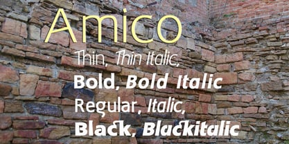
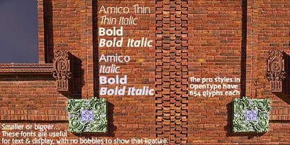
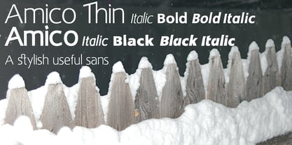
This is a new barely modulated, slightly narrow, sans serif font family. It has eight styles: thin, thin italic, regular, italic, bold, bold italic, black, & black italic grouped into two 4-font families: Amico Thin with the Bold; and Amico with the Black. Amico has the standard feature set developed at the end of 2007. It has many OpenType features and 654 character/glyphs: Caps, lower case, small caps, ligatures, discretionary ligatures, swashes, small cap figures, old style figures, numerators, denominators, accent characters, ordinal numbers (1st-infinity): lining and oldstyle), and so on. It is designed for text use in body copy. However, Amico really shines as the choice for heads & subheads when using Amitale or Brinar for the text family.
Designers: David Bergsland
Publisher: Hackberry Font Foundry
Foundry: Hackberry Font Foundry
Design Owner: Hackberry Font Foundry
MyFonts debut: Apr 2, 2008

About Hackberry Font Foundry
- The Hackberry Font Foundry was founded in the 1998 to sell the fonts David Bergsland designed to be used in his digital publishing training books.
- The goal of David’s fonts is to add a hand-drawn edge to them. In this age of increasing technological “slickness” he purposely loosens the structure and adds “air” to the glyphs with breaks.
- All fonts are designed as OpenType Pro fonts with special production features. Almost all of the fonts have oldstyle numbers as well as small cap figures, plus small caps, discretionary ligatures & special dingbats.
- They really shine in book production.
- The production families have contrasting serif and sans serif families both using the same vertical font metrics—for run-in heads and the like.
- At present he mainly writes and designs books.
Read more
Read less
- Choosing a selection results in a full page refresh.