Select this license type when you are developing an app for iOS, Android, or Windows Phone, and you will be embedding the font file in your mobile application's code.
Chunkie
by Hackberry Font Foundry
Individual Styles from $24.95 USD

Chunkie Font Family was
designed by
David Bergsland and
published by
Hackberry Font Foundry. Chunkie contains
1
styles.
More about this family
About Chunkie Font Family
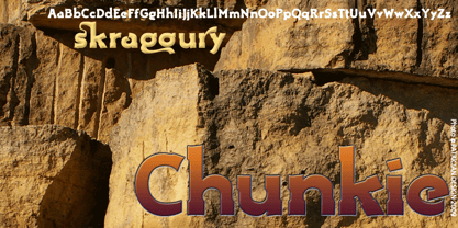
Chunkie is a simple serif experiment going for minimal width and maximum height. I made it into my display version of OpenType Pro, but mainly it was a vehicle for me to try out some more extreme serif ideas and glyph shapes. The solutions for the lowercase a and e are unique, for example. The double g ligature is a fun solution. I like the solution for the @, but I’m not sure how it will be received.
That being said, it turned into a useful dark display face with a small x-height.
Designers: David Bergsland
Publisher: Hackberry Font Foundry
Foundry: Hackberry Font Foundry
Design Owner: Hackberry Font Foundry
MyFonts debut: Mar 18, 2010
Chunkie

About Hackberry Font Foundry
- The Hackberry Font Foundry was founded in the 1998 to sell the fonts David Bergsland designed to be used in his digital publishing training books.
- The goal of David’s fonts is to add a hand-drawn edge to them. In this age of increasing technological “slickness” he purposely loosens the structure and adds “air” to the glyphs with breaks.
- All fonts are designed as OpenType Pro fonts with special production features. Almost all of the fonts have oldstyle numbers as well as small cap figures, plus small caps, discretionary ligatures & special dingbats.
- They really shine in book production.
- The production families have contrasting serif and sans serif families both using the same vertical font metrics—for run-in heads and the like.
- At present he mainly writes and designs books.
Read more
Read less
- Choosing a selection results in a full page refresh.