Select this license type when you are developing an app for iOS, Android, or Windows Phone, and you will be embedding the font file in your mobile application's code.
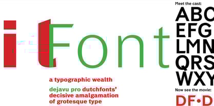
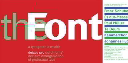
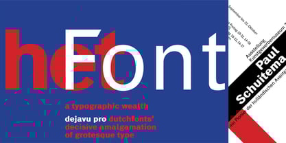
DF Dejavu Pro™
by Dutchfonts


- Aa Glyphs
-
Best ValueFamily Packages
- Individual Styles
- Tech Specs
- Licensing
Per Style:
$33.00 USD
Pack of 10 styles:
$330.00 USD
About DF Dejavu Pro Font Family
Designers: Ko Sliggers
Publisher: Dutchfonts
Foundry: Dutchfonts
Original Foundry: unknown
Design Owner: Dutchfonts
MyFonts debut: Nov 10, 2010
About Dutchfonts
DutchFonts is a type foundry set up by Ko Sliggers to develop and sell his typedesigns. Since 1979 typography has been a vital ingredient in his graphic design. Altering a character from an existing typeface never was a problem if the desired form asked for it. Painted and drawn letterforms gave his work an unmistakable typographic identity. From 1997 his designs were made with self-designed typefaces. In the various typefaces he developed, he tried to bring back irregularity as an articulation of a personal “hand-made”, human approach and expression. The fonts are partially based on, and inspired by found, vernacular letterforms. After he set up his studio in the northeastern part of Holland in 2002 on top of the old mound Lalleweer he started marketing fonts by www.lalleweer.nl and recently through www.dutchfonts.com. “Dutchfonts is typically Dutch in the sense that it combines precision and rationality with dada-like anarchism and irreverence.” (Jan Middendorp in 'Dutch Type')
Read more
Read less
- Choosing a selection results in a full page refresh.