The "Ma" in "Ma Braille" is used as a minimalist way to say "Negative Space". "Ma" in japanese arts is an "esthetical usage of emptiness".
Thus this font explicits the negative space around visible braille dots in each glyph.
A. Font user guide
a.1. Lowercase glyphs { A..Z }
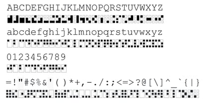
In these glyphs, dots are represented as "black squares" while the negative space is displayed as 1 or 2 white filled polygons.
a.2. Uppercase glyphs { a..z }
In these glyphs, dots are represented as "white squares" while the negative space is displayed as 1 or 2 black filled polygons.
a.3. Digits: they are just the same than a..j, but the "North US version" is also provided in ascii codes 0xE0..0xE4 (1..5) and 0xE7..0xEB (6..0).
a.5. "Dashed Border":
a.5.1. "Black dashed" border glyphs; { £, ¥, µ, Â, Ä, Ê, Ë, Î, Ï, Ô }
a.5.2. "White dashed" border glyphs; { Ö, Õ, °, ô, ö, î, ï, û, u, õ }
B. Posters
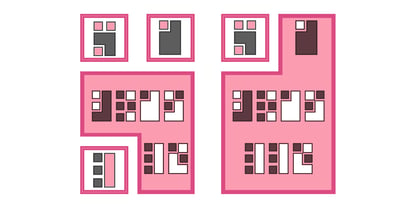
Poster 1: "Font Logo" version 1, it displays "Ma Braille" text surrounded by the "black dashed border" glyphs.
Poster 2: "Font Logo" version 2, it displays "MA" glyphs in big size and smaller "Braille" glyphs within "M" and within "A" as well.
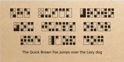
Poster 3: the classical pangram to test a font "The Quick Brown Fox jumps over the Lazy dog".
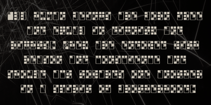
Poster 4: Article 1 of the Human Rights: All human beings are born free and equal in dignity and rights. They are endowed with reason and conscience and should act towards one another in a spirit of brotherhood.
Poster 5: the "Glyph set" (Border glyphs not included) with A..Z, a..z, digits and special characters.


