Skip to content
Home / Fonts / GLC / 1499 Alde Manuce Pro
1499 Alde Manuce Pro

1499 Alde Manuce Pro

by GLC
Individual Styles from $42.00 USD
Complete family of 2 fonts: $55.00 USD
1499 Alde Manuce Pro Font Family was designed by Gilles Le Corre and published by GLC. 1499 Alde Manuce Pro contains 2 styles and family package options.

More about this family
FREE 30-DAY TRIAL of Monotype Fonts to get over 150,000 fonts from more than 1,400 type foundries. Start free trial
Start free trial

1499 Alde Manuce Pro Family

2 fonts

Best Value!

Per Style:

$27.50 USD

Pack of 2 styles:

$55.00 USD

About 1499 Alde Manuce Pro Font Family


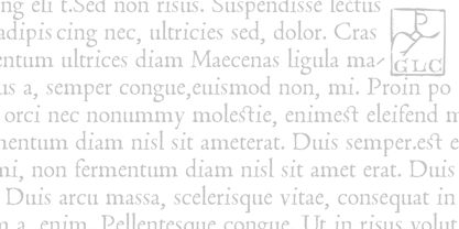
This family was inspired by the beautiful roman font used by Aldus Manutius in Venice (1499) to print for the first time Hypnerotomachia Poliphili..., the well known book attributed to Francesco Colonna. Francesco Griffo was the punchcutter. The present font contains all of the specific latin abbreviations and other ligatures used in the original. The Italic style, carved by Francesco Colonna, the so called "Aldine" style, was inspired from various documents, all printed with this first Italic font. We offer the complete set of ligatures (about 60) we have been able to find, contained in the original font. In the two styles, we have made differences between I and J, V and U, to make easier a modern use. Added are the accented characters and a few others not in use in this early period of printing. The Italic style may be used as a complement to our 1470 Jenson Latin. The font contains all characters for West European (including Celtic), Baltic, East and Central European and Turkish language.

Designers: Gilles Le Corre

Publisher: GLC

Foundry: GLC

Original Foundry: unknown

Design Owner: GLC

MyFonts debut: May 7, 2010
1499 Alde Manuce Pro

About GLC

Gilles Le Corre was born in 1950 in Nantes, France. Painter since the end of 70s, he is also an engraver and calligrapher. He has been learning about medieval art and old books for as long as he can remember. More recently he has made the computer a tool for writing like the quill pen and ink. With it, he aims to make it possible to print books that look just like old ones! Beginning in 2007 he has been trying to reproduce, very exactly, a wide range of historic European typefaces, mainly from medieval and early periods of printing - his favorite period - from 1456 with Gutenberg, up to 1913 with a font inspired by a real old typewriter.

Read more

Read less