❧ Useful links:
Luther’s Manuscripts at the UNESCO Memory of the World at Google Arts and Culture
Martin Luther font on Kickstarter (with Film about the creation)
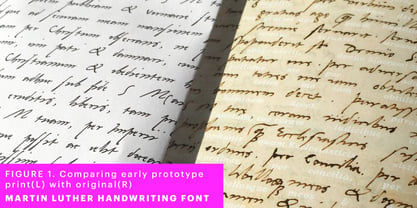
Each letter of the Martin Luther font is strictly based on original samples found in Martin Luther’s 500 year old handwritten manuscripts. Letters that occur more often for example vowels have two or more different versions stored in the font.
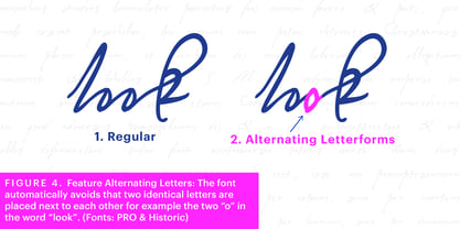
(➶ Figure 4) These alternative forms are exchanged automatically by the font as you type, and create a vivid look that comes close to actual handwriting. The font avoids that two identical letters are placed next to each other like, for example the two “o” in the word “look”.
➸ What Historic Sources is the Font based on?
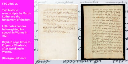
Two historic documents were used to base the font on. The notes Luther took before giving his speech in Worms in 1521 and a 6 page letter he wrote immediately after to Emperor Charles V., summarising his speech
(➶ Figure 2). Both documents have been added to the
UNESCO “Memory of the World” and can be seen at the
Google Arts and Culture website.
➸ The Creation of a Handwriting Font
The creation of a handwriting font is very different from the creation of a regular font. Harald Geisler has specialised in recreating handwriting in preceding projects with
Albert Einstein’s, Sigmund Freud’s and
his own handwriting. His experience working with Archives and Museums has gone into this project.
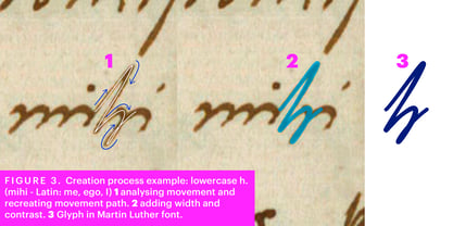
First Geisler analyses the movement in the writing to understand how each letter is drawn. This involves partially learning how to write like a person. In this process not the outlines of the sample are reproduced but the original movement path of the handwriting
(➶ Figure 3). In a second step width and contrast is added to reproduce Martin Luther’s characteristic impetus and the writing tools used at the time.
(Link: Youtube Playlist showcasing the creation of individual letters)
How about signs that can’t be found in archives?
Some Glyphs can not be found in 500 year old manuscripts, for example the @-sign. Towards the end of the creation one collects a profund amount of details about how a writer moves on paper and addresses certain tasks moving the pen. Keeping this knowledge in mind an improvisation can be based on similar letter forms. For example the @ sign is based on of the movement of a lowercase a and parenthesis.
➸ Features of the Martin Luther font
❶
Extensive Documentation of the creation of the font, including high quality reproduction of the used manuscripts.
❷
Additional texts from Historian Dr. Henning Jürgens and Palaeographer (and Luther handwriting expert) Prof. Ulrich Bubenheimer
❸
Alternating Letters - in handwriting every word looks a bit different. To avoid that two identical letterforms are placed next to each other (for example in the word look) the font actively changes between different versions of letters as you type.
❹
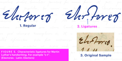
Ligatures - characteristic writing forms when two letters are combined (for example “ct”)
(➶ Figure 5)
❺
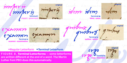
Terminal Letterforms - renders a special letterform when letter is at the end of a word.
(➶ Figure 8)
❻ ‘’’Initial and Medial Letterforms''' - some letterforms are different when placed in the beginning or middle of a word, for example the lowercase s.
❼
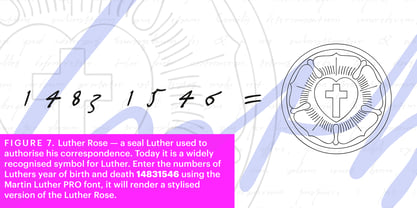
Luther Rose - is a seal Luther used to authorise his correspondence. Today it is a widely recognized symbol for Luther. When you enter the numbers of Luthers year of birth and death 14831546 using the Martin Luther PRO font, it will render a stylised version of the Luther Rose.
(➶ Figure 7)
❽
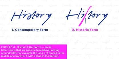
Historic letter-forms - letter-forms that are specific to medieval writing around 1500. For example the
long-s or h with a loop at the bottom.
(➶ Figure 6)
⚑
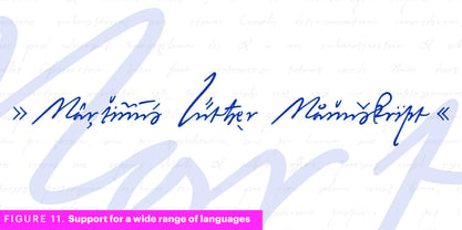
Multi language support - see the technical information tab for a full list of supported languages.
(➶ Figure 11)
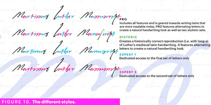
➸ The different Styles explained
❋
Martin Luther PRO - this includes all features listed above and is geared towards writing texts that are more readable today. It features alternating letters to create a natural handwriting look as well as two stylistic sets accessible through the OpenType menu. Historic forms are available through the glyph picker.
❋
Martin Luther Historic - this font creates a historically correct reproduction (i.e. with long-s) of Luther’s medieval latin handwriting. It features alternating letters to create a natural handwriting look as well as two stylistic sets accessible through the OpenType menu.
❋
Martin Luther Expert-1 - Dedicated access to the first set of letters only.
❋
Martin Luther Expert-2 - Dedicated access to the second set of letters only.
❈❈❈
Family Pack - recieve all fonts at a discounted price. ❈❈❈
➸ Kickstarter
The creation and development of the Martin Luther font was financed by 500 supporters on
➸Kickstarter.
About Harald Geisler
Harald Geisler Foundry is the creative atelier of typographic artist Harald Geisler, located in Frankfurt am Main, Germany. Geisler is renowned for his innovative and conceptual approach to typography, blending art, history, and personal storytelling to create unique typefaces that challenge the boundaries of conventional design.\n \n••••••Geisler’s work gained international recognition in 2010 with the release of the foundry’s first typeface, Ciseaux Matisse. This font was inspired by an exhibition of Henri Matisse’s technique of “drawing with scissors,” capturing the fluidity and movement of Matisse’s paper cut-outs.••••••One of Geisler’s most notable projects is the Sigmund Freud Typeface, developed in collaboration with the Freud Museum in London and the Sigmund Freud Museum in Vienna. This typeface meticulously transforms Freud’s handwritten letters into a digital font, offering users an intimate connection to the iconic psychoanalyst’s handwriting style.••••••Geisler’s Conspired Lovers typeface is another example of his unique approach to type design. Drawing inspiration from his own love letters, this font captures the emotional intensity and spontaneity of handwritten correspondence, making each character feel personal and heartfelt.••••••In 2013, Geisler embarked on an ambitious project to recreate Albert Einstein's handwriting digitally. He developed the Albert Einstein Font through a successful Kickstarter campaign, bringing the physicist’s distinctive penmanship into the digital age. The project, supported by over 2,500 backers, demonstrates Geisler’s ability to blend historical significance with contemporary digital tools.••••••Currently, Geisler is reviewing his font collection on display at MyFonts, continually refining and expanding his offerings. To stay updated on his latest developments, you can follow his work by signing up for his newsletter on his website: www.haraldgeisler.com, and www.handwriting.digital.••••••Geisler’s typefaces have been widely recognized and featured in international publications, including The Wall Street Journal, The Huffington Post, Fast Company, Design Taxi, Novum, and Page. His commitment to innovative design and storytelling through typography continues to significantly impact the field, earning him a reputation as a leading typographic artist.
Read more
Read less