Select this license type when you are developing an app for iOS, Android, or Windows Phone, and you will be embedding the font file in your mobile application's code.
Tuna
by Ligature Inc
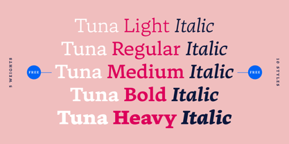
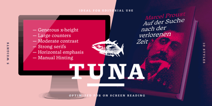
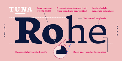
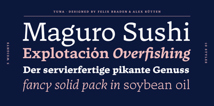
- Aa Glyphs
-
Best ValueFamily Packages
- Individual Styles
- Tech Specs
- Licensing
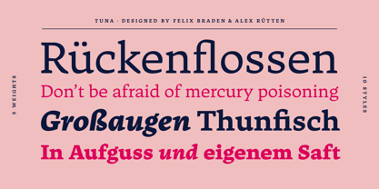
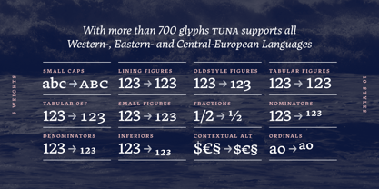
About Tuna Font Family
Designers: Felix Braden, Alex Rütten
Publisher: Ligature Inc
Foundry: Ligature Inc
Design Owner: Ligature Inc
MyFonts debut: Jan 17, 2017
About Ligature Inc
Ligature Inc. is the foundry of Alexander Rütten and Felix Braden (Floodfonts). Alexander and Felix met while studying communication design at the Trier University of Applied Sciences. After graduating they worked as editorial- and interface designers, art directors and developers for interactive applications. Both designed several award-winning typefaces for well-known foundries such as FontShop International, Linotype and URW+ before they found out that font- collaboration is a lot of fun! Now they work on fonts using a digital ping-pong-like process bridging the distance between Berlin and Cologne, happy to transform the solitary type design process into a close dialog about screen optimization, readability and the development of a distinct headline-character.
Read more
Read less
- Choosing a selection results in a full page refresh.