Select this license type when you are developing an app for iOS, Android, or Windows Phone, and you will be embedding the font file in your mobile application's code.
Sofia Pro
by Mostardesign

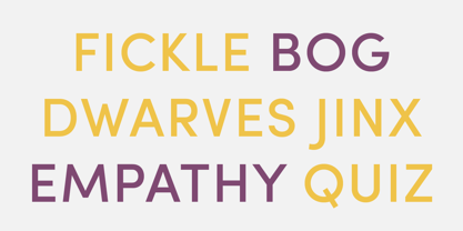

- Aa Glyphs
-
Best ValueFamily Packages
- Individual Styles
- Tech Specs
- Licensing
About Sofia Pro Font Family
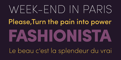
Sofia Pro is a geometric sans font family who dares the modernism and the harmony of
the curves. Created in 2009 and completely redesigned in 2012, it has become over time
a popular alphabet and has received many accolades from graphic industry professionals.
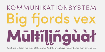
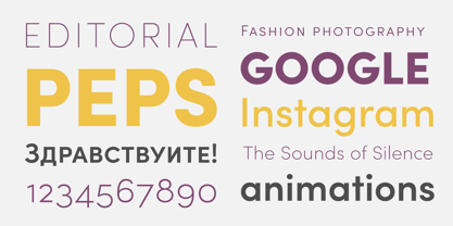
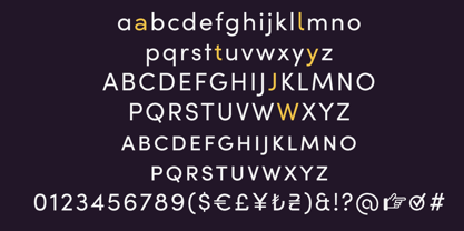
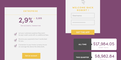
It has very rounded curves with very open terminals that makes this font family elegant, friendly and contemporary. Sofia Pro has been designed with a higher x-height than other fonts in its class to make tiny readability more obvious in any use situation. It will be ideal for use in small sizes such as business cards or mobile applications.
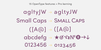
This typeface is also equipped with powerful OpenType features to satisfy the most demanding professionals. It has solid features like case sensitivity, small, true capitals, full ligatures, tabular figures for tables, old style figures to elegantly insert numbers into your sentences, circled numbers, and more alternative characters to give personality to your projects. This typeface already has a powerful home kerning system called “Pro Kerning”.
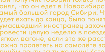
With all its specificities, Sofia Pro is a geometric sans that can meet the needs of professionals who want a family of clean geometric font; elegant with a wide character set for more than 130 languages of Western Europe, Europe Eastern, Central Europe, Greek and Cyrillic for international communication.
Designers: Olivier Gourvat
Publisher: Mostardesign
Foundry: Mostardesign
Design Owner: Mostardesign
MyFonts debut: Mar 22, 2012
About Mostardesign
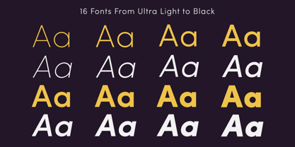
It was in the year 2004 that graphic designer Olivier Gourvat began experimenting with type design for use in his graphic design studio, Mostardesign Studio. With a focus on brand creation, custom type, illustration and advertising, his studio has worked on a wide variety of projects in the last two decades for clients across the world.With the creation of his first font, Visoko in 2009, Olivier’s focus shifted primarily to type design. “I use my work experience and my knowledge in the graphic design process to create unique and professional fonts to help designers and web designers create an effective communication for their projects,” he says. And it is with his past as a graphic designer in mind that he creates versatile type families like Sofia Pro, one of his best selling fonts to date."I consider that the versatility of a font is the first step on the way to the success of a good global communication,” Olivier says. “A large family with a lot of different weights will convey a strong message to its audience while being easy to use on various media, whether print or digital."
Read more
Read less
- Choosing a selection results in a full page refresh.