Select this license type when you are developing an app for iOS, Android, or Windows Phone, and you will be embedding the font file in your mobile application's code.
Quinella
by Eclectotype
Individual Styles from $40.00 USD

Quinella Font Family was
designed by
Dave Rowland and
published by
Eclectotype. Quinella contains
1
styles.
More about this family
About Quinella Font Family
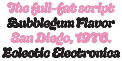
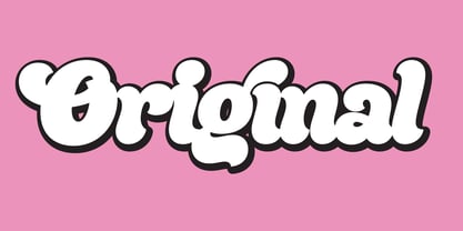
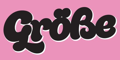
Plumper than a misguided Z-lister's dodgy lip job, this is Quinella, named after the cheffy scoops of ice cream and the like, quinelles. It's a cute, fat script with a seventies vibe but a personality all of its own. It's non-connecting in the usual sense, but the letters overlap to make the white space as tiny as possible. Ligatures (standard and discretionary) make smoother solutions for quite a few pairs and trios, and every upper case letter has a more exuberant swash alternate. The contextual alternates feature substitutes in an alternate t for a better fit with certain letters. Fonts don't come much more voluptuous than this. The full-fat, creamy appearance makes it perfect for food packaging, but don't let it end there; it'll make memorable logos, unmissable headlines, and posters with more punch.
Designers: Dave Rowland
Publisher: Eclectotype
Foundry: Eclectotype
Design Owner: Eclectotype
MyFonts debut: May 30, 2017
Quinella
About Eclectotype
Eclectotype is the foundry of Dave Rowland, and has been making retail and custom type for over a decade (formerly known as Schizotype). As the name suggests, the catalogue features an eclectic mix of styles from text workhorses to full on display faces. This is not a foundry that likes to stick to trends or expectations, often to the detriment of commercial success, but strives to make every release useful, original, and interesting.
Read more
Read less
- Choosing a selection results in a full page refresh.