Select this license type when you are developing an app for iOS, Android, or Windows Phone, and you will be embedding the font file in your mobile application's code.
Rotten Mangos
by StereoType Fonts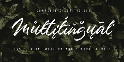
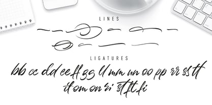
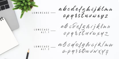
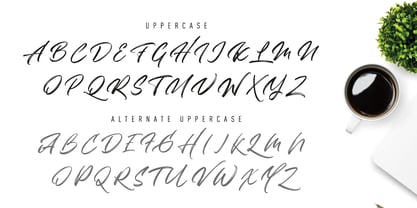
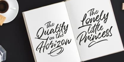
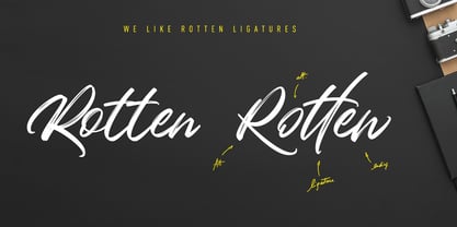
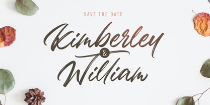
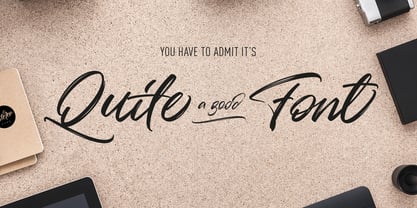
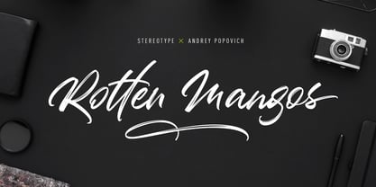
About Rotten Mangos Font Family
Designers: Clément Nicolle
Publisher: StereoType Fonts
Foundry: StereoType Fonts
Design Owner: StereoType Fonts
MyFonts debut: Jun 26, 2019
About StereoType Fonts
Located in Nancy, France, StereoType is a one-man foundry created in 2004 by me, Clément Nicolle. In the beginnings, it was mostly about playing with letters, but it slowly became something most serious. In the same time, I worked as an Art Director in a creative agency, where I developed my passion for letters, starting to draw any title by myself rather than chosing an existing font. This passion never stopped growing until the day I decided to focus only on typography. This is when StereoType was born. What I like is creating bridges between handlettering and fonts, creating fun around typography, trying to produce something fun. The most important is to think about the ""Wow effect"" at the moment when the final user will play with my fonts. Today, my goal is to keep focused on how typography will evolved, to keep offering playful and creative fonts.
Read more
Read less
- Choosing a selection results in a full page refresh.