Select this license type when you are developing an app for iOS, Android, or Windows Phone, and you will be embedding the font file in your mobile application's code.
Lens Grotesk
by Typedepot
- Aa Glyphs
-
Best ValueFamily Packages
- Individual Styles
- Tech Specs
- Licensing
Lens Grotesk Essentials
6 fontsPer Style:
$8.33 USD
Pack of 6 styles:
$49.99 USD
About Lens Grotesk Font Family
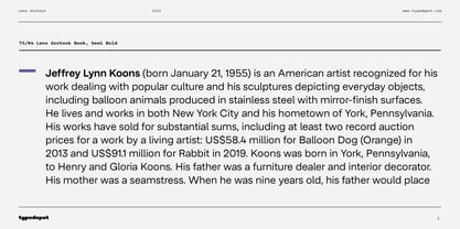
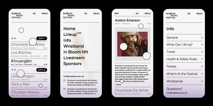
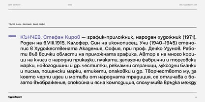
Lens Grotesk is a Neo-grotesque type family of 16 fonts born as a result of a very conscious research in the field of the neutral Swiss aesthetic. There's a reason for all the prominent examples of this design like Helvetica and Univers to be used on a daily basis for more than 70 years and it's a simple one - they just work.
The closed terminals, the low contrast, uniform widths and proportions makes the Neo-grotesques feel just right. Although very often branded as stiff, the neutral Neo grotesques are here to stay and Lens Grotesk is our own reading of the popular style.
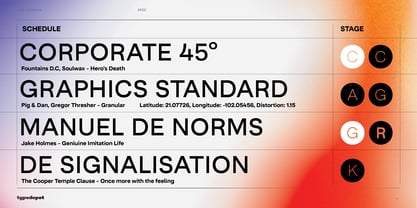
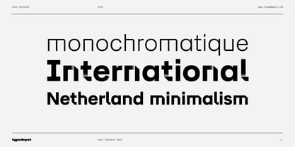
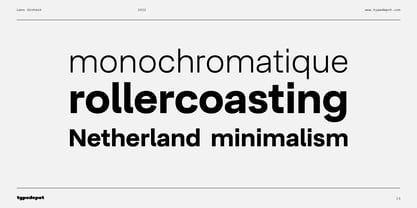
Lens Grotesk takes the Neo-grotesk model one step further adding a pinch of Geometric sans-serif to the mix thus creating a way more modern and contemporary looking design. Characterized with more generous oval proportions and slightly more open terminals, Lens Grotesk keeps the modulation and rhythm needed for a slightly longer texts while visibly keeping everything in order. Zooming in you'll find traces of the Geometric aesthetic - the robust almost right angled approach of the arches and tails (look t, f, j, y) and the way more circular rounded shapes.
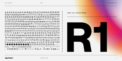
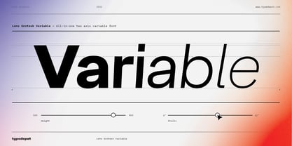
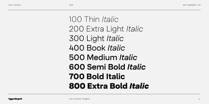
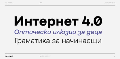
Like all our fonts, Lens Grotesk is equipped with a range of OpenType features, stylistic alternatives and of course Cyrillic support. It comes in a pack of 16 fonts with 8 styles and their matching italics or one variable font file available with all full family purchases.
Designers: Alexander Nedelev
Publisher: Typedepot
Foundry: Typedepot
Design Owner: Typedepot
MyFonts debut: May 4, 2022
About Typedepot
Typedepot co-founders Alexander Nedelev and Veronika Slavova say, “In the beginning, Typedepot was a side project, nothing serious – just experimenting with letterforms. Then, in a moment it just felt more right to do this than anything else.” Based in Sofia, Bulgaria, the duo first came upon type design while working as graphic designers in advertising. “We had absolutely no background in type design,” Alexander says, “but we had this project, a logotype for a small company, which we developed to become the Glide typeface.” Two years later they rented an office, took the plunge and started designing type full time. “Now it’s the thing we do and the thing we love to do.” So far they’ve seen great success with Best Seller Centrale Sans. The modern sans serif typeface was featured as one of MyFonts Most Popular Fonts of 2011 and was featured in our Rising Stars Newsletter that same year. The self-taught designers whose foundry started out as a way to experiment with type, say that their main focus is “to design original typefaces for retail and custom use.”
Read more
Read less
- Choosing a selection results in a full page refresh.