Select this license type when you are developing an app for iOS, Android, or Windows Phone, and you will be embedding the font file in your mobile application's code.
Bench Grinder
by Typodermic


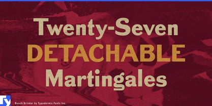

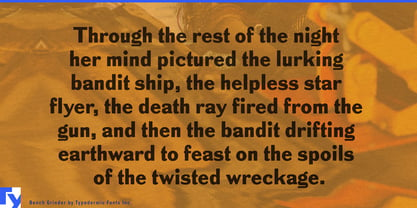
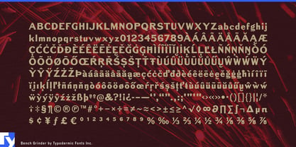
About Bench Grinder Font Family
Meet Bench Grinder, the typeface that’s about as slick as a muddy tractor tire—and proud of it. Inspired by 19th-century metal headline type that’s had its serifs unceremoniously lopped off, this font wears its rough edges like a badge of honor.
Bench Grinder isn’t here to win any beauty pageants. It’s the typographic equivalent of a weathered barn: sturdy, unapologetic, and full of character. Each letter looks like it’s been through a few harvests, emerging with a charm that’s as authentic as homemade apple pie. This isn’t a font for the faint of heart or the overly polished. Bench Grinder is for those who appreciate the beauty in imperfection, who understand that sometimes the most powerful messages come from the most unexpected places. It’s perfect for designs that need to cut through the noise with all the subtlety of a rooster at dawn.
Despite its rough-and-tumble appearance, Bench Grinder is surprisingly versatile. It speaks a wide range of languages, from Afrikaans to Zulu, proving that you don’t need fancy serifs to be worldly. Whether you’re designing for a farmers’ market or a punk rock album, Bench Grinder brings an unmistakable flavor of rustic rebellion to the table. So, if you’re tired of fonts that look like they’ve never seen a day’s work in their lives, give Bench Grinder a spin. It’s not pretty, it’s not sophisticated, but it’s got more personality than a barnyard full of characters. Use it when you want your words to roll up their sleeves and get their hands dirty.
Remember, in a world of sleek and polished typefaces, sometimes you need one that’s not afraid to track a little mud across the page. That’s Bench Grinder—because life’s too short for fonts without grit.
Designers: Ray Larabie
Publisher: Typodermic
Foundry: Typodermic
Design Owner: Typodermic
MyFonts debut: Feb 10, 2010

About Typodermic
Welcome to Typodermic Fonts, a spirited type foundry rooted in Nagoya, Japan, started by the Canadian typeface designer, Raymond Larabie in 2001. Our library brims with 500+ diverse typefaces to fuel creativity in graphic design, advertising, web, and app development. As digital type pioneers, we adopted web fonts and app licensing early, consistently pushing the design envelope. With Canadian heart and Japanese precision, we're your global partners in extraordinary typography. Explore Typodermic Fonts—where creativity meets character.
Read more
Read less
- Choosing a selection results in a full page refresh.