Select this license type when you are developing an app for iOS, Android, or Windows Phone, and you will be embedding the font file in your mobile application's code.
Carouselambra
by Typodermic


About Carouselambra Font Family
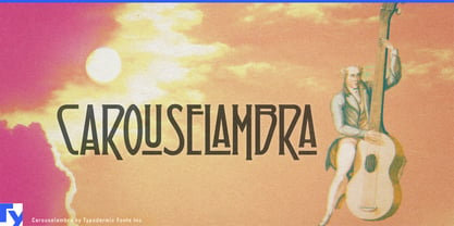
Step into a world of timeless elegance with Carouselambra, a typeface that weaves the intricate beauty of Art Nouveau with the raw energy of rock ‘n’ roll. Inspired by the iconic typography of Led Zeppelin’s “Houses of the Holy” album, this font transports you to an era where art and craftsmanship reigned supreme.
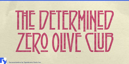
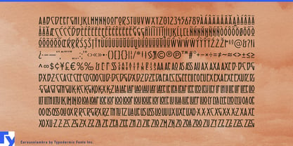
Carouselambra’s letterforms are a delicate dance of curves and flourishes, each character a miniature masterpiece that beckons the eye to linger. Its interlocking design, reminiscent of wrought iron gates and stained glass windows, creates a mesmerizing visual rhythm that elevates any design from mundane to magical. But Carouselambra is more than just a pretty face. It’s a sophisticated typographic tool, harnessing the power of OpenType to offer designers unprecedented control. With standard ligatures that can be seamlessly integrated or expertly manipulated, this font allows for both effortless elegance and meticulous customization.
Carouselambra’s linguistic versatility matches its visual flexibility. Fluent in a vast array of Latin-based European writing systems, it speaks the language of beauty from the misty highlands of Scotland to the sun-drenched piazzas of Italy. This expansive language support ensures that Carouselambra’s ornate charm can resonate across cultures and borders.
Choose Carouselambra when you need typography that doesn’t just communicate, but transports. It’s perfect for designs that demand a touch of the extraordinary—vintage-inspired branding, luxurious packaging, or editorial layouts that yearn to be framed. With Carouselambra, every word becomes a work of art, every phrase a portal to an age of unparalleled craftsmanship and beauty.
In a world of fleeting trends, Carouselambra stands as a testament to enduring style. It’s more than a font—it’s a typographic time machine, ready to infuse your designs with the timeless allure of Art Nouveau and the rebellious spirit of rock ‘n’ roll.
Designers: Ray Larabie
Publisher: Typodermic
Foundry: Typodermic
Design Owner: Typodermic
MyFonts debut: Jul 16, 2008

About Typodermic
Welcome to Typodermic Fonts, a spirited type foundry rooted in Nagoya, Japan, started by the Canadian typeface designer, Raymond Larabie in 2001. Our library brims with 500+ diverse typefaces to fuel creativity in graphic design, advertising, web, and app development. As digital type pioneers, we adopted web fonts and app licensing early, consistently pushing the design envelope. With Canadian heart and Japanese precision, we're your global partners in extraordinary typography. Explore Typodermic Fonts—where creativity meets character.
Read more
Read less
- Choosing a selection results in a full page refresh.