Select this license type when you are developing an app for iOS, Android, or Windows Phone, and you will be embedding the font file in your mobile application's code.
Fluctuation™
by Typodermic


- Aa Glyphs
-
Best ValueFamily Packages
- Individual Styles
- Tech Specs
- Licensing
About Fluctuation Font Family
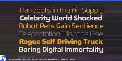
Meet Fluctuation, a sans-serif typeface that seamlessly merges high-tech aesthetics with typographic elegance. Inspired by cutting-edge consumer electronics, every curve and chamfer of Fluctuation has been meticulously crafted to embody modern precision.
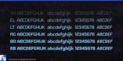
Its smooth lancet arches and calculated chamfers aren’t just visually striking—they’re functional, maximizing legibility while conserving horizontal space. This makes Fluctuation ideal for responsive websites, compact UIs, and sleek print designs alike. With weights ranging from extra-light to bold, plus italics, Fluctuation offers designers a full spectrum of expressive possibilities. The lighter cuts whisper of refined technology, while the bolder weights command attention in any setting.
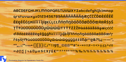
Fluctuation speaks fluently across borders, supporting a wide array of Latin-based European languages. This linguistic versatility makes it perfect for international tech brands and global corporations seeking a consistent, sophisticated voice. For designers who understand that in technology, form and function are inseparable, Fluctuation is more than a typeface—it’s a statement. It doesn’t just complement your design; it enhances it, adding a layer of technological sophistication to every character.
When your project demands a forward-thinking, functional typeface, turn to Fluctuation. It’s not just about choosing a font; it’s about setting the standard for modern, tech-savvy communication. With Fluctuation, you’re not just setting type—you’re defining the future of design.
Designers: Ray Larabie
Publisher: Typodermic
Foundry: Typodermic
Design Owner: Typodermic
MyFonts debut: Apr 30, 2013

About Typodermic
Welcome to Typodermic Fonts, a spirited type foundry rooted in Nagoya, Japan, started by the Canadian typeface designer, Raymond Larabie in 2001. Our library brims with 500+ diverse typefaces to fuel creativity in graphic design, advertising, web, and app development. As digital type pioneers, we adopted web fonts and app licensing early, consistently pushing the design envelope. With Canadian heart and Japanese precision, we're your global partners in extraordinary typography. Explore Typodermic Fonts—where creativity meets character.
Read more
Read less
- Choosing a selection results in a full page refresh.