Select this license type when you are developing an app for iOS, Android, or Windows Phone, and you will be embedding the font file in your mobile application's code.
Gleaming the Cube
by Typodermic
About Gleaming the Cube Font Family
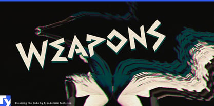
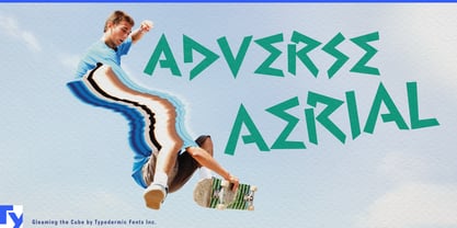
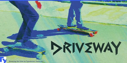
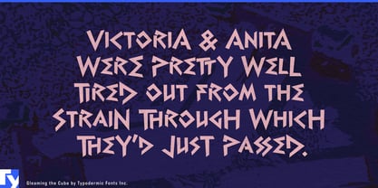
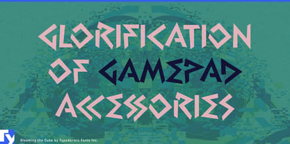
Dudes and dudettes, prepare to have your minds totally blown by Gleaming the Cube—a typeface that doesn’t just nod to the ’80s and ’90s, it kickflips right into your design with a gnarly ollie and sticks the landing!
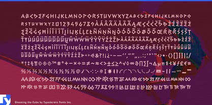
This isn’t your average, lame-o font, bro. Gleaming the Cube is the typographic equivalent of a neon-soaked skate park at midnight. It’s got attitude for days, with capital letters that bookend words like radical parentheses of coolness. It’s like your text is wearing a backwards cap and saying, “Yeah, I’m awesome. Deal with it.” But hold onto your skateboards, because Gleaming the Cube is packing more heat than a fresh pack of Garbage Pail Kids cards. We’re talking OpenType combination ligatures that’ll make your eyeballs do a 360° spin. These aren’t just letters; they’re acrobats pulling off sick typographic tricks that’ll have your audience gasping, “No way, dude!”
And just when you think it can’t get any more bodacious, BAM! Gleaming the Cube hits you with symbols so wild, they make Sonic the Hedgehog look like he’s moving in slow-mo. These aren’t just punctuation marks; they’re visual exclamation points that scream “Cowabunga!” Speaking of languages, this typeface is a total globe-trotter. It’s fluent in more tongues than that exchange student who know how to kiss. From Afaan Oromo to Zuni, Gleaming the Cube ensures your rad message maintains its tubular essence across borders. It’s like a linguistic world tour, but with more neon and less jetlag.
In a world of vanilla fonts, Gleaming the Cube is a double scoop of bubblegum ice cream with extra sprinkles and a cherry on top. It’s not just a typeface; it’s a time machine fueled by Jolt Cola and the righteous power of sheer awesomeness. Get Gleaming the Cube now and inject some maximum ’90s vibes into your next project.
Designers: Ray Larabie
Publisher: Typodermic
Foundry: Typodermic
Design Owner: Typodermic
MyFonts debut: Aug 11, 2010

About Typodermic
Welcome to Typodermic Fonts, a spirited type foundry rooted in Nagoya, Japan, started by the Canadian typeface designer, Raymond Larabie in 2001. Our library brims with 500+ diverse typefaces to fuel creativity in graphic design, advertising, web, and app development. As digital type pioneers, we adopted web fonts and app licensing early, consistently pushing the design envelope. With Canadian heart and Japanese precision, we're your global partners in extraordinary typography. Explore Typodermic Fonts—where creativity meets character.
Read more
Read less
- Choosing a selection results in a full page refresh.