Select this license type when you are developing an app for iOS, Android, or Windows Phone, and you will be embedding the font file in your mobile application's code.
Ultraproxi
by Typodermic
- Aa Glyphs
-
Best ValueFamily Packages
- Individual Styles
- Tech Specs
- Licensing
About Ultraproxi Font Family
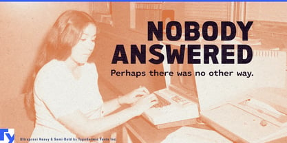
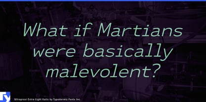
Ultraproxi: a typeface that hums with the electric precision of a bygone technological era. Like the rhythmic whir of the IBM 1403 chain printer that inspired it, this font family resonates with a harmonious blend of nostalgia and cutting-edge design.
At its core, Ultraproxi captures the essence of mid-20th century high-speed printing. Each character stands as a testament to an age when the staccato rhythm of metal slugs striking paper was the heartbeat of information processing. The typeface’s clean lines and measured spacing echo the metronomic precision of those early computer printers, where each letter was a triumph of mechanical engineering. But Ultraproxi is no mere facsimile of the past. Its semi-monospaced design strikes a delicate balance between technical austerity and modern flexibility. Like a virtuoso musician who knows when to adhere to the score and when to improvise, Ultraproxi offers designers the structure of a monospaced font with the freedom to break from rigid conformity when the design demands it.
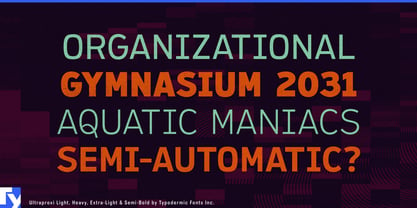
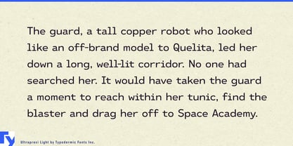
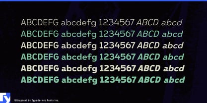
The six weights of Ultraproxi, each with its italic counterpart, provide a full symphony of typographic possibilities. From the whisper-quiet pianissimo of its lightest weight to the thunderous fortissimo of its boldest cut, this typeface allows designers to modulate their visual voice with unprecedented control. Ultraproxi speaks the language of data with fluency, making it the ideal choice for complex visualizations and user interfaces. Yet, it’s equally at home in body text, headlines, or anywhere that demands a perfect fusion of readability and technical aesthetics. It’s a typeface that doesn’t just display information—it elevates it.
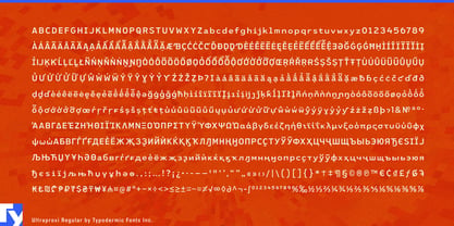
The linguistic versatility of Ultraproxi is as impressive as its design flexibility. Supporting an vast array of writing systems—from Latin to Cyrillic, Greek to Vietnamese—this typeface ensures your message resonates across cultures with the same technical precision, regardless of the language. Are you ready to infuse your designs with the spirit of technological innovation? Ultraproxi awaits, its characters poised to march across your screen with the same relentless efficiency as the chain printers that inspired it. Getit today and let your typography sing with the harmony of form and function.
With Ultraproxi, you’re not just choosing a font—you’re tapping into the pulse of an era when each printed character represented a leap forward in human progress. In a world of endless digital noise, Ultraproxi stands as a beacon of clarity, precision, and timeless technological cool.
Designers: Ray Larabie
Publisher: Typodermic
Foundry: Typodermic
Original Foundry: Typodermic
Design Owner: Typodermic
MyFonts debut: Nov 3, 2017

About Typodermic
Welcome to Typodermic Fonts, a spirited type foundry rooted in Nagoya, Japan, started by the Canadian typeface designer, Raymond Larabie in 2001. Our library brims with 500+ diverse typefaces to fuel creativity in graphic design, advertising, web, and app development. As digital type pioneers, we adopted web fonts and app licensing early, consistently pushing the design envelope. With Canadian heart and Japanese precision, we're your global partners in extraordinary typography. Explore Typodermic Fonts—where creativity meets character.
Read more
Read less
- Choosing a selection results in a full page refresh.