A geometric Art Déco multi-widths type family
Anisette has sprouted as a way to test some ideas of designs. It has started with a simple line construction (not outlines as usual) that can be easily expanded and condensed in its width in Illustrator. Subsequently, this principle of multiple widths and extreme weights permitted to Jean François Porchez to have a better understanding with the limitations associated with the use of MultipleMaster to create intermediate font weights.
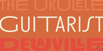
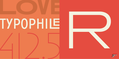
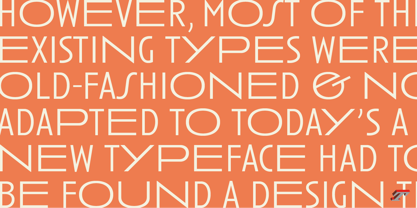
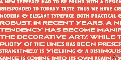
Anisette is built around the idea of two widths capitals can be described as a geometric sanserif typeface influenced by the 30s and the Art Deco movement. Its design relies on multiple sources, from Banjo through Cassandre posters, but especially lettering of Paul Iribe. In France, at that time, the Art Déco spirit is mainly capitals. Gérard Blanchard has pointed to Jean François that Art Nouveau typefaces designed by Bellery-Desfontaines was featured before the Banjo with this principle of two widths capitals.
A simple sentence will be as diverse in its representations, as the number of Anisette variables available to the user. With Anisette, typography becomes a game, as to design any title page as flamboyant as if it has been specially drawn for it.
Two typefaces, many possibilities
The complementarity between the two typefaces are these wide capitals mixed with narrow capitals for the Anisette while the Anisette Petite – in its latest version proposes capitals on a square proportions, intermediate between the two others sets. Anisette Petite proposes capitals in a square proportion, intermediate between the two other sets, all of which are interchangeable. In addition, Anisette Petite also includes a set of lowercase letters. Its style references shop signs present in our cities throughout the twentieth century.
Anisette, an Art Déco typeface
Anisette: Reveal your typographic expertise
Club des directeurs artistiques, 46e palmarès
Bukva:raz 2001
Slanted: Contemporary Typefaces #24
About Typofonderie
Founded in 1994 by Jean-François Porchez, Typofonderie is an independent digital type foundry in France, designing, manufacturing and distributing a selection of high quality typefaces for adventurous digital typographers. This is the first place in the world to buy our digital fonts.
Based in Clamart (France) from the end of 2008, Typofonderie as foundry, is dedicated to the distribution of a selection of high quality typeface designs, while ZeCraft focuses on the bespoke typefaces and lettering projects.
Many of the Typofonderie typefaces have won prizes in international competitions.
Read more
Read less

