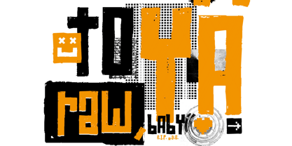
About the family
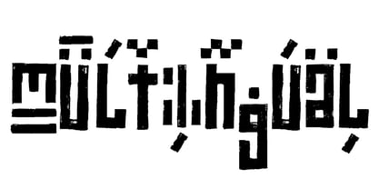
The typeface Raw Street Wall is designed for the Typo Graphic Design font foundry from 2011–2017 by Manuel Viergutz. A playful display type for headlines with a street-art graffiti-style by hand. Rough-look plus state-of-the-art automatic generated OpenType-features (like contextual alternates (calt)).
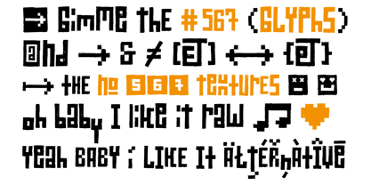
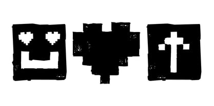
567 glyphs with extras like emoticons/icons, arrows, dingbats, symbols, geomatric shapes, catchwords and many alternative letters. Multilingual support with 27 languages.
Have fun with this font & try the DEMO-FONT (with reduced glyph-set) FOR FREE!
Example of use
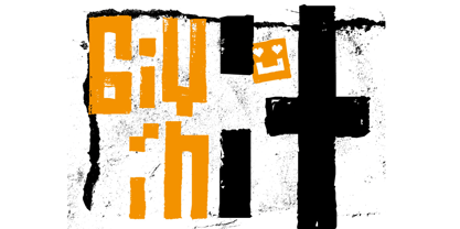
It’s your turn … for example everywhere where it makes sense. Maybe for use in magazines, posters, headlines and advertisement, plus as webfont for decorative headlines.
Technical Specifications
■ Font Name: Raw Street Wall
■ Font Weights: Regular + DEMO (with reduced glyph-set)
■ Font Category: Display for headline size
■ Font Format: .otf (OpenType Font for Mac + Win) + .ttf (TrueType Font)
■ Glyph Set: 567 glyphs
■ Language Support: 27: Afrikaans, Albanian, Catalan, Croatian, Czech, Danish, Dutch, English, Estonian, Finnish, French, German, Hungarian, Italian, Latvian, Lithuanian, Maltese, Norwegian, Polish, Portugese, Romanian, Slovak, Slovenian, Spanisch, Swedish, Turkish, Zulu
■ Specials: Extras like emoticons/icons, arrows, dingbats, symbols, geomatric shapes, catchwords and many alternative letters plus OpenType-Features.
■ Design Date: 2011–2017
■ Type Designer: Manuel Viergutz
■ License: Desktop license, Web license, App license, eBook license, Server license
Raw Street Wall
About Volcano Type
Volcano Type is a independent font foundry based in Karlsruhe, Germany.
The first course: a fast food youthfulness that was served for the first time in 1996. An earthy dish, created by chance, with thirteen organic fonts. Quickly whisked up and devoured. It rarely took more than a few days from sketch to use/digestion by the project. Uncouth forms, erupted from the bowels of the earth. Shattered letters, branded, stressed, humiliated. In order to produce arrogant fonts, far too expressive to last on a page of copy text. Quite indisputably from nature. Still roughly hewn. Raw. Imperfect.
The second course formed a strong contrast: tight concept, linear work, disciplined preparation. In most cases the font was formed by a matrix. Digital cool, sober, reduced. Plenty of free scope, like chess: the board is always the same, the moves always different. Classic openings are followed by unfamiliar variants. Competitive games. Finely nuanced movements. Carefully thought out, one masterminded brainchild after another.
Dessert: mathematical severity is rounded off and smoothed down. Fonts between digital and analogue. Straightened rivers - the surfaces of our times.
Read more
Read less

