Discover legacy content from FontShop.com, preserved for your reference.
To Ligature or Not to Ligature
Jason Tselentis in Learning on June 30, 2016
Ligatures come in handy for functional uses or merely embellishment. But under what circumstances do you want To Ligature? When is it best Not to Ligature? And what’s the difference between a standard ligature and a discretionary ligature?
Some fonts and Web browsers enable standard ligatures by default, which can help address spacing issues. But in certain cases, you might not need them, and you’ll have to disable them yourself. Other fonts require you to turn ligatures on manually, such as the more decorative discretionary ligatures, using CSS. And to make matters more complicated, there’s one Web browser that’s a bit of a wild card when it comes to ligatures.
Ligatures, a Primer
The word ligature has roots in Latin, from ligatura and the verb ligare, meaning bind or tie. Typographically, that’s what a ligature does: it binds two or more characters into one. Ligatures have been a part of the typographer’s toolbox since the days of Johann Gutenberg.
Standard ligatures, also known as common ligatures, are more functional than anything else, and they typically include the letter f, such as fi, fl, ff, ffi, and ffl. Different languages will have different standard ligatures, as will different fonts, with OpenType fonts including a treasure trove of ligatures.
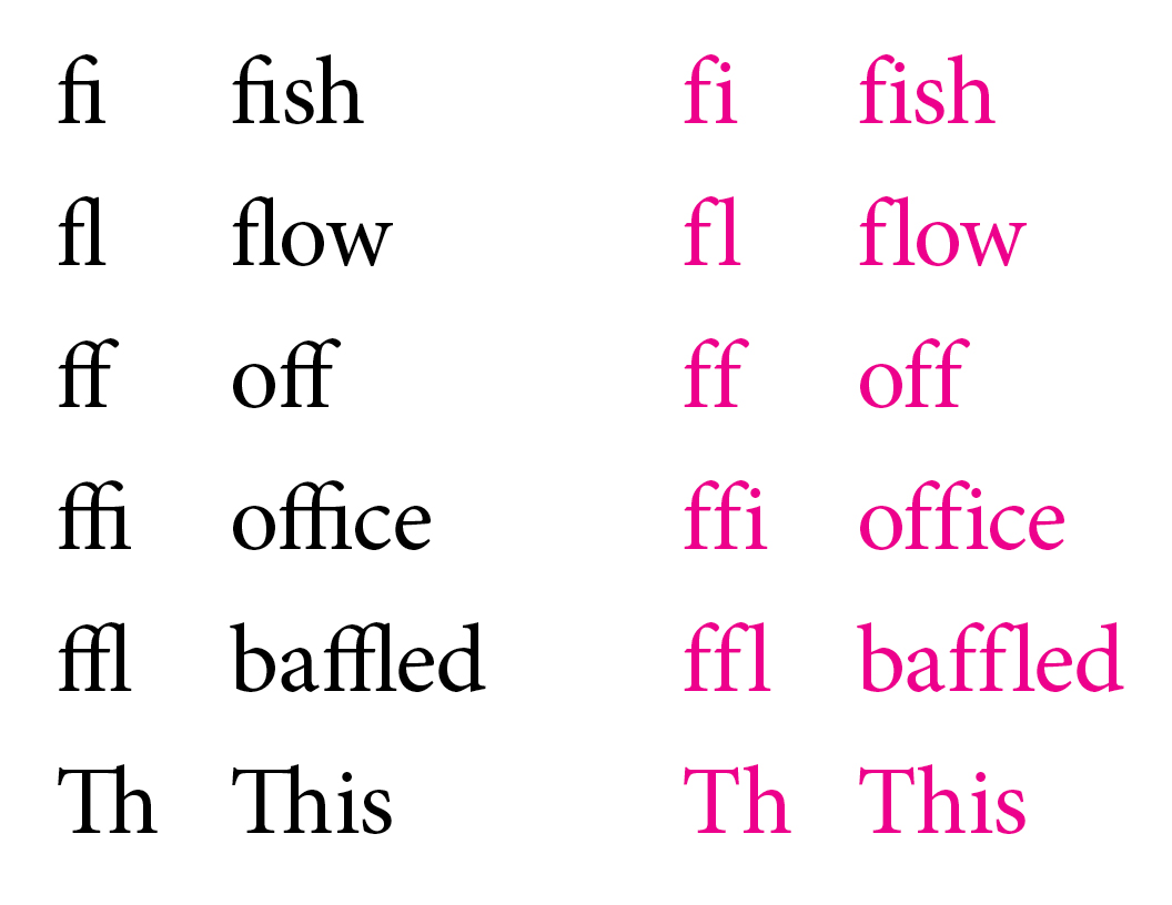
The Minion® Pro typeface shown with standard ligatures enabled (black, left), but they can also be disabled (right, magenta).
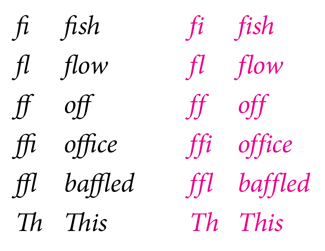
Standard ligatures also appear in the italic style. Discretionary ligatures are more decorative, which is why they’re sometimes called decorative ligatures. Their calligraphic appearance can make them feel ornamental.
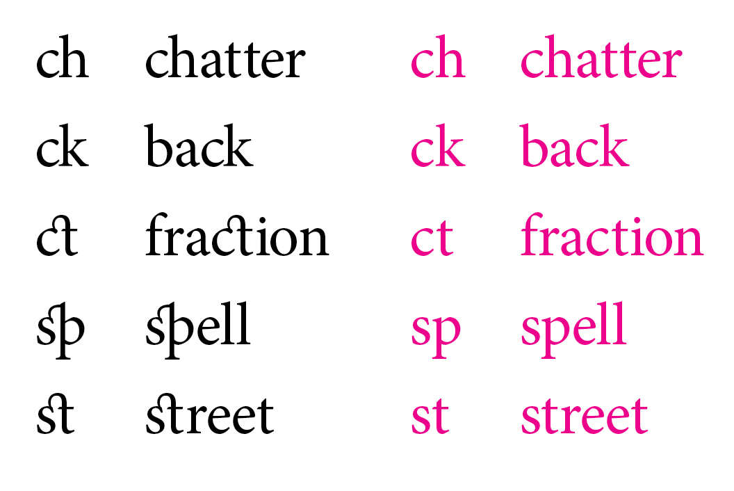
Discretionary ligatures enabled (left, black) and turned off (right, magenta) in Minion Pro. Note the subtle difference in how the ch and ck—common to the German language—are kerned in the black ligatures compared to the magenta characters.
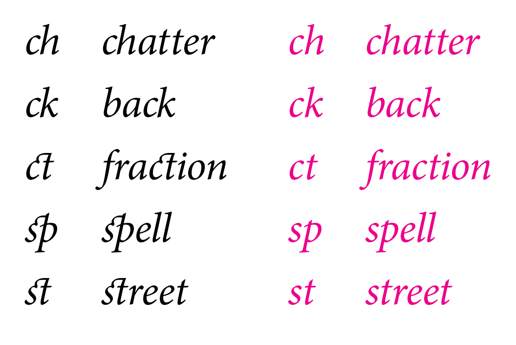
Minion Pro’s discretionary ligatures set in italic (left, black) and turned off (right, magenta).
Standard Ligatures on the Web
Standard ligatures are sometimes automatically enabled in a font. Contemporary Web browsers support standard ligatures, and Apple’s Safari® browser on both Mac OS X and iOS will enable them by default.
Because each browser handles typography differently, testing across browsers is especially important, and in certain cases, you might need to manually enable standard ligatures using the CSS font-feature-settings.
font-feature-settings: "liga", "clig";
-moz-font-feature-settings: "liga", "clig";
-ms-font-feature-settings: "liga", "clig";
-o-font-feature-settings: "liga", "clig";
-webkit-font-feature-settings: "liga", "clig";
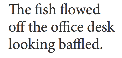
Above, Minion Pro in the Mozilla Firefox® Web browser with its standard ligatures automatically enabled.
For some Web browsers, you might need to use the font-variant-ligatures property in addition to or in place of the above font-feature-settings property, adding browser specific mark-up such as moz or webkit.
font-variant-ligatures: normal;
font-variant-ligatures: common-ligatures;
Because ligatures have their own spacing, if you have typography that might require more or less letter spacing, consider turning off ligatures using CSS with font-feature-settings.
font-feature-settings: "liga" 0, "clig" 0;

-moz-font-feature-settings: "liga" 0, "clig" 0;

-ms-font-feature-settings: "liga" 0, "clig" 0;

-o-font-feature-settings: "liga" 0, "clig" 0;

-webkit-font-feature-settings: "liga" 0, "clig" 0;

Minion Pro shown with standard ligatures automatically enabled (left, black), but additional CSS will disable them (right, magenta).
In the next two illustrations, we’ve added letter spacing, also known as tracking, in order to demonstrate how spacing changes with and without ligatures. Adding letter spacing to lowercase was something that Frederic Goudy frowned upon. But if you have a good reason to do it, and a discerning eye to make the judgment call, there are cases when increased letter spacing of lowercase characters works, and you will want ligatures off.

In the Firefox Web browser (left, black), standard ligatures are turned off automatically—and without adding the "liga" 0, "clig" 0 CSS—when you increase Minion Pro Bold’s letter spacing with letter-spacing: 0.04em added to the CSS. But in the Safari Web browser (right, gray), the ligatures remain on even with the letter spacing, making for an awkward and uneven appearance since the ligatures are still together.
To completely turn standard ligatures off in Safari will require an additional line of CSS.
-webkit-font-variant-ligatures: no-common-ligatures;

Set in Minion Pro Bold and with ligatures enabled (left), the black heading has a narrower width on the bottom. And formally, things appear crammed. But turning off ligatures (right, magenta) and adding letter-spacing: 0.01em to the CSS, gives us some air in between the letters while also removing the extraneous negative space.
Discretionary Ligatures on the Web
Discretionary ligatures typically need to be turned on using CSS. They can add fun and flair to your headings and pull quotes, if the font includes discretionary ligatures and if you have letters and words that will enable them.
font-feature-settings: "dlig";

-moz-font-feature-settings: "dlig";

-ms-font-feature-settings: "dlig";

-o-font-feature-settings: "dlig";
font-variant-ligatures: discretionary-ligatures;

Discretionary ligatures enabled (left, black) using CSS, and Minion Pro without them (right, magenta).
The best piece of advice to follow with discretionary ligatures is Use discretion. Stylistically they’re fun, and in some cases flamboyant, but don’t go overboard, because too many discretionary ligatures comes across as over the top, especially in lengthy amounts of text.
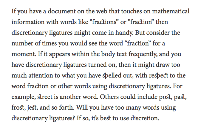
Sometimes, too much of a good thing can go bad. In this example of running text, too many discretionary ligatures looks overdone, and the layout goes overboard.
Will discretionary ligatures be right for your Web typography? It’s up to the designer, and it’s also up to the user. Consider how usability testing can help you decide whether discretionary ligatures work for you or against you. Then again, it may be a matter of taste—as in how users respond to them—and testing may tell you that users don’t like them. However, there are situations where discretionary ligatures work in your favor, standing out and getting attention, such as in a headline or pull quote.
But there’s a catch. As you test discretionary ligatures across browsers, and you notice that Safari isn’t rendering discretionary ligatures, know that it’s not you and it’s not the CSS. It’s Safari. As of this writing, Apple’s Safari Web browser does not support discretionary ligatures through CSS, just as it does not support swashes or alternate characters.

The Magneta™ typeface by Neil Summerour has a wealth of ligatures, including uppercase discretionary ligatures, enabled with CSS and shown in black at left. Although unconventional, it certainly makes a statement.

Unfortunately, even with the added CSS, Safari won’t render Magneta’s discretionary ligatures.
Each font will have its own discretionary ligature repertoire. Some will have a wide range of lowercase options. And, in some cases, you’ll find a font with uppercase discretionary ligatures like Magneta. But there is hope for discretionary ligatures in Safari. Some fonts, such as the Bello™ Pro typeface, have discretionary ligatures enabled automatically, as part of the standard character set.

Bello Pro has automatic ligatures, without needing CSS to activate them. Notice the ct and st.

But turning on discretionary ligatures with CSS gives you some additional treats, as shown in Firefox.

Unfortunately, Safari will not recognize the enabled discretionary ligatures, and in this case, we miss of and the that the discretionary ligatures ("dlig") CSS gave us. But since Bello Pro has discretionary ligatures already, as part of its standard characters, we still get the ct and st ligatures.
In the case of Bello Pro and its automatically enabled ligatures such as ct and st, you may not want them, and you can turn them off yourself using CSS.
font-feature-settings: "liga" 0, "clig" 0;

-moz-font-feature-settings: "liga" 0, "clig" 0;

-ms-font-feature-settings: "liga" 0, "clig" 0;

-o-font-feature-settings: "liga" 0, "clig" 0;

-webkit-font-feature-settings: "liga" 0, "clig" 0;
font-variant-ligatures: no-discretionary-ligatures;

Above, Bello Pro with ligatures turned off, as shown in Firefox.
Application and Testing
Functionally, you may not want to use standard ligatures when setting larger headings, in bold or heavy weights that require more or less letter spacing, and you can disable the ligatures. And stylistically, discretionary ligatures can give your headings some garnishment, but don’t go overboard because when applied to running text, it makes your typography look belabored.
Because different browsers will handle your typography differently, be sure to test accordingly. Looking at your Web typography from one browser to the next helps you see how ligatures appear—or if they don’t appear. And consider whether or not your users will be accepting of ligatures, especially discretionary ligatures.
Type on the Web is about form and function, and ligatures are one of the many variables you can use to enhance your reader’s experience, and to make it engaging. Just know when and how To Ligature or Not to Ligature.