Discover legacy content from FontShop.com, preserved for your reference.
Punching Up Web Typography with Capital Letters
Jason Tselentis in Learning on September 21, 2016
When it comes to text messages and emails, we usually interpret all capital letters, known as all caps, as YELLING. But setting your headlines, leads, and short pull quotes in all caps can punch up your layouts, and get a hold of your readers. It adds another level of typographic hierarchy too. And there’s also the case of acronyms like NASA or abbreviations such as BC and AD, which necessitate all caps.
Laying out your site with Web typography, there are instances when you will want to or need to use uppercase, and it’s important to consider formal issues related to typeface choices, layout, and the overall look and feel. But when should you use all caps? What about small caps? And what exactly are petite caps?
Considering Caps
Plays, screenplays, and teleplays have employed all caps to show that a character is yelling, and many of us have used the convention in text-based communications such as chat rooms, email, text messages, and social media. When we want to make a loud, EMPHATIC statement, we type it in all caps.
Will all caps always come across as yelling and screaming in Web typography? Not necessarily. In fact, there are situations when your designs might require all caps, and it’ll be less about yelling and more about design. But it’s important to know how capital letters differ from small caps and petite caps, and how to use each effectively.
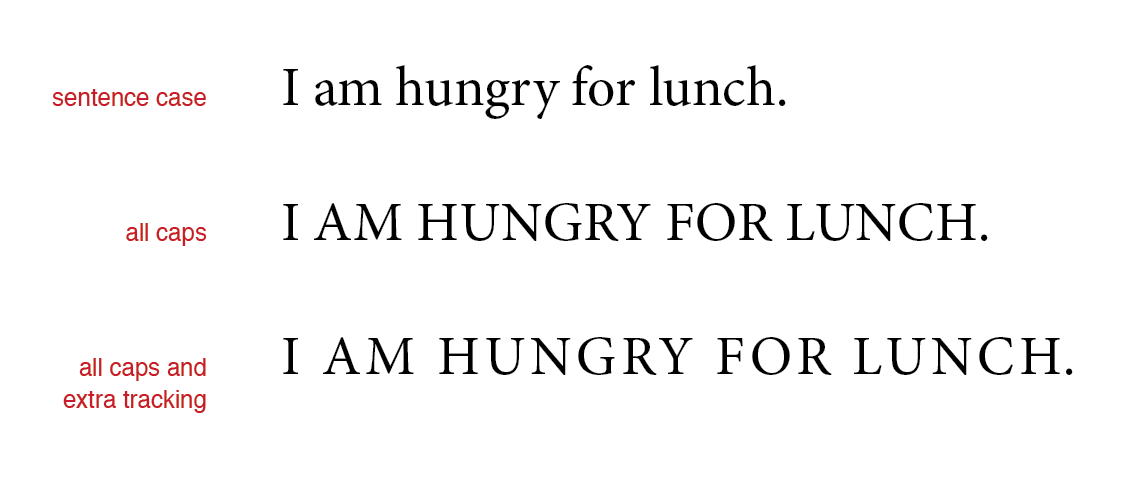
When setting uppercase, increase the tracking, also called letter spacing, to add some air between the letters.
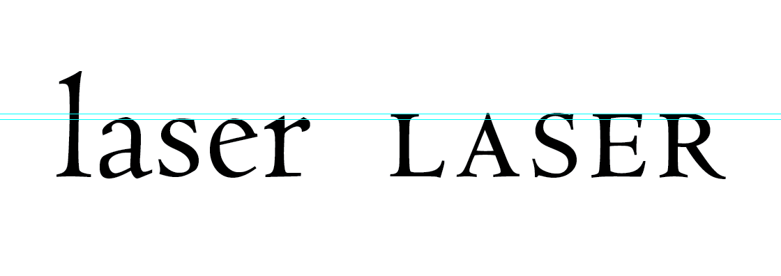
Know that small caps are not shrunken down uppercase characters. They are a completely different set of glyphs. In general, small caps have an x-height that is close to the x-height of lowercase letters. This is important, since small caps will ordinarily coexist with lowercase, as in the case of a small caps acronym like NASA, used in the paragraph below.

One misconception is that small caps have the same x-height as lowercase letters. Sometimes this is the case, but it’s not the standard. It depends on the font. The Monotype Centaur® typeface, used for the NASA example above and shown below in an x-height comparison, has small caps with a higher x-height compared to the lowercase.
The Linotype Didot® Small Caps typeface, on the other hand, has the same x-height as the Linotype Didot® typeface’s lowercase.

And then there are petite caps, so named because they have a lower x-height than small caps. Compare the P22 Underground™ Small Caps typeface (left) to P22 Underground Petite Caps (right).

The x-height relationship of the small caps, lowercase, and petite caps will vary from font to font. In the case of P22 Underground, lowercase has the lowest x-height, with it increasing from petite caps up to small caps. Uppercase appear at the far left.

Using and Choosing True Caps
You could create small caps and petite caps synthetically, by setting words in uppercase, and reducing the font size in your layout program for print design or your CSS for Web design, so they have approximately the same x-height as the lowercase. BUT THAT’S DOING IT WRONG. (If that came across as yelling, you interpreted it correctly, because faking small caps and petite caps is poor form.) It won’t give you the proper typographic color. It’s not the same as using a font with true small caps and true petite caps.
Setting faux small caps in Centaur, by typing NASA in uppercase and then reducing the type size, creates the size we want, but the color is too light compared to the rest of the typography. The example using true small caps, from the Centaur Small Caps & Old Style Figures font—set in the same size as the surrounding typography—renders an even typographic color.
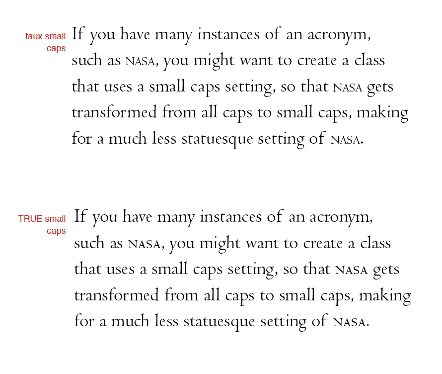
Instead of setting faux small caps or faux petite caps, find a font that includes true small caps and true petite caps, designed to function at their respective sizes, among the respective lowercase. For instance, Centaur comes in a range of styles and weights, and has true small caps, and they’re all available as Web fonts. And the P22 Underground typeface, also available for the Web, has a wealth of styles to choose from, including small caps and petite caps, in a range of weights.


ALL CAPS: Where AND Why?
When it comes to your layout, it’s important to consider things from a formal, and compositional perspective. How will the reader interact with the Web typography? How much space, or how little space, will it take up? What kind of statement do you want to make?
The ongoing debate about all caps versus sentence case, also called mixed case, considers how readability and legibility, and reading norms factor into the experience. In the two paragraphs below set in the Georgia® typeface, notice how much more space all caps takes up. All caps looks crammed, lengthy, and even obnoxious. For this amount of body copy, all uppercase is all wrong.
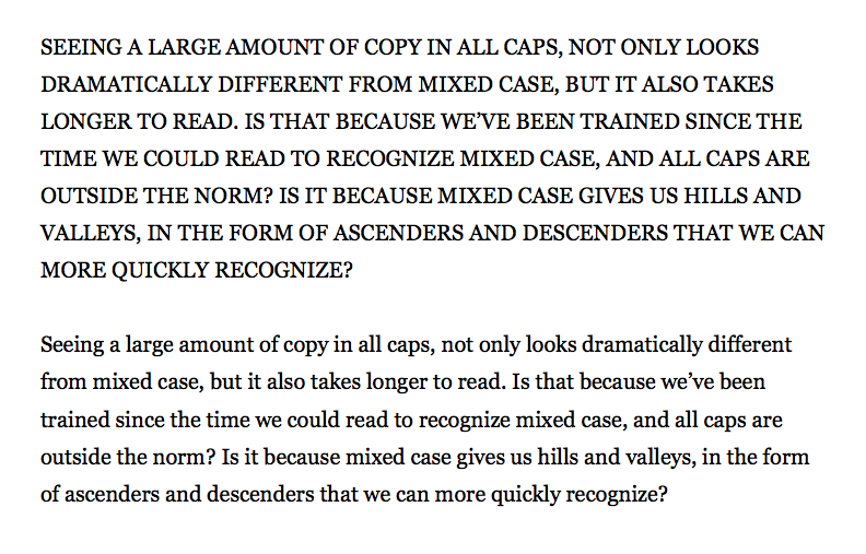
Large amounts of text set in all caps can cause trouble for the reader. But sometimes you want to say more with more. Headlines or short lines of text set in uppercase can convey excitement and importance.
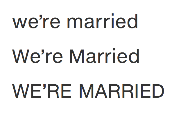
If you want to make a statement, and show everyone that you’re elated, all caps might do the job best.
Uppercase on the Web
You can use Web fonts that have uppercase, small caps, and petite caps, and you can also use CSS to transform anything typed in lowercase into uppercase using text-transform as shown in the heading below.
h1 {font-family: Helvetica, sans-serif; font-size:2em; text-transform:uppercase; letter-spacing:0.1em;}

p {font-family: Georgia, serif; font-size: 1.2em; line-height:1.8em;}
<h1>Sizing Your Web Typography</h1>
<p>Seeing a large amount of copy in all caps, not only looks dramatically different from mixed case, but it also takes longer to read. Is that because we’ve been trained since the time we could read to recognize mixed case, and all caps are outside the norm? Is it because mixed case gives us hills and valleys, in the form of ascenders and descenders that we can more quickly recognize?</p>
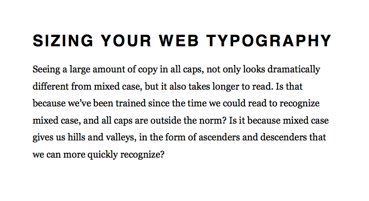
An all caps heading sets a rectangular line of type, without any ascenders or descenders creeping towards nearby elements. It looks cleaner, and hierarchically it can set the heading apart using size, weight, and case.
You can also use a large heading set in title case that leads into an all caps first-line of your paragraph, and then sentence case for the rest of the paragraph, to create three levels of hierarchy. Apply the first-line pseudo-element to a paragraph’s CSS to automatically set the first line in uppercase. But keep in mind that not every browser will support the first-line and uppercase transformation, so test it across browsers before deployment.
h1 {font-family: Helvetica, sans-serif; font-size:2em; text-transform:uppercase; letter-spacing:0.1em;}
p {font-family: Georgia, serif; font-size: 1.2em; line-height:1.8em;}
p::first-line {text-transform: uppercase; letter-spacing:0.05em;}
<h1>Sizing Your Web Typography</h1>
<p>Seeing a large amount of copy in all caps, not only looks dramatically different from mixed case, but it also takes longer to read. Is that because we’ve been trained since the time we could read to recognize mixed case, and all caps are outside the norm? Is it because mixed case gives us hills and valleys, in the form of ascenders and descenders that we can more quickly recognize?</p>
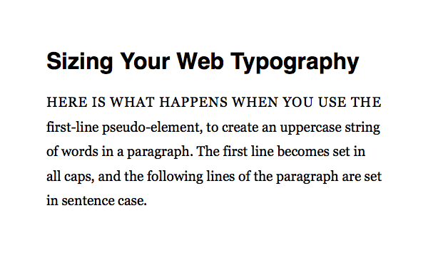
If an all caps first sentence isn’t punchy enough, you could create an all caps lead paragraph, like the one set below in the Premiéra typeface that has a large to medium to small hierarchy in the layout. The text-transform property makes the lead paragraph’s font entirely uppercase.
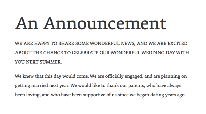
The uppercase lead paragraph’s font size gets enlarged in the example below, giving us more contrast between the lead and subsequent paragraph.
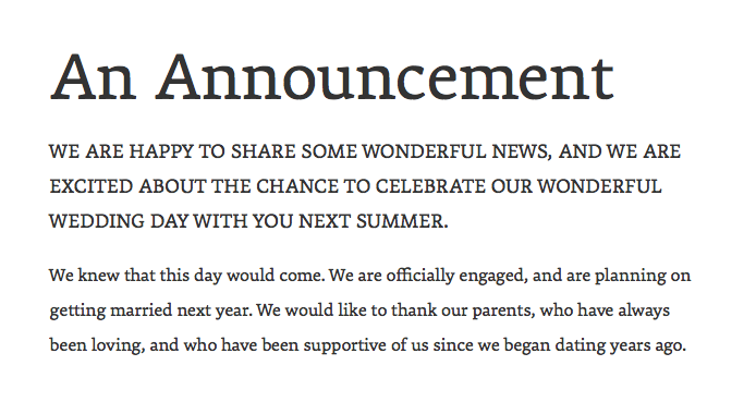
But this setting comes across as almost too big.
Contemplating Small Caps
All uppercase had the right amount of punch for the first line of a paragraph. And setting a lead in all caps, with a font like Premiéra, gave us typographic unity across the layout. The only problem was that setting the lead in a larger size came across as too emphatic, too large. What if you want a lead with a slightly larger font size that’s set in all caps, and with more contrast? We need something that will give us more with less.
Consider using small caps, which you can do through CSS with the Premiéra typeface. Unfortunately, Apple’s Safari® browser does not recognize small caps (smcp) as of this writing. Examples shown below are from the Mozilla Firefox® web browser, unless noted otherwise.
-webkit-font-feature-settings: "smcp";

-o-font-feature-settings: "smcp";

-moz-font-feature-settings: "smcp";

-ms-font-feature-settings: "smcp";

font-feature-settings: "smcp";
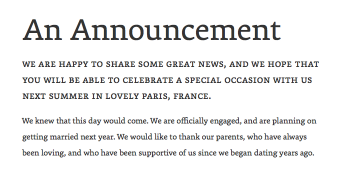
This layout set in Premiéra for the headline, lead, and running text, uses small caps (smcp) for the lead, but it comes across as too small.
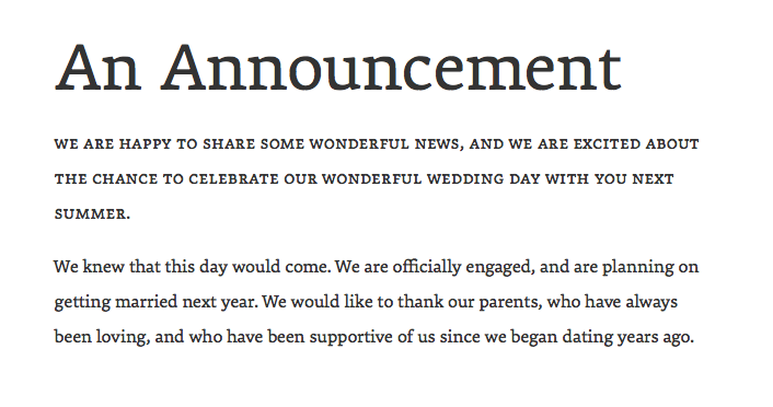
We’re going to increase the lead paragraph’s font size in the next example to give us a slightly larger lead with noticeable contrast in weight between it and the next paragraph.
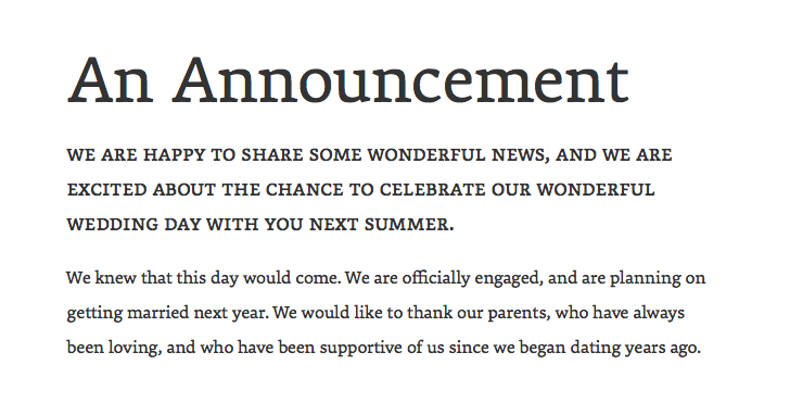
We now have just the right amount of differentiation. In the next version, we’ve added letter-spacing: 0.02em to the small caps lead, which opens it up to more closely meet the next paragraph’s width, creating more harmony between the two measures.
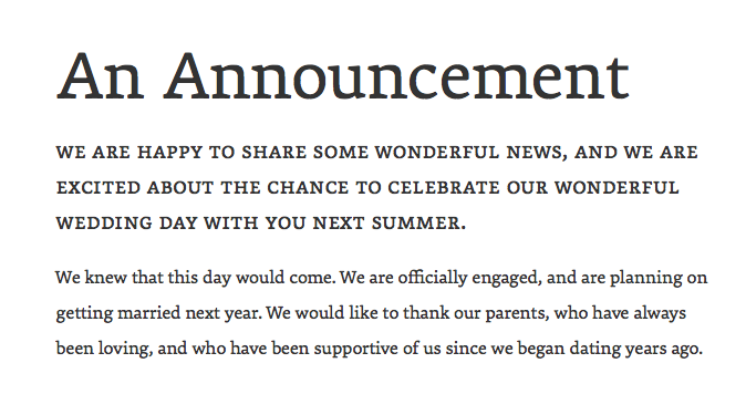
One last detail to consider: word length. Some of the words in the lead are long, making for a challenging read when set in caps. But by adjusting the copy with shorter words, we’re able to stay within the measure, and get the effect we want.
Peppering a Layout with Small Caps
We saw how to pump up the volume in a lead using small caps sized larger. But small caps are especially useful if you have acronyms and abbreviations frequently appearing in your running text. Compare the two examples below, in the Premiéra typeface, where NASA appears sporadically. Premiéra’s small caps blend in naturally with the top paragraph’s running text. In the other example, the uppercase NASA stands out, almost too much.
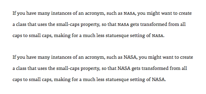
You can use the small caps (smcp) font-feature-setting to make nasa (not NASA) appear in small caps, provided your Web font has small caps, and the browser supports small caps.
-webkit-font-feature-settings: "smcp";

-o-font-feature-settings: "smcp";

-moz-font-feature-settings: "smcp";

-ms-font-feature-settings: "smcp";

font-feature-settings: "smcp";
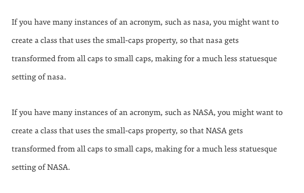
As noted earlier, Apple’s Safari browser does not support small caps (smcp) in CSS. Notice how the small caps we applied in the topmost paragraph appear in lowercase in Safari, shown below. But the uppercase NASA in the second paragraph renders properly.
Fortunately, there’s a fix for this problem. Use the capitals to small caps (c2sc) feature. This comes in handy whether your Web typography is viewed in Safari, Firefox, or another browser.
-webkit-font-feature-settings: "c2sc";

-o-font-feature-settings: "c2sc";

-moz-font-feature-settings: "c2sc";

-ms-font-feature-settings: "c2sc";

font-feature-settings: "c2sc";
On browsers that support c2sc, and with a Web font like Premiéra that has small caps, you get NASA set in small caps, as seen in Firefox.

But in Safari, shown below, which doesn’t recognize c2sc, NASA won’t set in small caps, so it falls back to NASA in uppercase. This is a lot better than having it appear repeatedly, and incorrectly, as nasa in lowercase when using smcp.

When it comes to defining styles for abbreviations and acronyms in small caps, it would be ideal to style them with a relatable HTML element. At one time, there was an <acronym> element, which would have been semantically appropriate for NASA, but <acronym> has been depreciated and is not used in HTML5 as of this writing. Using the HTML <abbr> element for both abbreviations and acronyms is best practice.
abbr {-webkit-font-feature-settings: "c2sc";

-o-font-feature-settings: "c2sc";

-moz-font-feature-settings: "c2sc";

-ms-font-feature-settings: "c2sc";

font-feature-settings: "c2sc";}
<abbr title="air conditioning">AC</abbr>
<abbr title="application program interface">API</abbr>
<abbr title="business to business">B2B</abbr>
<abbr title="business to consumer">B2C</abbr>
<abbr title="initial public offering">IPO</abbr>
<abbr title="National Aeronautics and Space Administration">NASA</abbr>
Some browsers may automatically style <abbr> in small caps. And some browsers will add a line or dotted line beneath the <abbr> element, and this can be disabled by adding text-decoration: none or border-bottom-width: 0 to its CSS. But there’s something to keep in mind: when visible, the underline is helpful, because it acts as a cue for readers since certain browsers will display the <abbr> element’s title when hovering over the element. For instance, hovering over NASA would show you National Aeronautics and Space Administration. And yet, if you have a lot of instances of an abbreviation or acronym, seeing it underlined throughout the layout can be distracting, so consider styling it in a less-noticeable underline.
Capping It Off
Despite the fact that we equate all caps with YELLING, there are instances when all caps will come in handy for Web typography. Using small caps for frequently appearing abbreviations and acronyms is a nice detail. And setting headlines in all caps will get your reader’s attention, punching up your layout. Lead paragraphs and short pull quotes work well in all caps too.
Uppercase works best when the entire layout is taken into consideration, along with word length, line length, and paragraph length. Ultimately, use uppercase sparingly. Nobody wants to be punch-drunk from uppercut after uppercut of uppercase.