Discover legacy content from FontShop.com, preserved for your reference.
Paragraph Spacing
Jason Tselentis in Learning on January 25, 2017
As a web designer, do you take paragraphs for granted? Putting in little to no effort designing them? Using whatever built-in paragraph <p> format your content management system provides? Relying on the defaults of your WYSIWYG web editor? Worse yet, doing next to nothing and hoping the browser takes care of it for you? If you answered Yes to any of the above questions, then it’s time to take a closer look at paragraph spacing.
Putting the Fun in Paragraph Fundamentals
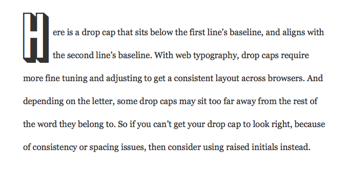
Past posts in Web Typography Essentials looked at customizing initial caps in parts one, two, and three of the series.
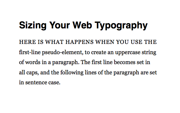
Another post explored setting the first line or lines of your paragraph in uppercase.
While those posts showed you how to add flair to your paragraphs, this one covers the structural foundations. Leading, margins, and indents factor into building and spacing paragraphs. Paragraph layout is important when it comes to engaging readers, giving them an inviting and pleasurable online reading experience. Moreover, once you understand paragraph fundamentals, it makes challenges like initial letters even more rewarding during the design phase.
Setting Leading & Margins
If the paragraph leading or line spacing—known as line-height in CSS—is too close it makes for a less than welcoming layout. The text looks dense and as a result, overwhelming. Default paragraph settings, whether composed using HTML, a content-management system, or a web editor, can make for crammed leading.

The biggest problem in the example above? The line-height. Because it wasn’t specified in the CSS, the browser uses its default setting and the vertical space between each line of text appears too close. In the revision below, a font-size:1.6em with a line-height:2.2em opens things up, adding more air.

Although the two paragraphs are clearly separated in the revised example above, the gap between them isn’t as noticeable as it could be. As in print layout programs, you can add space between paragraphs using margin-bottom or margin-top in your CSS, used below in the paragraph element.
font-size:1.6em; line-height:2.2em; margin-bottom:2.2em;

Compare the difference between the one without extra space (below, left) to the one with the added margin-bottom between paragraphs (below, right). Each paragraph on the right now stands on its own more noticeably.
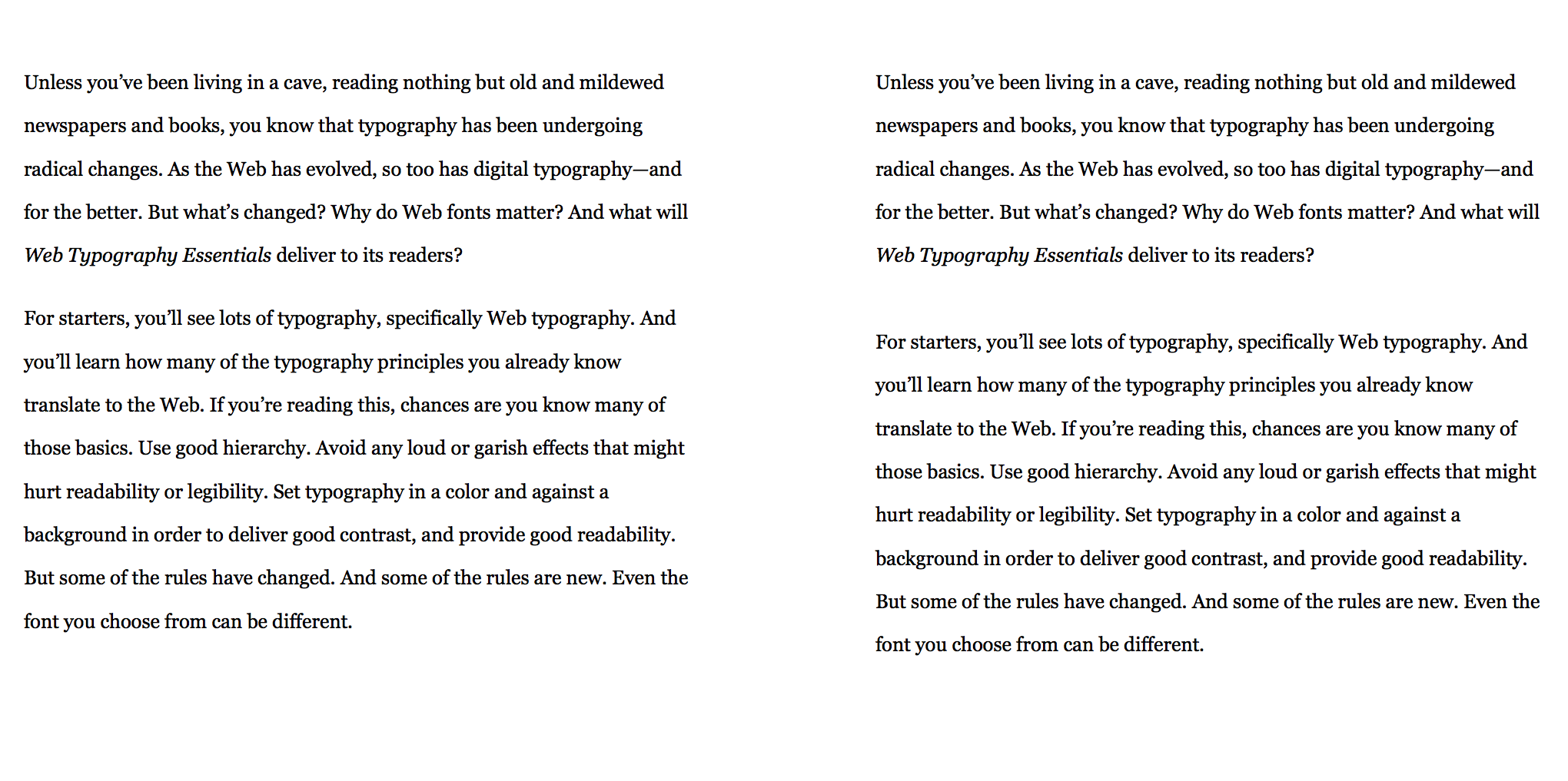
In the examples above, the Georgia® typeface, with its high x-height, works with the established line-height. But switching it up and using the Minion® Pro typeface with the same font-size and line-height gives different results. In the examples below, compare Georgia on the left with Minion Pro on the right.
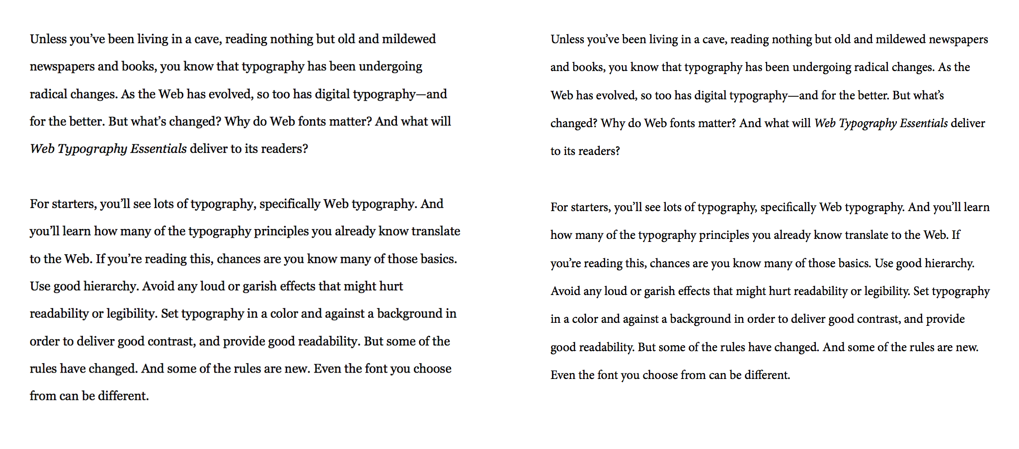
The differences are subtle, but the copy set in the Minion typeface feels smaller and as a result, the same line-height used for the leading makes the layout feel airier. This could be a case for tightening Minion’s line-height to condense the spacing. Or you could leave it as it is, making the paragraph lines feel open.
For another example, consider the Perpetua® typeface, set in the same font-size and line-height as prior examples. Despite the very same sizing system as Georgia and Minion do, Perpetua’s layout on the far right looks different. Even with the same line-height, copy set in the Perpetua typefaces feels even airier, with more negative space between each line.

Despite the open line-height, if Perpetua is used, it’s harder to read at this font-size and should probably be set larger with its line-height adjusted accordingly.
Whether it’s font-size or line-height, or even paragraph margins, one size does not fit all fonts. Different fonts yield different results. Some fonts will appear to have more leading, while others will appear tightly set. Although the rule of setting your line-height at 120% of your type size has been common practice, conduct testing with each typeface you use across various devices and browsers—as well as different screen sizes—before settling on a typographic sizing system.
Defining Paragraphs with Indents
Clearly separated paragraphs help the user scan, read, and review content. When they finish reading one paragraph, they should be able to find the next one and move on. Spaces between paragraphs are one way to create those cues.

But there is another option that many readers are accustomed to having seen it used in print design, especially book design: text indents. Word processing programs use tabs to create these indents, and in CSS, you use text-indent.

Indents are advantageous when setting large amounts of content, with the reader scrolling to move through the text. Customarily, the initial paragraph does not need an indent, and it’s that first paragraph where you can incorporate monumental typography such as initial letters.
You can have a separate class for your indented paragraphs, allowing the initial and non-indented paragraph to not be set in that indented class.
p {font-family:Georgia, Times, serif; font-size:1.6em; line-height:2.2em; margin:0;}
.indented {text-indent: 3em;}
<p>No indent would appear in this one.</p>
<p class="indented">This paragraph would be indented.</p>
Or you can use a pseudo-class to have more efficient HTML that’s free of using class="indented" throughout the backend. The :first-child CSS pseudo-class makes the first paragraph not have an indent, with subsequent paragraphs all indenting.
p {font-family:Georgia, Times, "Times New Roman", serif; font-size:1.6em; line-height:2.2em; margin:0; text-indent: 3em;}
p:first-child {text-indent:0;}
<p>No indent would appear in this one because it is the first-child.</p>
<p>This paragraph would be indented.</p>

The paragraph margin shown in the CSS above, and set to 0, tightens the paragraphs together, making for a book-like layout that readers will recognize from print design. It’s also conscious of space, making a web layout shallower, with less scrolling needed.
Having tight paragraphs mattered when less space meant less paper, costing less money. But that line of thinking doesn’t necessarily apply when it comes to web typography. You can add a subtle amount of space to add more breathing room between the paragraphs, with the indents used as well. The example below changes margin:0 to margin-bottom:1em.

Compare the two below.
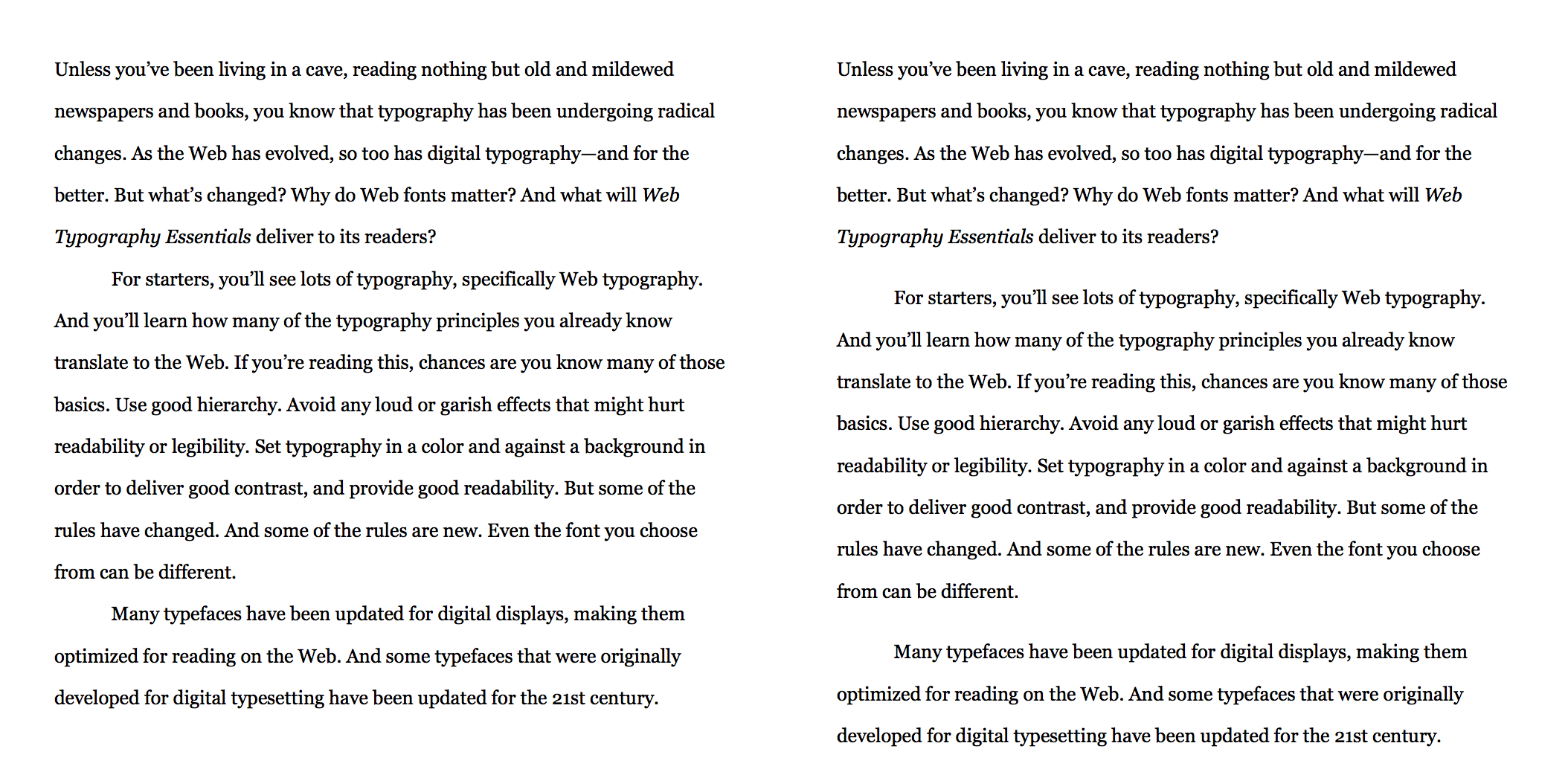
On the other end of the indent spectrum, you have outdents. Although unconventional, outdents—sometimes called exdents or hanging indents—also delineate paragraphs. In CSS a negative text-indent creates the effect, with text-indent:-2em used in the example below.

Spacing It Out Right
Build your paragraphs from the ground up using leading and margins, to chunk text content into bite-sized, inviting packages. And don’t be afraid to use indents since readers are used to seeing them in print, making for a book-like layout on the Web. Outdents are an unusual way of defining paragraphs, but they can make for a unique and memorable composition, provided it works for your design identity, as well as for your readers.
Line, margin, and indent spacing are paragraph building blocks. Use those spacing elements to invite the reader in so they engage with the content. The right spacing can mean the difference between keeping readers or losing them, and the last thing you want is to have your readers spacing out, going elsewhere.