Customizing Type Software Settings
There are many seemingly small, yet highly significant details that contribute to creating professional-looking typography, and in turn, good design. A number of these can be controlled with the settings of your software. Today’s design software contains some very robust typesetting features, but the default settings might not be set for the best result, or the project’s requirements. Personalizing these options can automate some of the important attributes of your typography, making your work faster and easier.
The settings you choose should be based on a combination of the best practices of typographic communication, your client’s requirements, your personal taste, and the needs of the specific project at hand. The following are a few of the most important settings that contribute to the best typography:
Hyphenation: Most default hyphenation settings allow two-letter hyphenation of words, and three or more hyphenated lines in a row. For better readability, change the settings to three letters before and after a hyphen, and a limit of two hyphens in a row. If you (or your client) prefer no hyphenation, this can also be made the default.

Figures: OpenType® fonts can contain a range of numerals styles – oldstyle and lining figures in both tabular and proportional spacing. But even when these are available in a font, the default in most software is most commonly tabular lining figures. Since this figure style should only be used for columns of numbers, it makes sense to change the default to proportional oldstyle or lining figures. This can easily be changed back if a project calls for tabular figures.

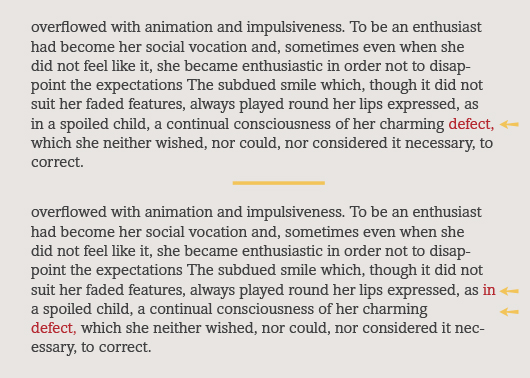
Line break and rag control: Some of the most commonly used design software has a default feature that attempts to optimize line breaks and hyphenations in a paragraph, rather than line-by-line basis. It can work well for justified settings, but when making manual line breaks with this setting turned on, other lines in the paragraph often rebreak and/or reflow based on the software’s algorithm, which can be very frustrating and result in an optically uneven rag.
For this reason, if you use manual line breaks to fine-tune the rags, set the default so that lines break on a line-by-line basis, not the entire paragraph. Composing the text line-by-line leaves you completely in charge of line breaks and prevents the application from doing the “thinking” for you.

Hung Punctuation and Optical Margin Alignment: Most design software has a sophisticated yet underused feature that controls the margin alignment, similar to what was referred to as hung punctuation in the pre-digital days. This function finesses the alignment of flush text by pulling punctuation as well as some characters such as T, Y and A into the margin to create a more visually uniform vertical alignment. This helpful feature, however, is not usually turned on in the preset default, so it is wise to change this setting to be activated by default. Once turned on, you can customize the default overhang setting to your liking.

All trademarks are the property of their respective owners. Additional information regarding Monotype’s trademarks is available at monotype.com/legal. Fontology is a trademark of Monotype Imaging and may be registered in certain jurisdictions.

- Editor’s Note:Ilene Strizver, founder of The Type Studio, is a typographic consultant, designer and writer specializing in all aspects of typographic communication. She conducts Gourmet Typography workshops internationally. Read more about typography in her latest literary effort, Type Rules! The designer's guide to professional typography, 4th edition, published by Wiley & Sons, Inc. This article was commissioned and approved by Monotype Imaging Inc.