Typesetting Mysteries, Part Two: Jumpy Line Spacing and Quirky Letterspacing
by Ilene Strizver
Three more typesetting tribulations are “demystified” in this second installment of our ongoing periodic series. We will continue to explain the inexplicable, clarify the confusing, and shed light on some baffling behaviors of digital typesetting.
Jumpy line spacing within a paragraph
Have you ever inserted a special character from a different font in a paragraph, such as a sign, symbol, dingbat, or webding, and then decided to change its point size, and the leading (line spacing) between that line and the one above changed as well? You are not alone! This is the result of using auto-leading in the main text. The default leading setting calculates leading using a ratio of 120% of the type point size.
For example: If your text is 12 point, the auto leading setting is 14.4. If you change any character within the paragraph to a larger size, the leading on that line will increase as well. Inserting a 14 point character will change the leading of that line to 16.8, creating an unwanted jump in your line-spacing.
The easiest fix is to convert the overall leading setting to a fixed value (even if it is 14.4), which will remain the same no matter how large you make a given character in the paragraph. (Read more about Auto Leading.)
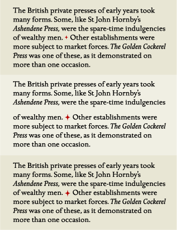
Middle: When the ornament is enlarged to 25 point, the auto leading for that line changes to 30 point, creating an unexpected "jump" in that line only.
Lower: When the leading for the entire text is converted to a fixed leading of 18 point, the line spacing stays consistent even though the ornament is still 25 point.
Jumpy line spacing at the end of a paragraph
Have you been driven crazy by the occasional rogue line at the end of a paragraph that has different line spacing than the rest of the paragraph? Here’s the scoop: this can happen when you change the leading or point size (when using auto-leading) of a paragraph, but neglect to include the invisible end-of-paragraph sign, called a pilcrow, which also carries formatting information.
The fix is to be sure you highlight this sign, which is usually one extra ‘space’ after the last printed character in the paragraph, when selecting text to change formatting. TIP: You can avoid some (but not all) of these instances by turning on Apply Leading to Entire Paragraphs located in Preferences > Type.
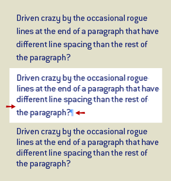
Middle: The text is highlighted to change formatting to 20/22, but because the invisible pilcrow is not included, the last line might not change.
Lower: Remember to include this invisible symbol at the end of the paragraph to ensure all text will be included in the reformatting.
Quirky kerning or tracking
Does the spacing or kerning of a headline or text occasionally look “off” to you, or to your teacher, boss or client? It looks too open or too tight, but you have no idea why? This may be caused by copying and pasting text that includes manual kerning or tracking changes, and then changing the font or point size and forgetting about your previous formatting.
While there is no easy way to search for these occurrences except with a discerning eye, the fix is simple. For tracking, highlight the text and return the tracking either to 0 or to your desired value. For kerning, highlight the text and return the setting to either metrics or optical, whichever is your desired setting. (Read more about Kerning in InDesign and Quark.)
* * * *
For revelations about mystery line break changes and missing fonts, check out Part One.
Middle: The next text box automatically holds on to the preceding +200 tracking formatting, even when not desired.
Lower: Make sure to clear any manual styling that is not desired, such as kerning, tracking, and word spacing.

- Editor’s Note:Ilene Strizver, founder of The Type Studio, is a typographic consultant, designer and writer specializing in all aspects of typographic communication. She conducts Gourmet Typography workshops internationally. Read more about typography in her latest literary effort, Type Rules! The designer's guide to professional typography, 4th edition, published by Wiley & Sons, Inc. This article was commissioned and approved by Monotype Imaging Inc.