Change those defaults!
by Ilene Strizver
Today’s design software not only makes it possible for you to set type well, it’s sophisticated enough to make many typographic decisions for you. Unfortunately, you might not always agree with those decisions!
The good news is you can change the way your software “thinks” by changing its default settings. Customizing the defaults to suit the way you work can save time as well as lead to a more professional result.
How to change defaults
InDesign
Make sure all documents are closed. Launch InDesign, then change settings and options as desired. The next step is important: quit InDesign to commit the new settings to memory. Then relaunch the application. Your new defaults will apply to all new documents you create.
QuarkXPress
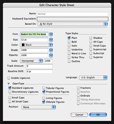
Text attributes in a new QuarkXPress document are defined by the Normal Paragraph Style Sheet, found under the Edit menu. To change defaults, make sure all documents are closed, then open the Paragraph Style Sheet and edit from there. You can change defaults for most text attributes by going to Edit Character Style, under the General menu.


What to change
There are many text attributes whose defaults can be changed. Here are just a few that can have a broad impact on your overall type and design. Click the links to access full articles exploring each topic.
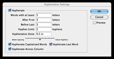
Hyphenation: Hyphenation is automatically turned on in both QuarkXPress and InDesign, but the default settings are too liberal for many typography purists. For better readability, change the settings to no fewer than three letters before and after a hyphen, and no more than two hyphenations in a row.
To find the Hyphenation Settings palette in InDesign, go to the Paragraph palette.
In QuarkXPress, access hyphenation under H&Js in the Edit menu (unlike most QuarkXPress defaults, hyphenation is not editable on the Style Sheet).
If you prefer to turn hyphenation off completely, you can deselect Hyphenation to change the default for new documents in either application.
Numerals: OpenType fonts can offer a range of numeral styles: old style and lining figures in both proportional and tabular spacing. Even when all four choices are available, the defaults of both your design application and OpenType font will usually be set to tabular lining figures.
Save time by using the OpenType palette of either QuarkXPress or InDesign to change the default to whichever numeral style you use the most. If you set a lot of text, the style and elegance of proportional old style figures usually looks and reads best.
Story: InDesign’s Story palette is located in the main menu under Type. This little-known palette controls a sophisticated feature called Optical Margin Alignment, which finesses the alignment of flush text. When Optical Margin Alignment is turned on, punctuation is “pulled” into the margin to create a more visually uniform alignment, as are serifs and the edges of certain overhanging characters, such as T, Y and A.
InDesign’s default setting is to have Optical Margin Alignment turned off; it’s best to change this before creating new documents (turning it on for an existing document can cause the text to reflow). Once this feature is activated, tweak the point size in the Optical Margin Alignment palette to get the results you want.
Paragraph Composer: InDesign includes a feature called Adobe Paragraph Composer that attempts to optimize line breaks and hyphenations by analyzing several lines at a time. It works well until you make manual edits; once you do, the application often reflows text in lines unrelated to your edits.
Adobe Paragraph Composer is turned on by default. If you use manual line breaks to fine-tune the rags (as I do), set the default to Single Line Composer instead, located off the Paragraph palette. This leaves you in charge and prevents the application from doing too much thinking for you.
Ligatures: Ligatures are turned on by default in InDesign, but not in QuarkXPress. To turn ligatures on in QuarkXPress, check the “Enable Ligatures” box in the Normal Character Style Sheet. Ligatures can be manually enabled for selected text by selecting the Ligatures checkbox in the Measurements palette.

- Editor’s Note:Ilene Strizver, founder of The Type Studio, is a typographic consultant, designer and writer specializing in all aspects of typographic communication. She conducts Gourmet Typography workshops internationally. Read more about typography in her latest literary effort, Type Rules! The designer's guide to professional typography, 4th edition, published by Wiley & Sons, Inc. This article was commissioned and approved by Monotype Imaging Inc.