Kerning in QuarkXPress and InDesign
by Ilene Strizver
Kerning (adjusting the space between characters, most commonly by placing two characters closer together) is often a necessary step to quality typography. But kerning is not always – or only – a hand-tweaked, letter-by-letter undertaking. There are powerful kerning tools built into the design applications you may already be using. Understanding these features will save time and improve the quality of your typesetting.

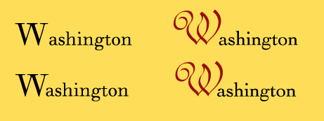
Right: The Optical kerning setting can also be used to automatically kern letter combinations set in different typefaces. Here, the W is in ITC Redonda; the rest of the word is set in Walbaum.
QuarkXPress® and Adobe® InDesign® both offer advanced type-handling features, including options to control and customize kerning. Here’s an overview to help you get the most out of these full-featured applications.
Adobe InDesign
Adobe InDesign offers three options for controlling kerning, all located in the Character Palette.
The Metrics setting uses a font’s built-in kerning pairs. If the font has adequate kern pair tables, this default setting is usually the best choice. (In Adobe Illustrator, the Metrics setting is called Auto.)
The Optical setting does not use a font’s built-in kern tables. Instead, it lets InDesign determine the spacing and kerning between all character pairs. This can be useful when a font has few or no built-in kern pairs, or when the overall spacing seems uneven. However, the real value of the Optical setting is that it automatically adjusts the fit when different fonts or type sizes are combined (see illustration).
The Character Palette has another useful kerning feature: if you highlight a character pair or chunk of copy and set the Character Palette kerning to 0, the selected text will be displayed without any of the built-in kern pairs.
Remember that no matter which of these settings you use, you can always add manual kerns “on top,” as needed.
QuarkXPress
There are several ways to control kerning in QuarkXPress.
Use Preferences/Character to control the point size at which built-in kern tables are turned on. It’s usually best to keep kern tables turned on for all sizes. Check the preference settings and reduce the minimum point size, if necessary. (Once the built-in kern pairs are turned on, you can still manually kern any character pairs you wish.)
The Kern/Edit feature (under Utilities) is an often-overlooked kerning option in QuarkXPress. It lets you customize a font’s built-in kern table for use in one or all of your QuarkXPress documents. This can be invaluable when setting large quantities of text.
When you change a value in Kern/Edit, the change will affect every instance of that character pair only within your QuarkXPress documents. It does not affect the actual font in your Fonts folder, or the font’s use in other applications.
Kerning Units
If you use both QuarkXPress and InDesign (or another Adobe design application), remember that these programs kern to different unit values. QuarkXPress kerns to 1/200 of a unit, while the default for InDesign is 1/1000 of a unit. This means that a kern value of -5 in QuarkXPress is equal to -25 in InDesign. You can make the transition back and forth simpler by changing InDesign’s default unit value to 20/1000 (equivalent to QuarkXPress’s 1/200) in Preferences/Units & Increments.
For more information on Kerning, see:
- FYTI – Spacing and Kerning Part 1
- FYTI – Spacing and Kerning Part 2

- Editor’s Note:Ilene Strizver, founder of The Type Studio, is a typographic consultant, designer and writer specializing in all aspects of typographic communication. She conducts Gourmet Typography workshops internationally. Read more about typography in her latest literary effort, Type Rules! The designer's guide to professional typography, 4th edition, published by Wiley & Sons, Inc. This article was commissioned and approved by Monotype Imaging Inc.