Optical Margin Alignment in InDesign
by Ilene Strizver
Setting professional-looking type is not always a black and white process, so to speak. There are many aesthetic considerations that contribute to excellence in typography. Hung punctuation is one of them.
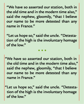
Hung punctuation refers to the practice of slightly extending lines of text that begin or end with punctuation marks into the margin, in order to improve the optical alignment of the column of text. Why is this necessary? In flush left or justified text, a line that begins with quotation marks or an apostrophe can appear to be indented. This is because these punctuation marks are smaller than most other characters, with large amounts of white space surrounding them. As a result, the margin looks uneven.

Top: Alignment of both the left and right margins is marred by the white space surrounding the quotation marks and the hyphen. Bottom: Alignment is improved when the offending punctuation is “hung” in the margin. Text is set in ITC Legacy Sans Pro and excerpted from A Tale of Two Cities, by Charles Dickens.
The same problem can happen on the right margin of flush right or justified text. Lines ending with quotation marks, apostrophes, periods, commas, hyphens, or asterisks will appear a tiny bit “short” to the eye; consequently, the right margin will not look perfectly aligned.
It’s not difficult to manually hang punctuation in headlines, subheads, and other large settings, but many designers don’t bother finessing text settings in this manner due to the impracticality of making dozens of manual adjustments. Some help is available from the top design applications. Here’s what you can and can’t do in three widely used programs.
InDesign
Adobe InDesign comes to the rescue with Optical Margin Alignment, a little-known but extremely powerful feature in the inexplicably named Story palette. When Optical Margin Alignment is activated, not only is punctuation “pulled” into the margin to create a more visually uniform alignment, but so are serifs and the edges of certain overhanging characters, such as T, Y and A.
To set Optical Margin Alignment in Adobe InDesign:
- Select the text box, or place the cursor within the text
- Under Type in the main menu, select Story
- Check Optical Margin Alignment
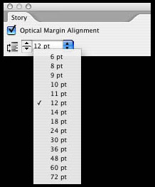
- Adjust the point size as necessary to get the results you want
Note that the point size determines how far into the margin characters will extend, but it doesn’t necessarily have to correspond to the point size of your text. Go by what looks good to you, not by the number, which may sometimes be considerably larger than the text size.
To choose this feature as the default for new documents, check Optical Margin Alignment when the InDesign application is open, but before you create a new document.
QuarkXPress & Microsoft Word
Unfortunately, QuarkXPress does not offer an automatic optical alignment feature at this time. Your best bet is to manually adjust the worst-offending lines, and leave the rest as is.
One easy way to manually hang left margin punctuation in QuarkXPress is to simply add a space before the punctuation mark, then reverse kern the character to the space until the desired alignment is achieved. You won't see the character that hangs outside of the text box on your screen, but it will print.

InDesign’s Optical Margin Alignment feature (located in the Story palette) allows you to choose how far punctuation is “pulled” in the margin by adjusting the point size.
The same trick doesn't work for right margin punctuation, so you'll have to resort to setting the punctuation in a separate text box and placing it as desired.
Microsoft Word doesn’t have an optical alignment feature either, but this application is intended for word processing, not high-end designing. If this degree of typographic refinement is important to a project, consider switching to page layout software and saving Word for the kinds of projects it does best.
Read about Hanging Characters in QuarkXPress® 8 here.

- Editor’s Note:Ilene Strizver, founder of The Type Studio, is a typographic consultant, designer and writer specializing in all aspects of typographic communication. She conducts Gourmet Typography workshops internationally. Read more about typography in her latest literary effort, Type Rules! The designer's guide to professional typography, 4th edition, published by Wiley & Sons, Inc. This article was commissioned and approved by Monotype Imaging Inc.