Discover legacy content from linotype.com, preserved for your reference.
Aeonis
Clear forms, classic and simple – Erik Faulhaber’s Aeonis family

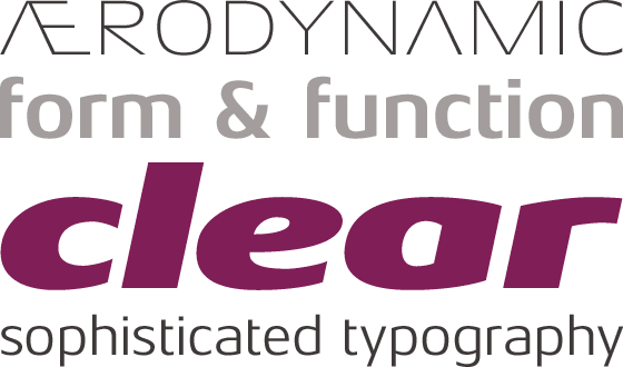
After Generis™, Aeonis™ is the second large family of typefaces by Erik Faulhaber. The basic Aeonis sans-serif form references Ancient Greek lapidary inscriptions from the 9th century BC. A typical characteristic of this is the open form of the capital A in the Aeonis family. The curved forms in Aeonis were inspired by a lamp designed by the famous German industrial designer Wilhelm Wagenfeld in 1952. Between the poles of antiquity and modernity, a deliberate contradiction of round and rectangular forms gave way to a new and energised font: Aeonis.
 |
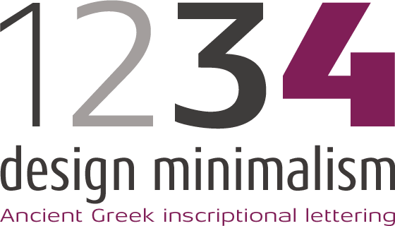
By eradicating serifs on the stems of small characters, the formal language of Aeonis was reduced to a minimum. In order to concentrate even further on the pure script, all horizontal strokes which were not necessary for readability were partially removed from the small characters “f”, “t” and the number “4”.
 |
Aeonis is available in three widths and seven weights, all of which have been carefully coordinated in terms of their proportions. The clear contrast in the bold stroke intensity emphasises the organic nature of the font and creates exciting aesthetics. In light of their open forms, the letters guarantee a good level of readability, even in small point sizes. Given that the dynamic individual forms of Aeonis also fit perfectly in a functional image, this typeface is ideal both for complex, text-heavy documents as well as for logos and display text settings.
During the development of Aeonis, particular attention was paid to ensuring carefully coordination proportions: all styles and weights have the same cap height, as well as identical ascender heights, x-heights, and descender lengths. As with Generis, the widths of all figures, currency symbols, mathematical operators, and special characters have been carefully aligned for tablular settings.
During the development of Aeonis, particular attention was paid to ensuring carefully coordination proportions: all styles and weights have the same cap height, as well as identical ascender heights, x-heights, and descender lengths. As with Generis, the widths of all figures, currency symbols, mathematical operators, and special characters have been carefully aligned for tablular settings.
 |
Aeonis is an extremely systematic design. All of its widths and weights may be combined with one another, without restrictions. For users who do not like the open A, an alternate A with a crossbar is included in each font as well.
Here are some more designs in which an open A was used:
Here are some more designs in which an open A was used:
| Former NASA logo |
| JAL (Japan Airlines) |
 |
| J-League (football league in Japan) |