Agmena
Agmena: a perfectly designed, poetic book typeface
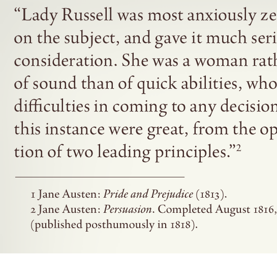
Created by Jovica Veljović, the Antiqua typeface Agmena has been designed to be the perfect book font. This typeface makes skilful use of proportion, form and spacing rather in the way that a practiced storyteller varies the timbre of his voice and deftly inserts longer pauses to bring his tale alive. You can read more about this fascinating typeface in the following. Agmena™ has no historical precursor; it was designed from scratch by Jovica Veljović whose aim was to create a new book typeface. Although it generally has certain similarities with the group of Renaissance Antiqua fonts, it is not clearly derived from any of these. Clear and open forms, large counters and a relatively generous x-height ensure that the characters that make up Agmena are readily legible even in small point sizes.
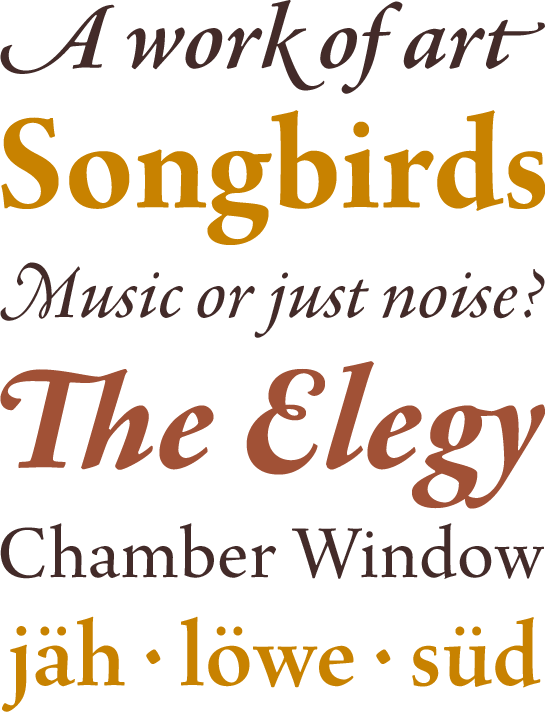
The slightly tapering serifs with their curved attachments to letter stems soften the rigidity of the typeface, bringing Agmena to life. This non-formal quality is further enhanced by numerous tiny variations to the letter shapes. For example, there are slight differences to the terminals of the “b”, the “d” and the “h” and minor dissimilarities in the forms and lengths of serifs of many of the letters. The tittles over the “i” and “j” and those of the German umlauts are almost circular, while the diamond shape that is more characteristic of a calligraphic script is used for the punctuation marks. Although many of these variations are only apparent on closer inspection, they are enough to give Agmena the feeling of a hand-made typeface. It is in the larger point sizes that this feature of Agmena comes particularly into play, and individual characters gain an almost sculptural quality.
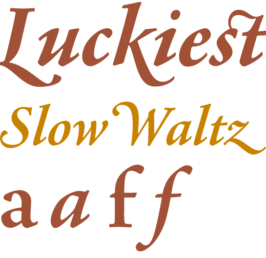
 The italic variants of Agmena are actually real cursives. Various swash letters and additional ligatures enhance the calligraphic character of the italics. The narrower and thus markedly dynamically formed lowercase letters have a wider range of contrast in terms of line thickness and have the appearance of having been manually produced with a quill thanks to the variations in their terminals. The lowercase “a” assumes a closed form and the “f” has a descender. The italic capitals, on the other hand, have been consciously conceived to act as a stabilising element, although the way they have been inclined does not produce a simply mechanical effect. This visual convergence with the upright characters actually means that it is possible to use letters from both styles in combination.
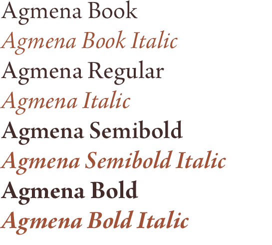
 Agmena is available in four weights: Book, Regular, Semibold and Bold, and each has its matching italic variant. Veljović designed Book and Regular not only to provide an optical balance between various point sizes, such as between that used for the text and that used in footnotes, but also to take account of different paper forms: Regular for lined paper and Book for publishing paper.
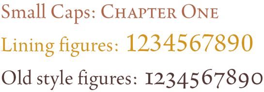
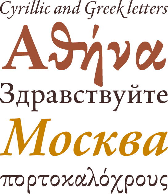
 Agmena’s range of characters leaves nothing to be desired. All variants include small caps and various numeral sets with oldstyle and lining figures for setting proportional text and table columns. Thanks to its pan-European language support, Agmena can be used to set texts not only in languages that use the Latin alphabet as it also features Cyrillic and Greek characters. The set of standard ligatures has been extended to include special combinations for setting Greek and Serbian. Agmena also has some initial letters, alternative glyphs and ornaments.
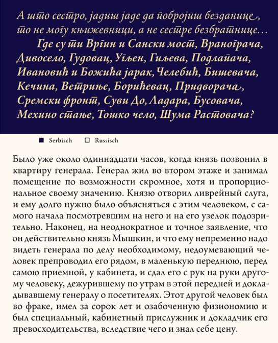
Sample text in Serbian and Russian (Serbian: light-coloured characters on dark background; Russian: dark-coloured characters on light-coloured background)
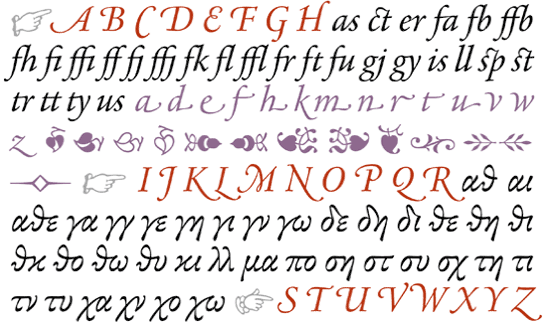
Ligatures and swash letters
Agmena is a poetic text font with forms and spacing that have been optimised over years of work to provide a typeface that is ideal for setting books. But its letters also cut a good figure in the larger font sizes thanks to their individual, vibrant and, in some cases, sculptural effects. Its robust forms are not merely suited to a printed environment, but are also at home among the complex conditions on terminal screens. You can thus also use Agmena as a web font when designing your internet page.
Why not also read the interview with Jovica Veljović?
See the following page for a detailed analysis by Jovica Veljović of his typeface Agmena together with drafts, sketches and examples of the font in use.
Online publication
Available is an online brochure on Agmena that you can read directly from your screen.Award
 |
Agmena was awarded a Certificate of Excellence in Type Design at the Type Directors Club of New York TDC2 competition in 2013. |