Discover legacy content from Linotype.com, preserved for your reference.
Akko
All about Akko

The new Akko and Akko Rounded from Akira Kobayashi – Industrial, friendly, fancy
Akira Kobayashi has been working as Type Director at Linotype since 2001 and, in the meantime, has reworked and enhanced many major typeface families. He has collaborated with Adrian Frutiger on Avenir® Next and with Hermann Zapf on Optima® nova – to name but a few of his projects. Although his artistic skill and input have significantly determined the success of the redesigned fonts, the final versions did not have as their starting point original creations of his own. The Akko™ font family is the first new typeface to be actually designed by Akira Kobayashi for quite some time – but the waiting has been worth it.
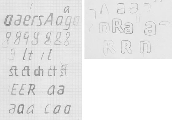 |
| Preliminary designs for Akko |
From initial concept to finished font
Akira Kobayashi has been working on Akko since early 2010 – he coined the name, by the way, from the first two letters of his forename and surname. “I originally planned to design a sans serif font with rounded corners. But then I was attracted to the idea of a industrial engineering design, something similar to the rectilinear form of DIN Next™, but with curved strokes and soft proportions,” he recalls.
By combining the more austere industrial concept with the softer, friendlier aspects, Akira Kobayashi has managed to create two typeface families in one: Akko and Akko Rounded. Both can thus be seen as the perfect stylistic blend of two fonts – the restrained and functional DIN Next and the more organic Cooper Black™.
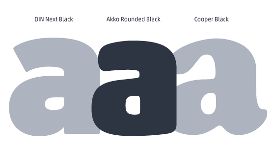 |
| If DIN Next, Akko Rounded and Cooper Black are compared, it becomes apparent that, in stylistic terms, Akko occupies a space somewhere between the other two typefaces |
Precise and intelligent type-engineering providing for excellent script display
The letters of Akko and Akko Rounded are characterised by their simplicity and compactness, meaning that they can be used where it is necessary to save space within a layout. For this reason, Akira Kobayashi paid particular attention to the design of the counters and the junctions between strokes. The softly rounded diagonal strokes in letters such as A, V, K, v and y ensure that no dark areas are produced within texts. The appearance of text set in these fonts is thus homogeneous, straightforward and warm.
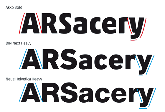 |
| A comparison of Akko with DIN Next and Neue Helvetica shows that the diagonal lines of DIN Next and Neue Helvetica are straight, while those of Akko are slightly convex |
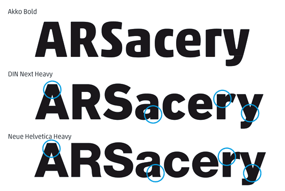 |
| The upstrokes and downstrokes of Akko are more open than is the case with DIN Next and Neue Helvetica, making Akko brighter and less heavy |
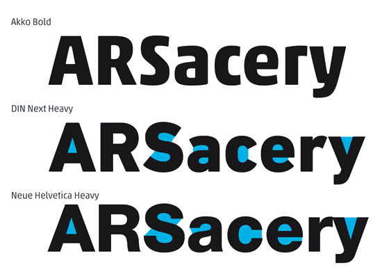 |
| The counters of Akko are also more generous, enhancing legibility: text set in Akko looks uniform, without dark areas |
From genuine ligatures to extensive language support – everything has been provided for
Akira Kobayashi has provided his font family Akko with a suite of ligatures. In addition to the standard, historical c-t and s-t ligatures, Akko also has c-h, c-k and s-c-h ligatures specifically designed for setting German text.
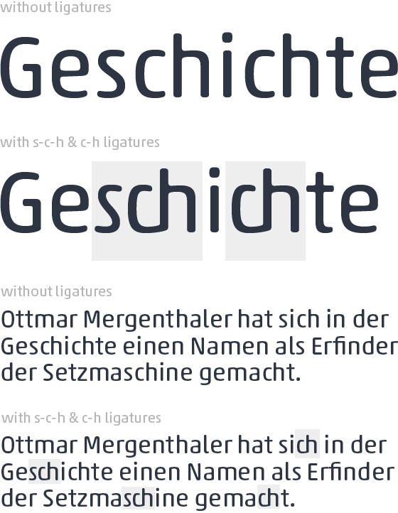 |
| Examples of text set in Akko without and with ligatures |
Akko and Akko Rounded are each available in six different stroke widths of Thin Black, in each case with corresponding italics. The typeface family is also available in OpenType Pro format, making it possible to automatically insert ligatures and special symbols. Most central European and many eastern European languages are supported.
See potential applications and examples of Akko in use on the next page
See potential applications and examples of Akko in use on the next page