Between
Between: a new and unusually flexible design approach from Akira Kobayshi
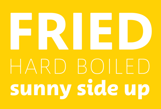
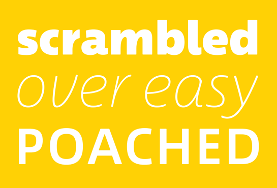
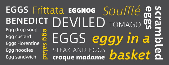
Between™, the new typeface from Akira Kobayashi, comes in three closely linked versions, covering areas like technical and modern, crystal clear and legible, as well as cheerful and lively. The obvious similarities of the three versions make Between the ideal choice for the different collections of a clothing brand, for example, or the automotive and energy industries, or anywhere a modern, but friendly and open expression is required.
The history of the font, now published as Between, goes back to the 1990s. Kobayashi recognized that many companies prefer a neutral sans for their brand, but with a friendly flair. He wanted to design a DIN-like font that had a more humanist appearance and better performance in high-volume typesetting.
The result: Between, in three versions. While the various styles share some letterforms, the three fonts are not simply different versions of the same design. Each style has its own concept with its own character and expression. The differences are not so major as to make it a large family, however. Between is precisely that: “between”.
Each style of Between is available in eight finely graded weights, from Thin to Black, each with a matching italic. All styles also include various number sets with uppercase and old-style figures as well as some ligatures.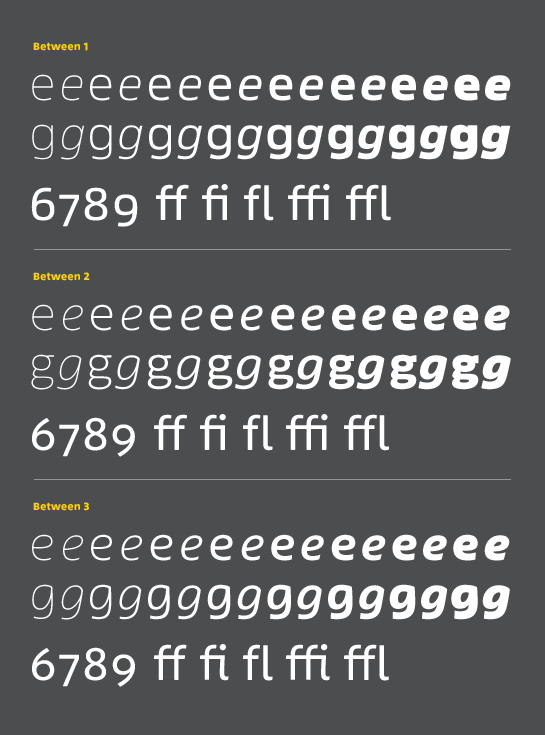 Kobayashi’s unconventional approach – designing his new font Between in three stylistic versions – gives you, the designer, a new level of flexibility. While the three designs do have major differences, they complement and blend perfectly with one another. For example, you can use individual characters from another version to add a special accent to a logo. Call attention to your headline with the dynamic flair of Between 3 and take advantage of the great legibility of Between 2 for the body text. Since all styles have the same weights, they help you as the designer find the perfect combination of fonts and characters for your project.
And, last but not least, you can easily combine all three Between styles with other font families: Try Between 1 with Eurostile or DIN Next, for example, Between 2 with Neue Frutiger or Avenir Next, and Between 3 with Akko Rounded or DIN Next Rounded.


Between 1: technical and modern
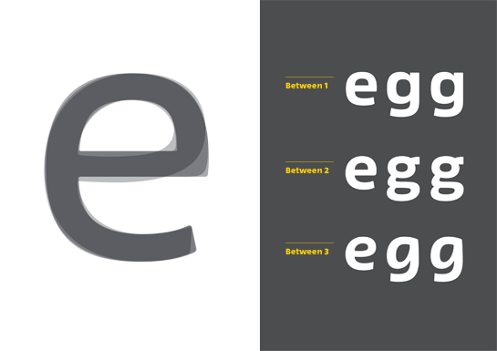
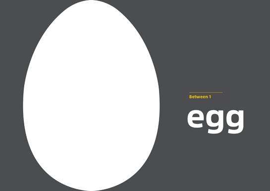
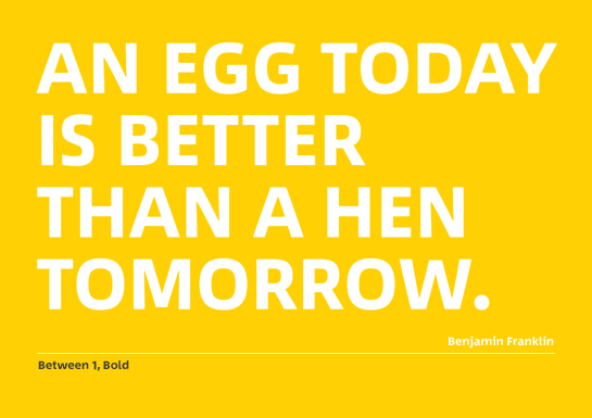
The letterforms are based substantially on the super-ellipse, which gives them a technical and very modern feel. The differences among the Between styles are easily recognizable in the lower-case “e” and “g”. The “e” in Between 1, for example, has a more square shape, and the “g” is in the single-story format, which is typical for a sans. The italic in Between 1 is very neutral, which is fitting for the style; the design has slightly more rounded curves and tighter letters.

Between 2: organic and friendly
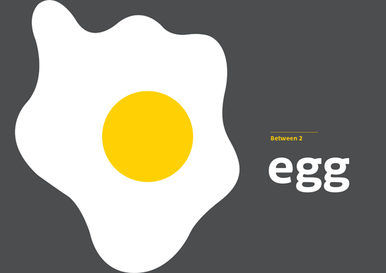
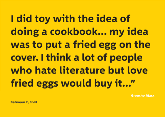
Derived from the Antiqua, the letters in Between 2 have a slightly increased contrast in the stroke width compared to Between 1 as well as somewhat warmer and rounder shapes. This design also uses the characteristic rounded “e” and the two-story “g”. The italic version of Between 2 is a true cursive with much more rounded letterforms, an “f” with a descender, a single-story “g” and a “k” with an extended foot.

Between 3: cheerful and dynamic
The shapes of Between 3 recall a cursive and give the font a very dynamic, handwritten character. Accordingly, the characteristic letters “e” and “g” are much rounder and more curved than in the other styles. The italic of Between 3 changes the shape of the letter “k” and the terminals of numerous letters are extended as in a script font.

Each style of Between is available in eight finely graded weights, from Thin to Black, each with a matching italic. All styles also include various number sets with uppercase and old-style figures as well as some ligatures.
 Kobayashi’s unconventional approach – designing his new font Between in three stylistic versions – gives you, the designer, a new level of flexibility. While the three designs do have major differences, they complement and blend perfectly with one another. For example, you can use individual characters from another version to add a special accent to a logo. Call attention to your headline with the dynamic flair of Between 3 and take advantage of the great legibility of Between 2 for the body text. Since all styles have the same weights, they help you as the designer find the perfect combination of fonts and characters for your project.
And, last but not least, you can easily combine all three Between styles with other font families: Try Between 1 with Eurostile or DIN Next, for example, Between 2 with Neue Frutiger or Avenir Next, and Between 3 with Akko Rounded or DIN Next Rounded.
