Bitstream Foundry
Founded in 1981 by Matthew Carter and Mike Parker among others, the US software and font foundry Bitstream was one of the pioneers of the digital typeface revolution. In the more than 30 years of its existence, several hundred font families have been added to Bitstream’s range. Bitstream was acquired by the Monotype Group in March 2012, and its collection is now available through the Linotype Originals.
 The following is a selection of the typeface highlights.
Amerigo BT
The following is a selection of the typeface highlights.
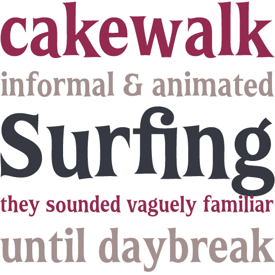
Amerigo BTThe Amerigo family by Gerard Unger with its unusual conical terminals has been designed to work well at lower resolutions.
Antagometrica BT
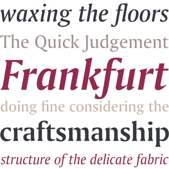
Maximiliano Giungi’s trendy Antagometrica, with its extensive repertoire, is ideal for setting both texts and headlines.
Arrus BT
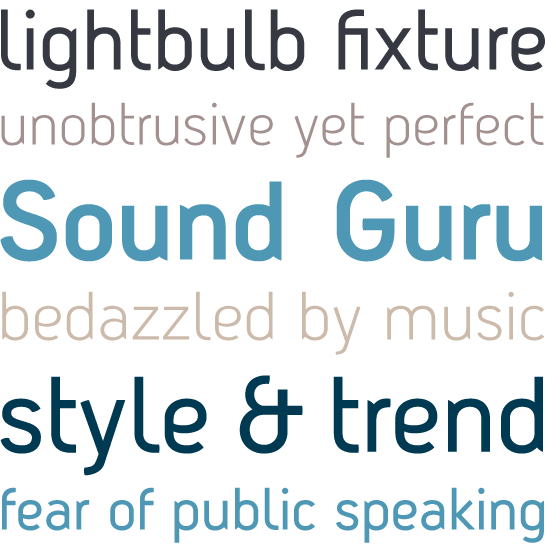
The calligraphic influences apparent in Arrus, designed by Richard Lipton, give this font a particularly dynamic appearance.
Bremen
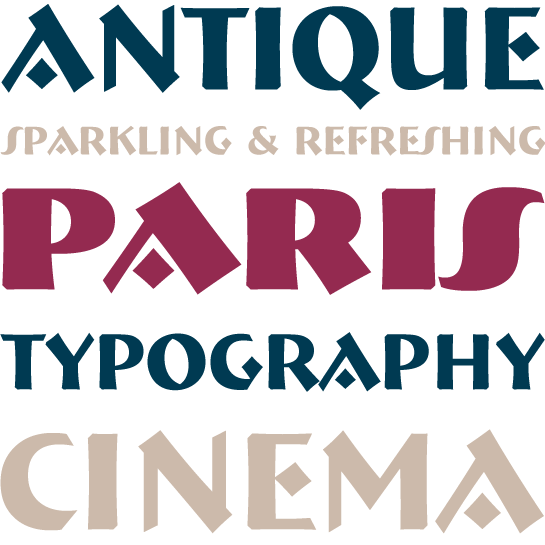
The uppercase font Bremen by Richard Lipton was inspired by German poster art of the early 20th century.
Carmina BT
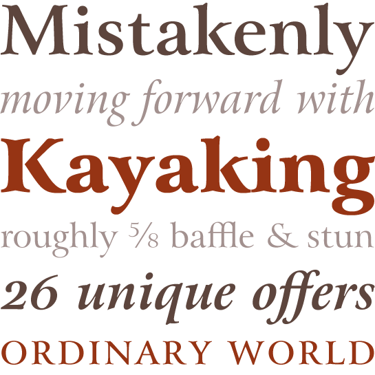
Thanks to its symmetrical, harmonious graphic effect and wide range of variants, Carmina by Gudrun Zapf-von Hesse can be used in a wide range of applications, from books to signalling systems.
Charter BT
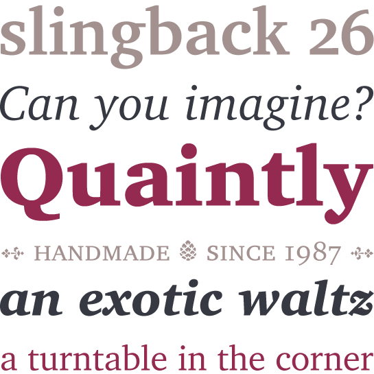
Matthew Carter designed this font in the mid-1980s for output devices with low resolution. It clear-cut and plain forms make it highly versatile.
Chianti BT
The humanist sans serif Chianti by Dennis Pasternak is readily legible in small point sizes and has a wide range of different weights.
Covent BT
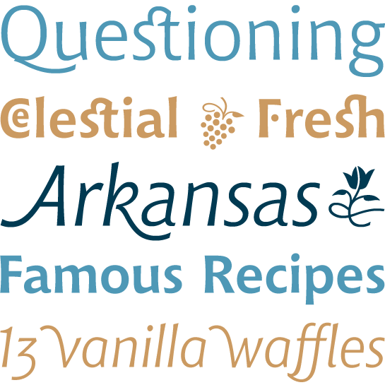
Rounded terminals and stencil-like breaks in contours are the main characteristics of Jochen Hasinger’ Covent.
De Vinne
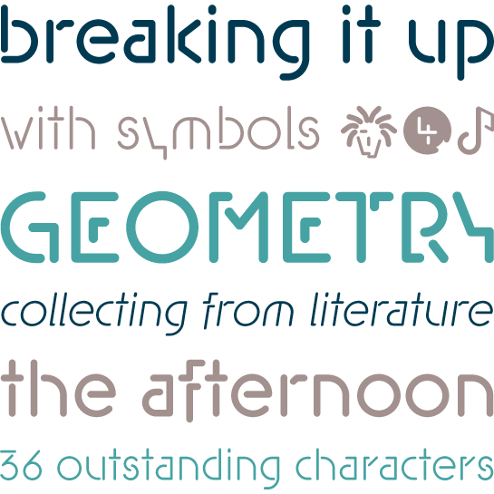
De Vinne by Gustav F. Schroeder has the characteristic elegance of the classic antiqua fonts of the 19th century.
Full Moon BT
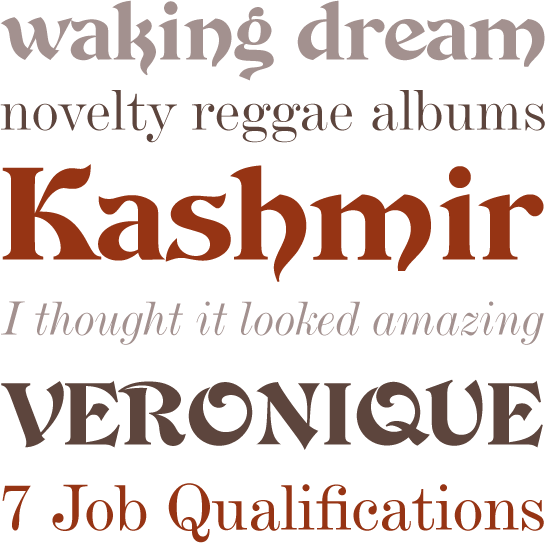
Full Moon, with its suite of casual comic fonts, is the result of collaboration between Charles Gibbons and Mary Trafton.
Impuls
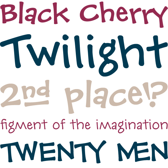
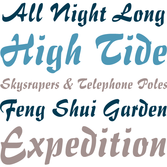
Impuls is a dynamic and richly contrasting brush script designed by Paul Zimmermann.
Iowan Old Style BT
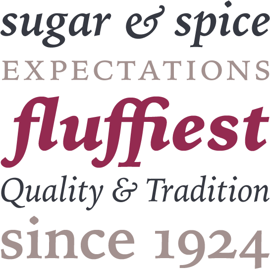
John Downer used models such as Jenson™ and Griffo as the inspiration for his Iowan Old Style, but the latter has a larger x-height and tighter letterfit.
Liorah BT
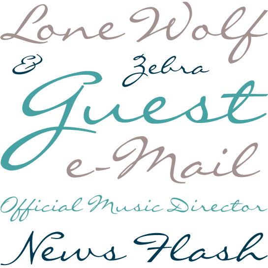
Generously proportioned curvilinear letters are the main feature of Holly Goldsmith’s Liorah.
New Lincoln Gothic BT
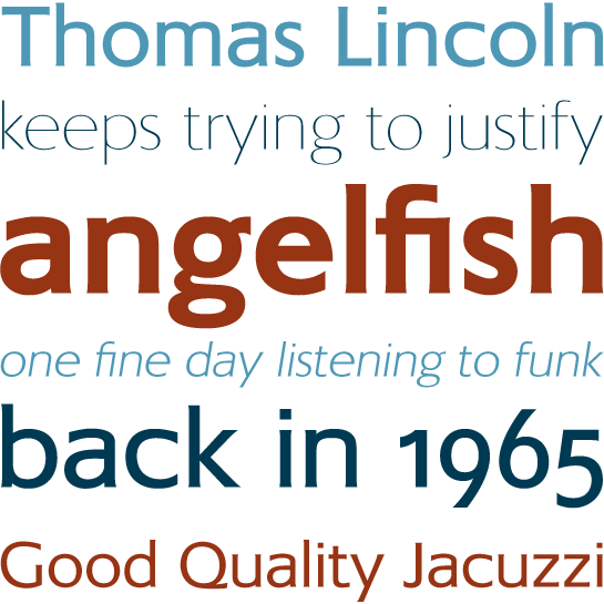
Slight variants in weight and delicately moulded ends to terminals bring this elegant sans serif by Thomas Lincoln to life.
Normande
Normande is readily legible only in larger point sizes but is thus ideal for setting headline text.
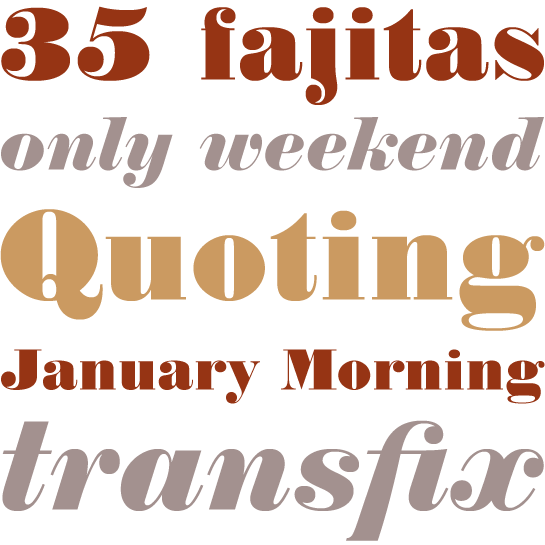
Oranda
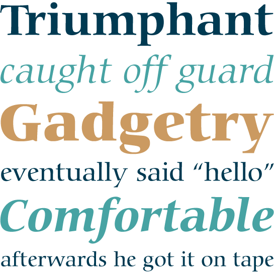
Oranda is a highly legible antiqua that was originally designed by Gerard Unger for the printer manufacturer Océ.
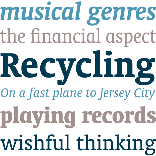
Prima Serif
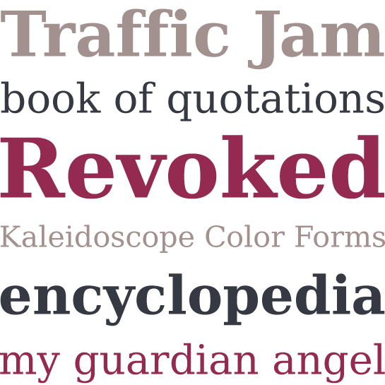
Prima Sans
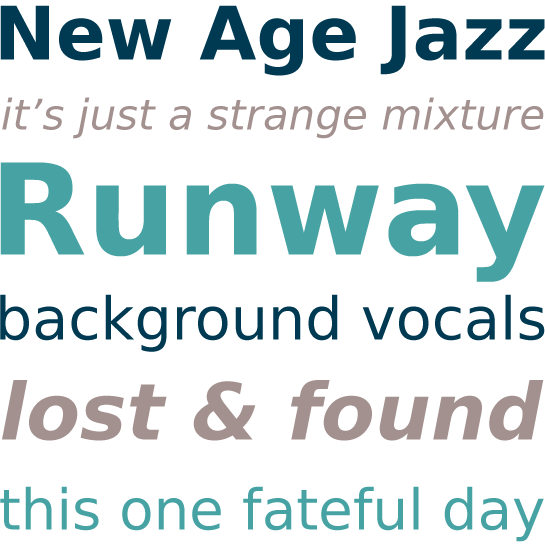
Prima Sans Mono
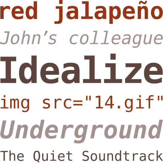
Prima is a series of three typefaces designed for use with low-resolution screens. The humanist sans serif Prima Sans is partnered by Egyptienne Prima Serif, both designed by Jim Lyles. Sue Zafarana’s Prima Sans Mono looks almost as if it has been produced by a typewriter.
Space
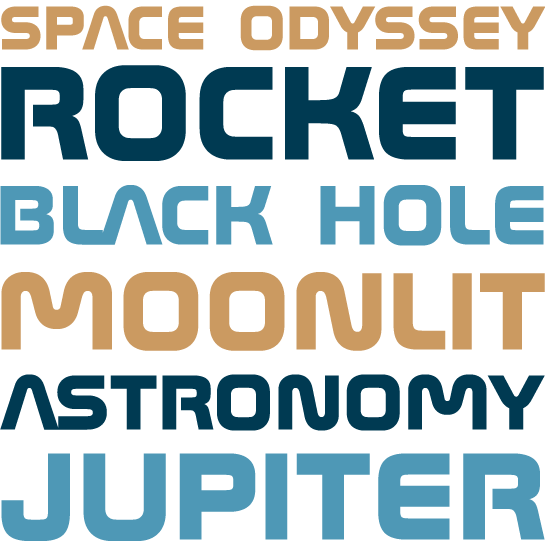
The futuristic small cap font Space has an essentially rectangular basic form.
VeraCruz BT
The highly inventive display font VeraCruz by Ray Cruz offers a generous repertoire of alternative letters.
