Discover legacy content from linotype.com, preserved for your reference.
Diotima Classic
Diotima Classic – Gudrun Zapf von Hesse recreates a post-war favorite

In 2008–2009, Akira Kobayashi worked with Gudrun Zapf von Hesse to revive and reinterpret Diotima®, one of the most beautiful types ever cast in metal. Their result is Diotima Classic.
 |
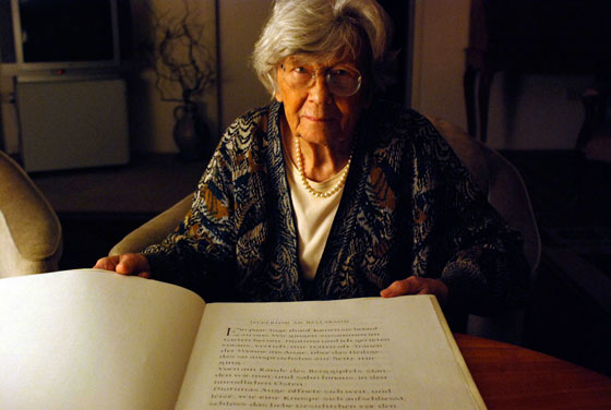
| Gudrun Zapf von Hesse has been a practicing calligrapher for over 60 years. Here she may be seen with one of her handwritten manuscripts. |
Gudrun Zapf von Hesse began the design of the original Diotima family back in 1948. Their roots lay in a calligraphic sheet; the text was the “Hyperion to Diotima” by Friedrich Hölderlin. Diotima is the name of a Greek priestess in Plato’s dialogue about love. In the philosopher’s imagination, she should appear slim and beautiful.
 |
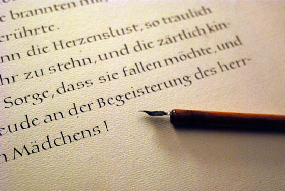
| The basic letterforms for Diotima come directly from Gudrun Zapf von Hesse’s writing. |
Diotima was released as a metal typeface for hand setting by D. Stempel AG in 1951–53. This original Diotima was a festive design particularly suited to invitations, programs, and poems. The delicate Italic drew attention to text passages that should be emphasized.
Linotype’s previous digital Diotima had only a Regular and an Italic font. These looked great in display sizes.
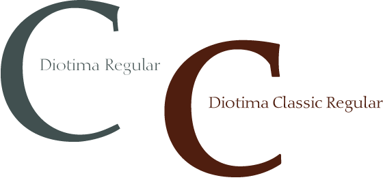
Diotima Classic has four weights. The new Regular has more robust serifs and thicker hairlines, which is more appropriate for text sizes. The Diotima variation with finer serifs still remains – under the name Diotima Classic Light. Gudrun Zapf von Hesse also took the opportunity in 2008 to add an extremely heavy weight to the family.
In comparison to the old Diotima, letterforms of the Diotima Classic are more harmonious and balanced. The rhythm of the Italic letters in Diotima Classic is more consistent. The lining figures of the Diotima Classic align with caps, and the letter spacing of the tabular lining figures in Diotima Classic is significantly better. The forms of the figures have been improved as well.
 |
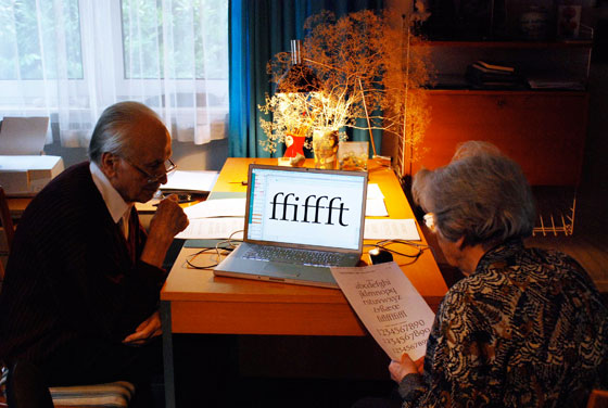
| Hermann Zapf and Gudrun Zapf von Hesse in their home in Darmstadt, Germany. |
Gudrun Zapf von Hesse is married to the typeface designer Hermann Zapf.
