Eric Gill Series
Eric Gill Series: the revised and extended classics Gill Sans Nova and Joanna Nova as well as the new Joanna Sans Nova
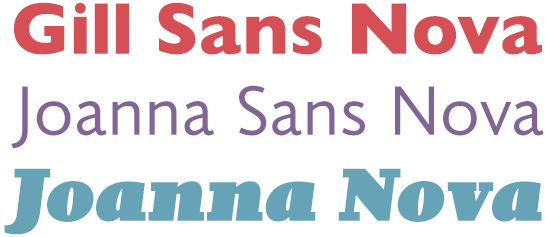
Gill Sans Nova: the completely revised and significantly expanded classic
As a part of the Eric Gill Series, we’re presenting Gill Sans® Nova, a thoroughly revised version of the original Gill Sans®, published by Eric Gill in 1928-1932. The revision of the popular humanist sans with geometrical influences under the direction of George Ryan makes major additions to the characters and stroke widths as well as optimizations for digital publishing. We’ll also present in greater detail the fonts Joanna® Nova and Joanna® Sans Nova, also a part of the Eric Gill Series, down below.
Gill Sans Nova
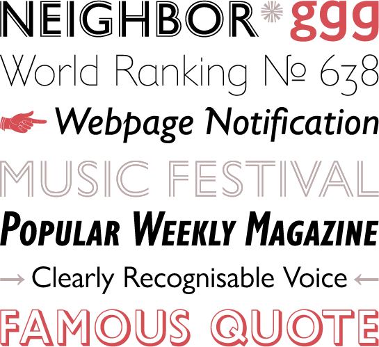 The roots of the Gill Sans go back to a font designed for the London Underground by Eric Gill’s teacher, Edward Johnston, in 1918. The starting point for the actual development of the font, however, was an order from Stanley Morison in 1926. Morison was at that time a typographic consultant for Monotype. He wanted a font that captured the geometric “o” of the Bauhaus movement. Eric Gill used drafts that he had already created for Douglas Cleverdon’s bookshop in Bristol and designed Gill Sans. In response to the immense popularity of the new font, Monotype continuously expanded the classic typeface in the decades that followed, adding additional weights as well as decorative cuts like the shadow versions.
After decades with different composition and printing processes, it was possible to liberate successful fonts like Gill Sans from historical compromises and expand it for more contemporary needs, particularly in the digital realm. Gill Sans Nova was born. Two other fonts were created in parallel, however. While George Ryan worked on Gill Sans Nova, Terrance Weinzierl was occupied with the new Joanna Sans Nova and Ben Jones with their historical predecessor, Joanna Nova. Brought together in the Eric Gill Series, you can rely on three stylistically coordinated fonts that are perfectly suited to large projects in print and on the Web.
The most obvious change for the new Gill Sans Nova is the significantly expanded options for weights. From Ultra Light to Ultra Bold, you now have nine finely graded styles available. All the weights apart from the two thickest come with a matching italic. The extensive Condensed styles available in Gill Sans Nova were practically designed from scratch. The decorative cuts have also been expanded: use Gill Sans Nova Shadowed in three weights, or Gill Sans Nova Inline in six weights, or the new Gill Sans Nova Deco. All in all, Gill Sans Nova offers you 43 styles.
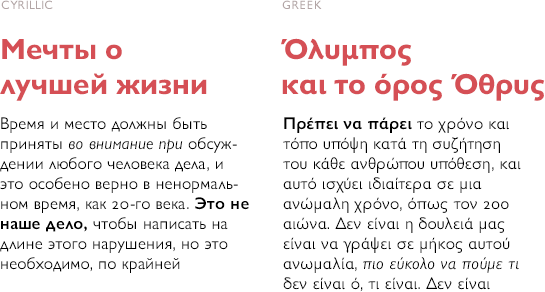
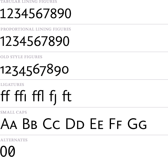
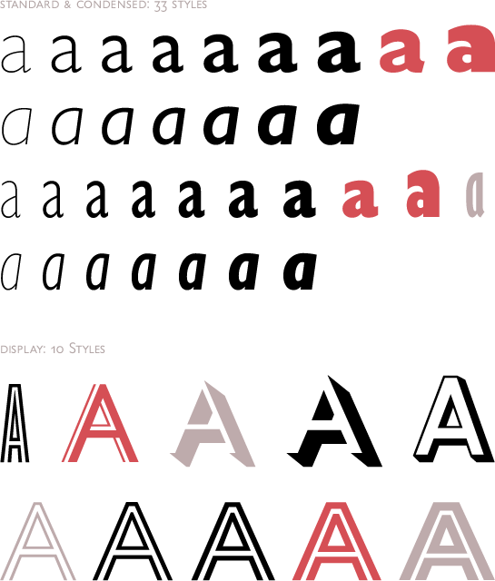 Not only was the number of styles expanded, but also the selection of characters, as well. Of course, there are small caps, ligatures, and various numeral sets in your selection. In addition to the Western and Central European languages, Greek and Cyrillic characters are offered, as well.
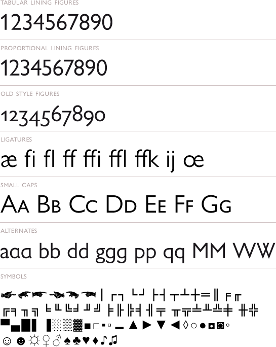
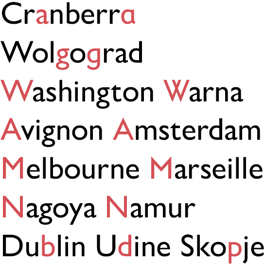
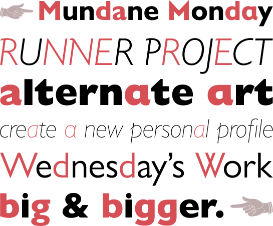
 In addition, numerous alternative letter forms are included, some dating back to the original drawings by Eric Gill. For example, a closed “a”, a single-story “g” or a “w” with crossed lines are available. In addition, the capital letters “A”, “M” and “N” with sharp apexes, as well as “b”, “d” and “p” with spurs are included. A few very beautiful hand pictograms round out the offer.
 With this major expansion in Gill Sans Nova, the timeless design by Eric Gill is ready for decades to come and the digital world. The humanist sans with some geometric accents shows a clear British influence. The lighter styles can be used without problem for long texts and the thicker styles for headlines and commercial typesetting. Along with the other fonts in the Eric Gill Series, you get a coordinated font portfolio that prepares you for large international projects in print and on the Web.
Joanna Nova and Joanna Sans Nova: the fundamentally revised slab serif and its new companion, designed for the digital age.
Terrance Weinzierl designed the sans serif Joanna Sans Nova based on the slab serif Joanna®, published by Eric Gill in 1937. This brought the original Joanna back into focus and Ben Jones revised the font at the same time. The two new families are being published as Joanna Sans Nova and Joanna Nova as part of the Eric Gill Series. The completely revised Gill Sans Nova, also a part of the Eric Gill Series, is presented in more detail above. The historic Joanna stands in the tradition of the arts and crafts movement; Eric Gill initially created it for typesetting books by hand in his Joanna Press printing house. A metal type version, the “book font without any fancy business”, as Gill called it, came out a few years later. Decades passed before Monotype’s Ben Jones brought this highly appreciated, though rarely used font into the 21st century.
Joanna Nova
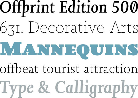 Old drawings and prints from the Monotype archives helped Jones liberate Joanna from its errors and deficits – compromises for earlier typesetting processes and previous digitalizations. The revision brought the italic in particular closer to the version originally designed by Gill, thanks to the wider, more legible design. Ultimately, Joanna Nova appeared, a new and modern interpretation of Joanna. The font’s expansion and options satisfy contemporary requirements.
The Antiqua is equipped with significant slab serifs, which lend the very legible and place-saving text font a special character. Connoisseurs will recognize the long, extended leg in the capital “R” of Joanna Nova, which was typical for Gill.

The font’s italic styles have an unconventional and striking appearance. Compared to other cursives, the letters only have a 3° incline, so they are almost standing upright. They make use of the typical, more rounded italic forms, however. The resulting unique contrast that develops between the dynamic script elements and the stable standing letters gives Joanna Nova Italic an entirely unique flair with a high degree of recognition value.

In addition, the lower-case “a” changes to the closed format in the Italic style and the “g” to the single-story format. The “g” has a closed lower loop, however, which adds another striking characteristic to the font.

Joanna Nova has over 18 styles – more than twice that of the original version. Joanna is available in nine finely graded weights, from Thin to Ultra Black, each with a matching italic. The stroke contrast in the Thin version is almost reduced to a hairline, and the letters in the Ultra Black Italic have a steeper incline, in order to differentiate it adequately from the upright version.
 In addition to a comprehensive language expansion – Greek and Cyrillic characters are also included – small caps, numerous ligatures and various character sets are available.
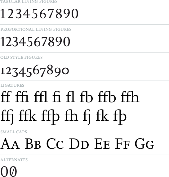
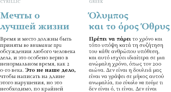 Joanna Nova can be used alone in text as well as in headlines, of course. The slab serif is at its best in combination with Joanna Sans Nova.

Joanna Sans Nova
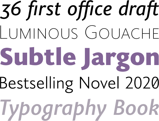 While the shapes of Joanna formed the basis for the new font Joanna Sans Nova, Weinzierl did not simply cut off the serifs of the historic slab serif. With heavily revised letter forms, he created a warm, dynamic and humanist sans that stayed true to the character of Gill’s fonts. A significantly reduced stroke contrast compared to the historical original provides for a solid appearance and the in some cases slightly slanted line ends and round points give Joanna Sans Nova a lively flair. The font was developed for legibility and display on a screen, but nonetheless cuts a fine figure in print.
The true italic of Joanna Sans Nova emphasizes the dynamic and lively character of the font. Weinzierl did pick up on the typical forms of Joanna Italic here, like the distinctive “g”. He gave the letters a stronger incline, however. Apart from that, the “a” changes to a closed shape, the “f” gets a descender and the lower-case “k” is designed with a loop. The shapes, more round in comparison to the upright versions, also add a sense of handwriting and calligraphy to the sans serif.
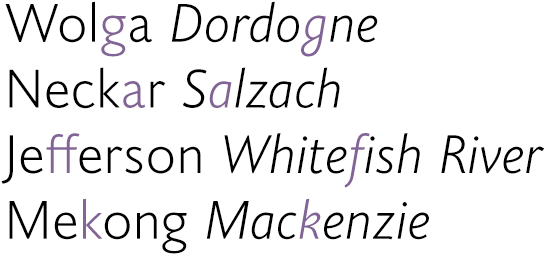 Joanna Sans Nova is available in eight finely graded weights, from Thin to Black, each with a matching italic.
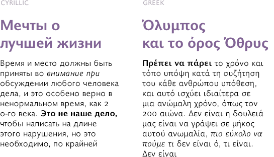
 The language support not only includes Western and Central European languages, but also the Greek and Cyrillic. Small caps and various number sets round out the offer.
 The friendly, low-key but characterful Joanna Sans Nova can be used for both text and headlines. The low contrast in the letters supports the legibility in the small font sizes and provides for a contemporary ambiance in headlines. Calligraphic influences and flowing forms provide the extra accent. Joanna Sans Nova combines perfectly with the other fonts in the Eric Gill Series, the slab serif and sister font Joanna Nova and the somewhat cooler and more formal Gill Sans Nova.