Eurostile Next
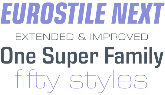
Expanded to 50 styles: new design and application options with the popular Eurostile Next
With the Eurostile® Next typeface, Akira Kobayashi, Type Director at Monotype, has not only brought the original forms of Aldo Novarese’s popular sans serif into the digital world, he has also expanded the family with the addition of many new font styles.Now Terrance Weinzierl is widening the selection even further, with additional widths as well as italic styles. He is also expanding the character set for pan-European use, to include Greek and Cyrillic characters.
By using the new Condensed and Wide styles in the familiar weights you can have even greater flexibility to respond to design needs. Additional italic versions are available for all existing and new font styles, offering brand new possibilities for using Eurostile Next. These bring the family from 15 styles to a whopping 50.
From Microgramma to Eurostile to Eurostile Next
Eurostile® has been with us for decades. Its heritage is a bit obscure. Born in Italy, Eurostile had two designers, and two release dates, even if purists might insist that it really just had one of each. Without a doubt, the typeface has had two official names. Of course, the first of those two names – Microgramma™ – only refers to part of the final design. After many years, Linotype is releasing an extended revision and update, named Eurostile Next. Confused?Once a few signposts in the Eurostile history are defined, things become much clearer. The type was created as an uppercase-only face and was drawn by Alessandro Butti, with help from a young assistant named Aldo Novarese. Novarese would go on to become one of Italy’s premier typeface designers, but in 1952, the release of this all-caps titling face revolved around Butti and the foundry where he worked, Nebiolo.
Microgramma: a popular, real “Titling Design.”
The design in question was called Microgramma™ and it was intended strictly for display composition. Microgramma was a real “Titling Design.” To have this classification in the old hot metal type days meant much more than just being all-caps; a titling design would have its capital letters go all the way to the edge of the top of the lead sort. “72-point titling caps” were much larger than 72 point caps from a regular font. Even if you had wanted to mix Microgramma’s letters with lowercase letters from another font of type, it would have been very difficult.Microgramma remained very popular for the better part of 10 years, until the then more mature Aldo Novarese began to create the missing lowercase letters. His completed effort was renamed Eurostile, released in 1962.

Eurostile: a handsome family with lowercase versions and seven design variants
Eurostile’s release did not see the removal of Microgramma from the market. Microgramma would eventually expand into a family of five designs: a Regular weight, with Condensed and Extended companions, and a Bold weight, with an Extended companion of its own. As Novarese developed Eurostile®, he followed suit by creating lowercase versions for the same five variants, plus a new Bold Condensed and an ultra narrow design called Eurostile Compact. Novarese’s original Eurostile was made up of seven variants.Linotype began distributing Eurostile decades ago, and during the early 1980s, it worked together with Adobe to bring Novarese’s creation into the digital age as PostScript fonts.
The most obvious attribute of Eurostile, other than its lack of serifs, is the squared quality of its design. Many of the letters look as if they began life by tracing the frames of old television screens. There is a symmetry and implied mathematical quality to the design. Hermann Zapf dubbed this the “super curve,” and worked with it himself in his serif newspaper face Melior®. The geometricity of Eurostile also puts it together with types like Avenir®, Futura®, and ITC Avant Garde Gothic®, even though Eurostile looks quite different at first glance.
Eurostile has a large x-height and is distinctive without being flamboyant. In plain text, this means that it is not a replacement for sans serif text faces like Univers® or Franklin Gothic™. Nevertheless, Eurostile is easy to use well, and it has the added benefit of standing out from the crowd of other typefaces in the sans serif genre.
While many individual letters distinguish Eurostile, some of the most interesting are the K and k, which have diagonals that do not touch the vertical stroke or the lowercase t, where the crossbar is long on the right and the long tail curves all the way back to vertical. A, M, N, V, and W all have flat apexes, and the Q has the odd distinction of a tail longer on the inside of the character than on the outside.
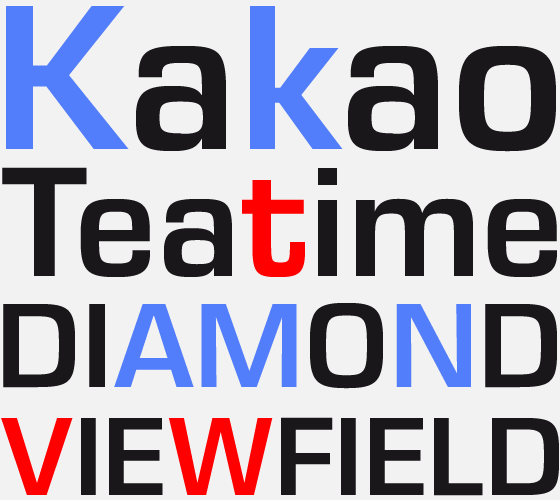
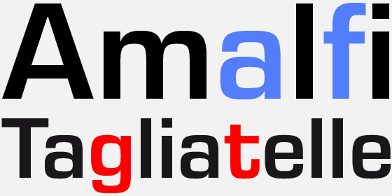
Eurostile’s lowercase a is of the traditional two-storied variety found in 19th century grotesques and most roman types. The crossbar of the f mimics that of the t, and the g is a single-storied, like that found in Helvetica ® or Futura®.
While it was once the first choice among graphic designers for use in headlines and the like, Eurostile seems to have sadly faded into relative obscurity. Univers, Helvetica, and Avant Garde Gothic have picked up where Eurostile left off. Yet in the past decade, part of the renaissance that these typefaces have had was due to digital rethinking by Linotype, Monotype, and ITC. In the tradition of Linotype Univers®, Helvetica World, ITC Avant Garde Gothic®, and even Palatino® Linotype and Palatino nova, Linotype has taken the basic Eurostile design and created a remarkably fresh and improved version of the family.
Eurostile Next: the corrected, expanded and improved version of Eurostile
As Akira Kobayashi, Linotype’s Type Director, began to study the Eurostile fonts, he found several design flaws and inconsistencies imposed by metal typefounding and perpetuated in the succeeding phototype and digital renditions of the design. Furthermore, when Eurostile was first made into digital fonts, the technicians responsible did a poor job of translating Novarese’s original shapes, like the super curve. The most basic comparison of the old digital Eurostile and the new Eurostile Next can be seen in Kobayashi’s treatment of Novarese’s curves. Additionally, the stroke weight difference between the upper and lowercase letters is less drastic than in the previous digital Eurostile fonts, allowing for more harmonious strings of text.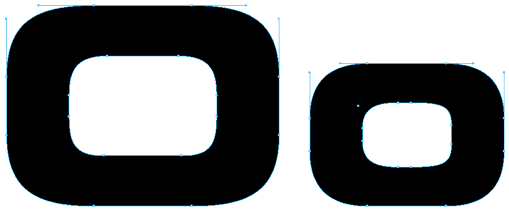
Eurostile Bold Extended 2
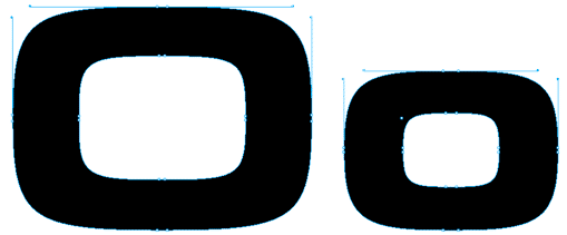
Eurostile Next Bold Extended
Kobayashi’s drawings are much more fluid, and true to the original 1960s spirit. Eurostile Next also contains a rethinking of the fonts’ accents and special characters. In previous decades, these symbols were unfortunately not considered as important as they are today, when fonts are marketed to a global audience instead of primarily to Western Europeans and North Americans.
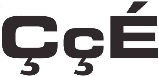
Eurostile Bold Extended 2
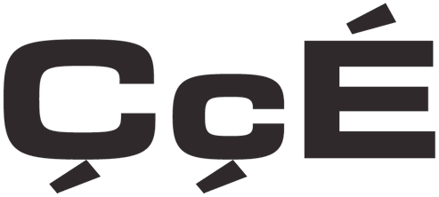
Eurostile Next Bold Extended
Of course, Eurostile Next is a full-fledged OpenType family. As such, it includes a character set that supports all Western, Central and Eastern European languages that use the Latin script – including those from the Baltic States and Turkey. For the first time, Eurostile Next offers a Eurostile version with true small caps. Other OpenType features include tabular and proportional figures, superior and inferior numerals, diagonal fractions, and ordinals.
* Gross price 141.61 USD/EUR including German sales tax.
The offer does not apply to holders of user accounts, who already receive a fixed price reduction.
The offer does not apply to holders of user accounts, who already receive a fixed price reduction.


