FF Bau

FF Bau: a neutral grotesque for all applications
The neutral grotesque FF Bau® by Christian Schwartz is the ideal workhorse for the most diverse design tasks. Use the restrained character of this font family in long texts, for example, or in headlines or commercial designs. Schwartz based the design of FF Bau on the grotesque from the type foundry Schelter & Giesecke in Leipzig, which published the first styles around 1880. At that time, sans serif fonts were popular and virtually all font foundries brought similar designs to the market. By the way, these early sans serif fonts served as the templates for well-known typefaces like Helvetica® or Arial®, which explains why FF Bau is similar to these fonts. The grotesque from Schelter & Giesecke was also a preferred font in the Dessau Bauhaus for many years – the name FF Bau is an homage to one of the most famous uses of the font.
 It was Erik Spiekermann who told Schwartz about the grotesque by Schelter & Giesecke. Schwartz based his revival of the linear Antiqua on the original sketches, converting the styles Regular, Medium and Bold. Even when making small adjustments, Schwartz attempted to maintain the particular spirit and warmth of the historical font. Schwartz then based the new, extra bold Super and Italic styles on this foundation, since both fonts had no historical predecessor.
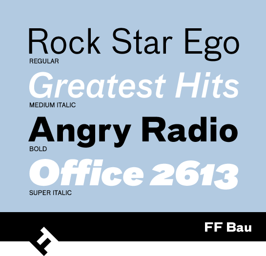
The restrained, very neutral characters of FF Bau are available in four weights, each with a matching italic. Schwartz gave the italic versions a “g” with a single-story format.
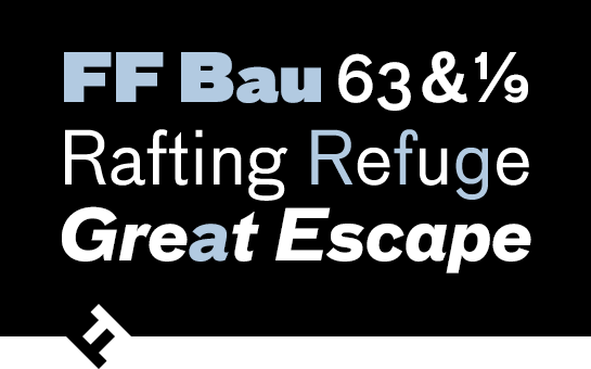
 Along with various number sets, the font includes numerous characters, depending on the weight. As a result, you can use a capital “R” with a straight leg, or a single-story “g”.
 Additional characters like the “r” or “s” with slightly modified forms are available in the Regular style, as well.
 The restrained appearance and neutral character of FF Bau make it ideal for a variety of applications. You can use this universal typeface for text or headlines – it is an ideal partner for large projects, as well.
