FF Casus
Even with a degree in philology, Eugene Yukechev amassed experience in designing. He was so enthusiastic that he decided to study typography and graphic design at the “British Higher School of Design” in Moscow. Now Yukechev works as a typographer and designer, commuting between Berlin and Moscow, and runs an online magazine on typography with friends, while he also develops fonts. His FF Casus represents his latest font.
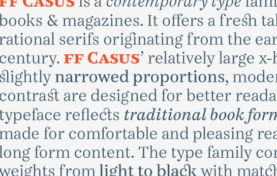
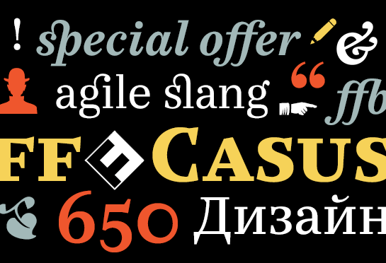
Inspired by the early Antiquas of the 18th century, Eugene Yukechev’s modern design adds a fresh touch to these easily legible fonts. Open forms, a not too strong a contrast in the weights and sturdy, somewhat geometric serifs thus not only result in a pleasant reading flow, but also lend the font a conspicuous yet friendly appearance. Its clear-cut droplets and linear elements in the finish of the italics also add further dimensions to FF Casus.
Use this well-equipped font family with six weights and Cyrillic letters, for instance, for printing of magazines or books.

