FF Clan
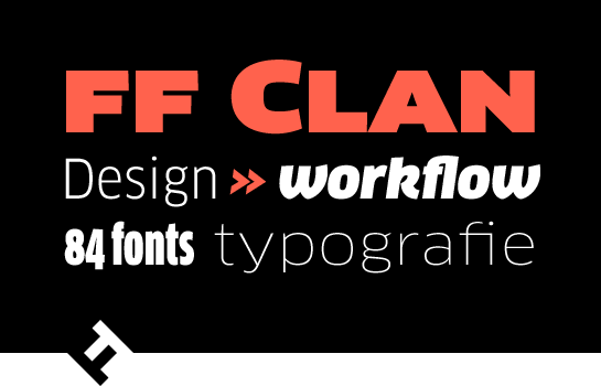
FF Clan: a versatile and friendly sans
with plenty of options
The friendly sans FF Clan® from Łukasz Dziedzic is one of the most successful and largest families in the FontFont library. You will most definitely find the right weight and width for every situation among the total of 84 styles.
The basic shape of the letters, derived from the Renaissance Antiqua, lend FF Clan a humanist, friendly character. This flair is supported by several slightly slanted line ends, conical spurs, oval points and a light, yet clearly visible contrast in the weights. An extreme X-height and resulting short ascenders and descenders and big counters not only give FF Clan perfect readability, but also make for an open and generous character. The contrast between the typical Roman forms of the lower-case “a” and “g”, as well as the typical sans shape in the upper-case letters, especially the heavily reduced “G”, are also noteworthy.
Dziedzic designed a very beautiful italic for each upright style. In the true italic styles, almost all lower-case letters have a new, more rounded shape that changes the character of FF Clan, giving it a more dynamic, softer flair. This impression is emphasized by the change in the small “a” to closed and the “g” to a single-story shape. The lower-case “k” also has a new, script-oriented appearance.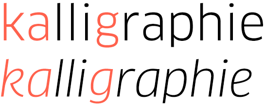 With seven weights in six widths, FF Clan comes very well-equipped. All styles have small caps, ligatures, old-style and uppercase numerals, designed for proportional and table settings. In this way, you have access to an almost inexhaustible variety of typographic options and can find the perfect style for every design challenge.
 FF Clan is a versatile typeface that Dziedzic himself describes as: not too modern, not too elegant, not too cold. FF Clan is distinctive enough to give your designs a special character, but does not take up too much of the foreground or come across as dominant. Take advantage of the lighter styles, with their delicate but steady appearance, for fashion or cosmetics campaigns, for example. At the other end of the spectrum, the thicker styles are suited to posters or eye-catching headlines.

Dziedzic designed a very beautiful italic for each upright style. In the true italic styles, almost all lower-case letters have a new, more rounded shape that changes the character of FF Clan, giving it a more dynamic, softer flair. This impression is emphasized by the change in the small “a” to closed and the “g” to a single-story shape. The lower-case “k” also has a new, script-oriented appearance.
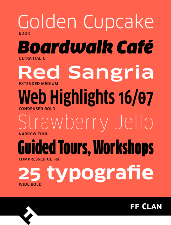
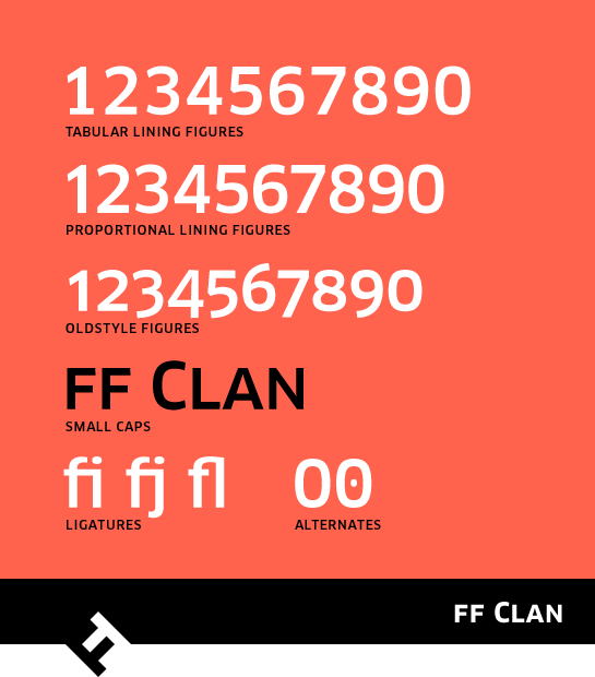
 With seven weights in six widths, FF Clan comes very well-equipped. All styles have small caps, ligatures, old-style and uppercase numerals, designed for proportional and table settings. In this way, you have access to an almost inexhaustible variety of typographic options and can find the perfect style for every design challenge.
 FF Clan is a versatile typeface that Dziedzic himself describes as: not too modern, not too elegant, not too cold. FF Clan is distinctive enough to give your designs a special character, but does not take up too much of the foreground or come across as dominant. Take advantage of the lighter styles, with their delicate but steady appearance, for fashion or cosmetics campaigns, for example. At the other end of the spectrum, the thicker styles are suited to posters or eye-catching headlines.