FF Dax
FF Dax: A distinctive, perfectly equipped and versatile font family
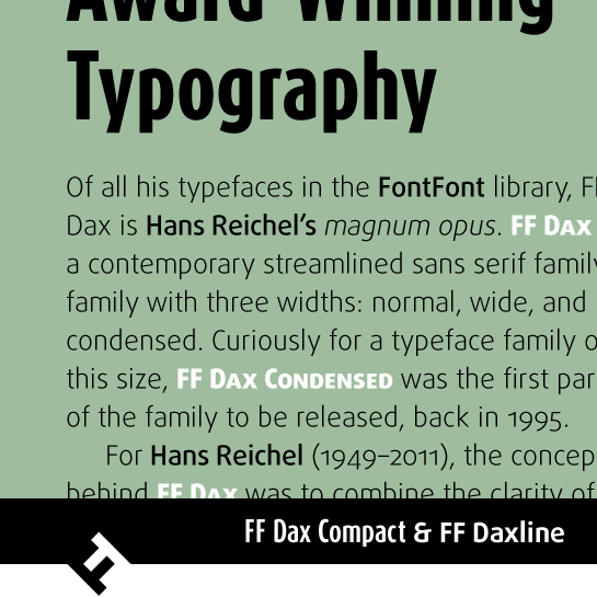
The multi-talented Hans Reichel not only designed fonts and worked as a graphic designer, he was also a musician and instrument maker. He invented the daxophone, an instrument consisting of wooden tongues of various shapes that are played with a bow. It is no coincidence that Reichel’s magnum opus, the FF Dax® font family, shares a similar name. Reichel cleverly combined in FF Dax the clear and neutral forms of a structured grotesque with a humanist touch. The lack of spurs lend the letters a very reduced, almost technical character. Round letter forms that recall an Antiqua in some cases and a clear contrast in the stroke width counter the formal character, creating a fascinating internal tension and giving the font a friendly flair. The open counters and a large X-height serve to reinforce this impression. The bows that stick out above and below the stem are also very distinctive; they give the letters a kind of thickset appearance. The uppercase “D”, as well as “B”, “d” and “p” are good examples of this. The members of the extended FF Dax super-family are highly specialized, and optimized for very specific areas of application.
FF Dax
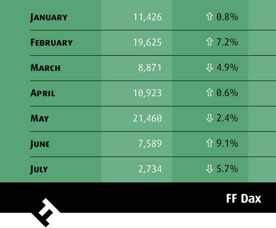
The original version of the font, equipped for practically all typographic tasks. It comes with three widths, Condensed, Normal and Wide, as well as six weights, each with a passing italic. Use these fonts for high-volume typesetting, headlines and logos, for example. Old-style figures and small capitals round out the features of FF Dax®.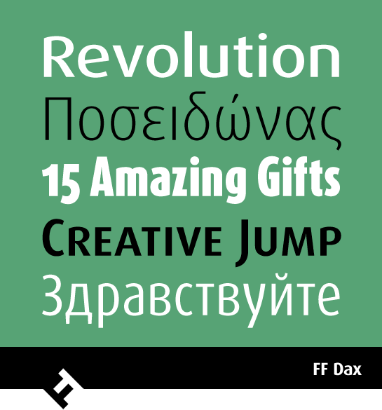
FF Dax Compact
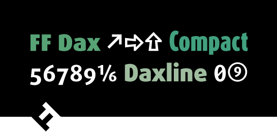
The condensed headline font FF Dax® Compact shares the same basic letterforms of FF Dax. It has a larger X-height, however, and shorter ascenders and descenders. Apart from that, the lower-case letters are designed with ascenders in the same size as the capitals. Although FF Dax Compact has a width similar to FF Dax® Condensed, this design trick makes it appear narrower and somewhat larger. It is the ideal font wherever space is limited and performs particularly well in newspaper or magazine headlines, for example, or on flyers. FF Daxline
Slightly wider characters, lower contrast in the stroke width and larger capitals make the design of FF Daxline® optimal for high-volume typesetting. Without losing the characteristics of FF Dax, FF Daxline can also achieve its full effect in the smaller font sizes. In addition to the six familiar FF Dax weights, FF Daxline has another, even finer Thin style. As always, old-style figures, small capitals and some symbols round out the font.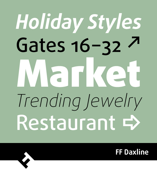 Of course, all styles in the large FF Dax family are coordinated and combine well with one another. For example, use FF Daxline for text and FF Dax Compact for headlines.

The original version of the font, equipped for practically all typographic tasks. It comes with three widths, Condensed, Normal and Wide, as well as six weights, each with a passing italic. Use these fonts for high-volume typesetting, headlines and logos, for example. Old-style figures and small capitals round out the features of FF Dax®.


FF Dax Compact
The condensed headline font FF Dax® Compact shares the same basic letterforms of FF Dax. It has a larger X-height, however, and shorter ascenders and descenders. Apart from that, the lower-case letters are designed with ascenders in the same size as the capitals. Although FF Dax Compact has a width similar to FF Dax® Condensed, this design trick makes it appear narrower and somewhat larger. It is the ideal font wherever space is limited and performs particularly well in newspaper or magazine headlines, for example, or on flyers.
 FF Daxline
Slightly wider characters, lower contrast in the stroke width and larger capitals make the design of FF Daxline® optimal for high-volume typesetting. Without losing the characteristics of FF Dax, FF Daxline can also achieve its full effect in the smaller font sizes. In addition to the six familiar FF Dax weights, FF Daxline has another, even finer Thin style. As always, old-style figures, small capitals and some symbols round out the font.
 Of course, all styles in the large FF Dax family are coordinated and combine well with one another. For example, use FF Daxline for text and FF Dax Compact for headlines.
