FF Kievit
FF Kievit: A universal super family, ideal for large projects in print and on screen
FF Kievit and FF Kievit Slab were created in the context of corporate projects, so they are clearly well at home in that area. However, their clear, legible forms and great options make the fonts applicable to countless other areas.
FF Kievit
Michael Abbink designed the first drafts of Kievit while he was still in design school. The font was inspired by the clarity and expression of classic sans serif fonts, such as Frutiger® or Univers®, and the historical, humanistic Antiquas like Garamond™ or Granjon®. A few years later, the font was completed in the context of a corporate project at Studio Method Inc. in San Francisco. FontShop published it in 2001.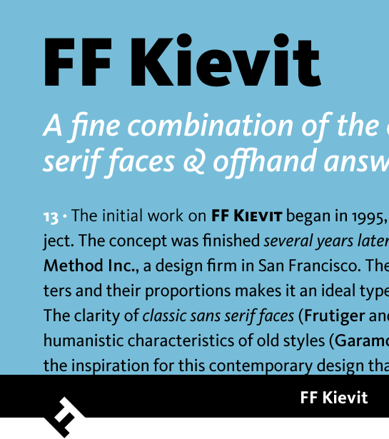 A large x-height and large counters lend FF Kievit® an open and very clear appearance. Moreover, the slightly oblique line ends, the clear traces of the humanist fonts in the design language, and a careful contrast in weight make for a friendly and lively character. A true italic with considerably more dynamic, more rounded letters also emphasizes FF Kievit’s connection to the historical Antiqua predecessors.
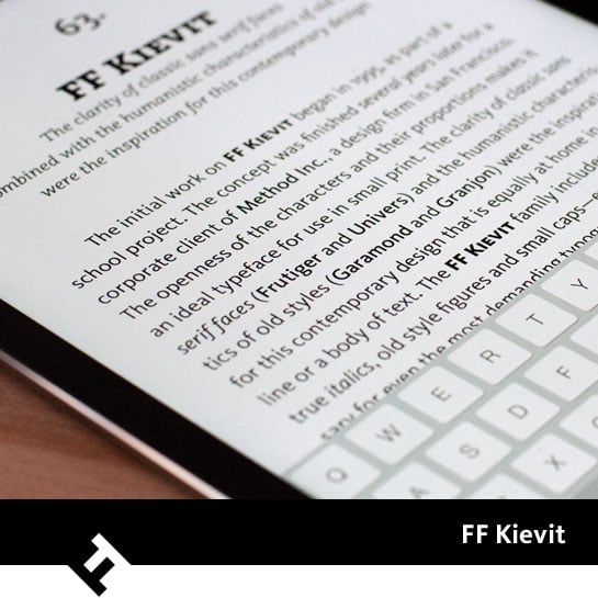 FF Kievit is available in nine finely tuned weights, ranging from Thin to Extra Black. In addition to the Regular, an extra Book style takes the requirements of high-volume text into account. All weights have matching italics. Ligatures, different sets of numbers and small caps are also available.
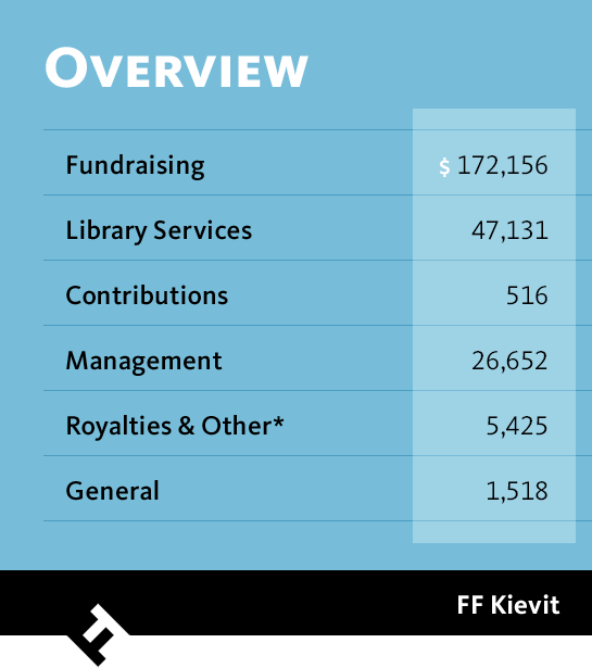 Two awards have confirmed the quality of FF Kievit. The font won the ISTD Award in 2001 and made it to the list of the best fonts of the previous century from ATypI in the Bukva:raz contest in 2001.
FF Kievit Slab
Once again, corporate projects at Method led to the further development of FF Kievit. By the end of the 1990s, a Nike logo appeared with slab serifs that were derived from FF Kievit. Early versions of FF Kievit® Slab were also present in the rebranding of Autodesk and the corporate identity of WDR (West German Broadcasting). Michael Abbink finally finalized the project along with his friend Paul van der Laan and published FF Kievit Slab in 2013.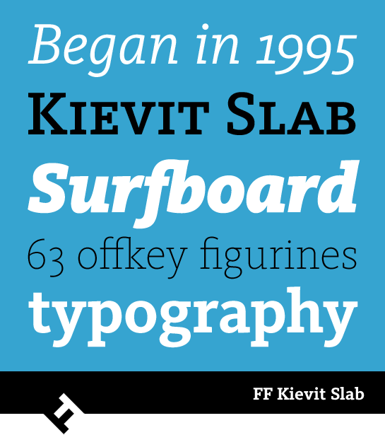 While the basic shape of the letters and the division of the styles are based on FF Kievit, the slab was not simply slapped onto the original font. Abbink and van der Laan carefully revised the shapes and contrast and adapted them to the new character, which resulted in a coherent and harmonious overall appearance. The striking and powerful character of the FF Kievit Slab can complement FF Kievit, but can also stand on its own in the areas of display or text.
Like its sister font, FF Kievit Slab is well equipped with nine weights, italic styles, various sets of numbers and small caps.
Either of the FF Kievit styles is a typographical all-rounder that is convincing in headlines or text, but also on the screen. Together, the two families span an extremely flexible and versatile typographic universe in which they are complement and support one another perfectly. These fonts will help you achieve your goals, even in larger projects with multiple challenges.
Michael Abbink designed the first drafts of Kievit while he was still in design school. The font was inspired by the clarity and expression of classic sans serif fonts, such as Frutiger® or Univers®, and the historical, humanistic Antiquas like Garamond™ or Granjon®. A few years later, the font was completed in the context of a corporate project at Studio Method Inc. in San Francisco. FontShop published it in 2001.
 A large x-height and large counters lend FF Kievit® an open and very clear appearance. Moreover, the slightly oblique line ends, the clear traces of the humanist fonts in the design language, and a careful contrast in weight make for a friendly and lively character. A true italic with considerably more dynamic, more rounded letters also emphasizes FF Kievit’s connection to the historical Antiqua predecessors.
 FF Kievit is available in nine finely tuned weights, ranging from Thin to Extra Black. In addition to the Regular, an extra Book style takes the requirements of high-volume text into account. All weights have matching italics. Ligatures, different sets of numbers and small caps are also available.
 Two awards have confirmed the quality of FF Kievit. The font won the ISTD Award in 2001 and made it to the list of the best fonts of the previous century from ATypI in the Bukva:raz contest in 2001.
FF Kievit Slab
Once again, corporate projects at Method led to the further development of FF Kievit. By the end of the 1990s, a Nike logo appeared with slab serifs that were derived from FF Kievit. Early versions of FF Kievit® Slab were also present in the rebranding of Autodesk and the corporate identity of WDR (West German Broadcasting). Michael Abbink finally finalized the project along with his friend Paul van der Laan and published FF Kievit Slab in 2013.
 While the basic shape of the letters and the division of the styles are based on FF Kievit, the slab was not simply slapped onto the original font. Abbink and van der Laan carefully revised the shapes and contrast and adapted them to the new character, which resulted in a coherent and harmonious overall appearance. The striking and powerful character of the FF Kievit Slab can complement FF Kievit, but can also stand on its own in the areas of display or text.
Like its sister font, FF Kievit Slab is well equipped with nine weights, italic styles, various sets of numbers and small caps.
Either of the FF Kievit styles is a typographical all-rounder that is convincing in headlines or text, but also on the screen. Together, the two families span an extremely flexible and versatile typographic universe in which they are complement and support one another perfectly. These fonts will help you achieve your goals, even in larger projects with multiple challenges.
