FF Scala
FF Scala: a perfectly equipped font family group, for more than just text setting
In the mid-1980s, Martin Majoor worked as a designer for the Vredenburg Music Center in the Dutch city of Utrecht. At that time, one of the relatively new DTP systems was available to him. However, none of the only 16 installed PostScript fonts could satisfy his professional demands for text setting. He did not have any old style figures, for example, or small caps or ligatures. Majoor decided to compensate for this lack with his own font, Scala. The font was released in 1991 as the first real text font from the newly formed FontShop. A few years later, a sans companion was added and subsequently the font became a continuously growing super family. Today, FF Scala®, FF Scala® Sans and the ornamental font FF Scala® Jewel are available as well-equipped OpenType fonts, and not only for text setting.
FF Scala
Majoor modeled the serif Renaissance Antiqua on a number of historical fonts, without copying any of them exactly. A clearly perceptible, though not extreme, contrast in stroke width and some sharp shapes sometimes recall the stroke of a fountain pen. The serifs designed as rectangles provide for extra sharpness and a distinctive, powerful image. Nonetheless, the very legible font has a pleasant and friendly appearance, not in the least due to the rounded points.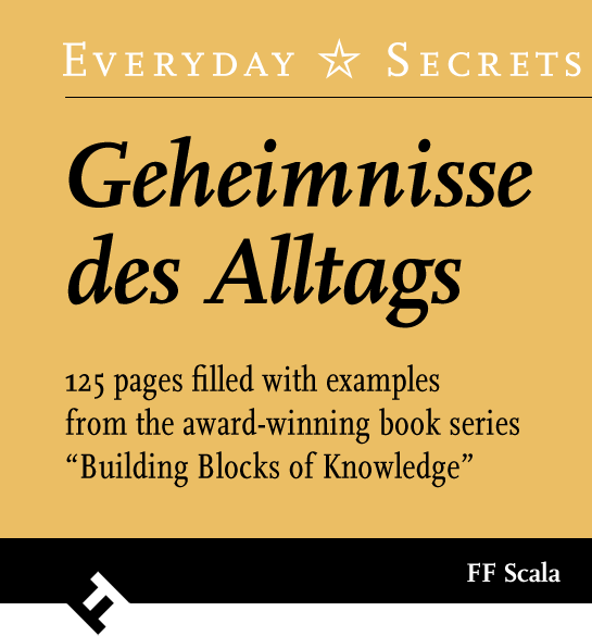 As a small peculiarity, Majoor designed open counters for “b”, “q” and “p”.
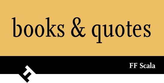 The italic is a true cursive, in which all the characters have a clearly inclined and particularly curved form, with numerous references to a fountain pen and long, drawn outline ends.
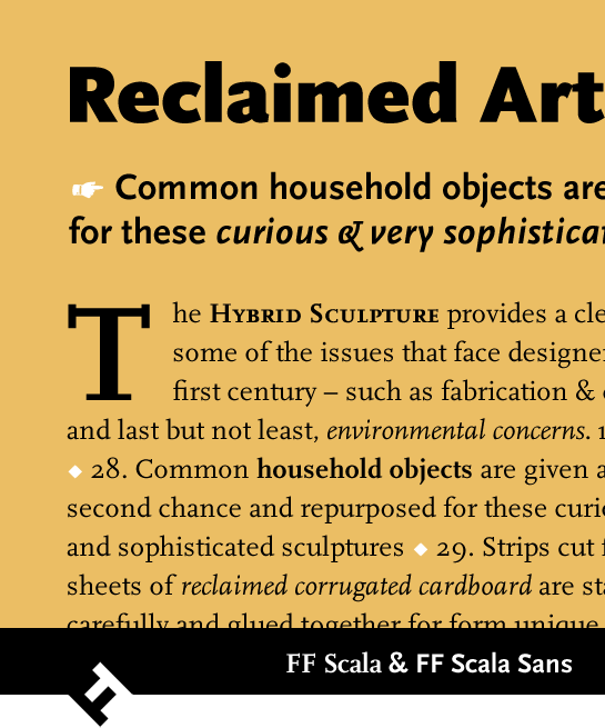
FF Scala is available in the four major weights for text setting, Regular, Italic, Bold and Bold Italic. A Condensed variant complements both upright weights. Of course, the modern OpenType variants have the small caps, old-style numerals, and ligatures, which were so important to Martin Majoor at the time. A set of hand pictograms rounds out the character range.

FF Scala Sans
The sans serif variant, which appeared a few years after the FF Scala, not only opened up new applications for the font, but also increased greatly the popularity of the Scala family.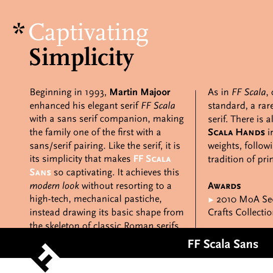 Martin Majoor did not simply remove the serifs from FF Scala, however. He revised every single character. The most striking result is the reduced stroke width, adapted to a sans. All the same, the characteristic, sharp forms reminiscent of a fountain pen remain in FF Scala Sans. The same applies to the dynamic forms of the italic, which are similar to the Antiqua cursive, unusually diverse and energetic for a sans.
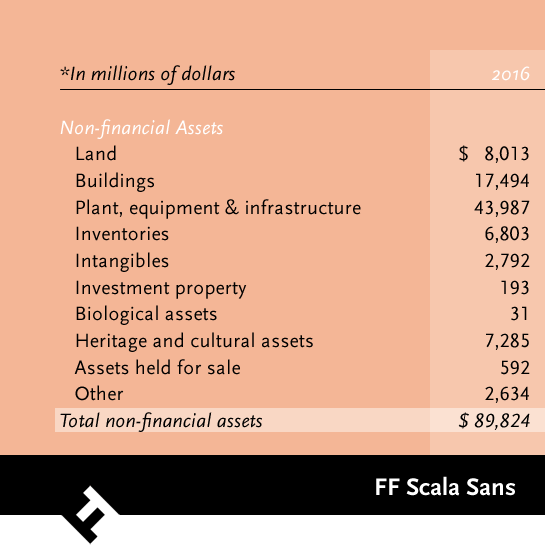 In addition to the two Regular and Bold weights, which harmonize with FF Scala, Majoor also designed the leaner Light and the bolder Black, each with a matching italic. The Condensed styles are also included for the upright, middle weights, familiar from the Antiqua, as well as the hand pictograms.
 FF Scala Jewel
Majoor expanded the FF Scala family with four upper-case, ornamental fonts based on the Antiqua. Strong highlights and inlaid decorations are meant to recall various pieces of jewelry. Scala Jewel Crystal, for example, recalls the structure of polished crystals. Diamond and Saphyr have inlaid gemstones in the stems, while Pearl has ovals in the same position. The ornaments are designed so as to be recognized even in small font sizes, so the fonts can be used as decorative variants in all text sizes.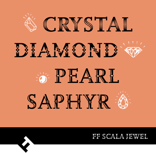 All the fonts in the FF Scala family are co-ordinated in stroke width and X-height and fit each other perfectly. Whether in the typesetting or for other, large projects, you have access to rich and varied design options, not least thanks to the unique Jewel styles.
Majoor modeled the serif Renaissance Antiqua on a number of historical fonts, without copying any of them exactly. A clearly perceptible, though not extreme, contrast in stroke width and some sharp shapes sometimes recall the stroke of a fountain pen. The serifs designed as rectangles provide for extra sharpness and a distinctive, powerful image. Nonetheless, the very legible font has a pleasant and friendly appearance, not in the least due to the rounded points.
 As a small peculiarity, Majoor designed open counters for “b”, “q” and “p”.
 The italic is a true cursive, in which all the characters have a clearly inclined and particularly curved form, with numerous references to a fountain pen and long, drawn outline ends.
FF Scala is available in the four major weights for text setting, Regular, Italic, Bold and Bold Italic. A Condensed variant complements both upright weights. Of course, the modern OpenType variants have the small caps, old-style numerals, and ligatures, which were so important to Martin Majoor at the time. A set of hand pictograms rounds out the character range.


FF Scala Sans
The sans serif variant, which appeared a few years after the FF Scala, not only opened up new applications for the font, but also increased greatly the popularity of the Scala family.
 Martin Majoor did not simply remove the serifs from FF Scala, however. He revised every single character. The most striking result is the reduced stroke width, adapted to a sans. All the same, the characteristic, sharp forms reminiscent of a fountain pen remain in FF Scala Sans. The same applies to the dynamic forms of the italic, which are similar to the Antiqua cursive, unusually diverse and energetic for a sans.
 In addition to the two Regular and Bold weights, which harmonize with FF Scala, Majoor also designed the leaner Light and the bolder Black, each with a matching italic. The Condensed styles are also included for the upright, middle weights, familiar from the Antiqua, as well as the hand pictograms.
 FF Scala Jewel
Majoor expanded the FF Scala family with four upper-case, ornamental fonts based on the Antiqua. Strong highlights and inlaid decorations are meant to recall various pieces of jewelry. Scala Jewel Crystal, for example, recalls the structure of polished crystals. Diamond and Saphyr have inlaid gemstones in the stems, while Pearl has ovals in the same position. The ornaments are designed so as to be recognized even in small font sizes, so the fonts can be used as decorative variants in all text sizes.
 All the fonts in the FF Scala family are co-ordinated in stroke width and X-height and fit each other perfectly. Whether in the typesetting or for other, large projects, you have access to rich and varied design options, not least thanks to the unique Jewel styles.


