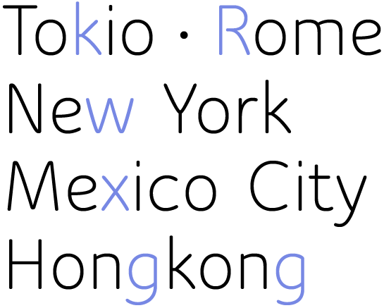
In order to reinforce the lively character of his font, Maack designed numerous alternative letters with extended vertical and horizontal strokes along with many ligatures, some of which are unconventional and somewhat playful. As the designer, you decide what shape of the letters best suits the tone of your design.

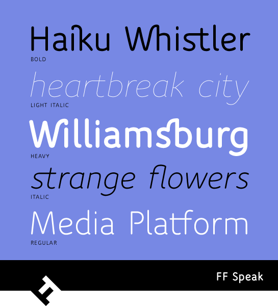
FF Speak is available in four very thin styles, from Light to Heavy, each with a matching italic.
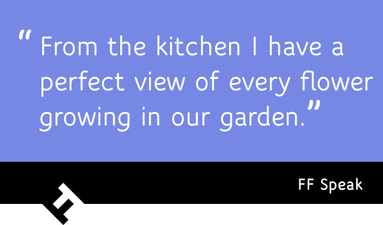
With FF Speak, Maack captures the sound and voice of a youthful language. The interesting contrast between formal, stencil-like forms and a calligraphic font creates a unique typographic tone. Depending on the stroke width, that tone can be soft or loud. Use the countless alternative letters and ligatures to fit FF Speak into your project, whether in text or in headlines.

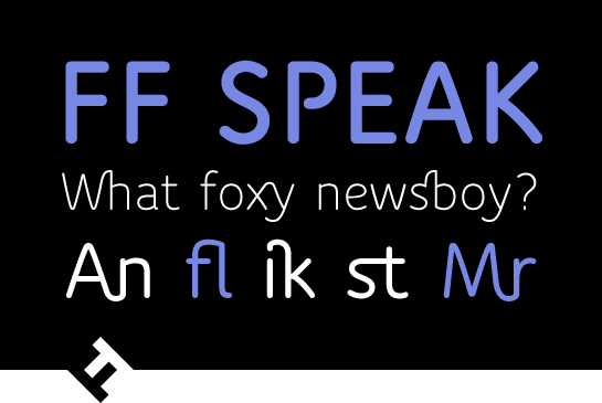
 In order to reinforce the lively character of his font, Maack designed numerous alternative letters with extended vertical and horizontal strokes along with many ligatures, some of which are unconventional and somewhat playful. As the designer, you decide what shape of the letters best suits the tone of your design.
 FF Speak is available in four very thin styles, from Light to Heavy, each with a matching italic.
 With FF Speak, Maack captures the sound and voice of a youthful language. The interesting contrast between formal, stencil-like forms and a calligraphic font creates a unique typographic tone. Depending on the stroke width, that tone can be soft or loud. Use the countless alternative letters and ligatures to fit FF Speak into your project, whether in text or in headlines.
