FF Tisa
FF Tisa and FF Tisa Sans: an extended family for multimedia usage
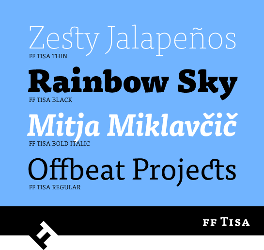
Slovenian designer Mitja Miklavčič’s goal for FF Tisa® was to design a contemporary magazine font. The slab serif font quickly found use as a multimedia typeface, however, since it earned a lot of fans as a web font. FF Tisa® Sans came out soon after, resulting in an extended family that has proven itself effective for corporate communications and signalization systems, in particular.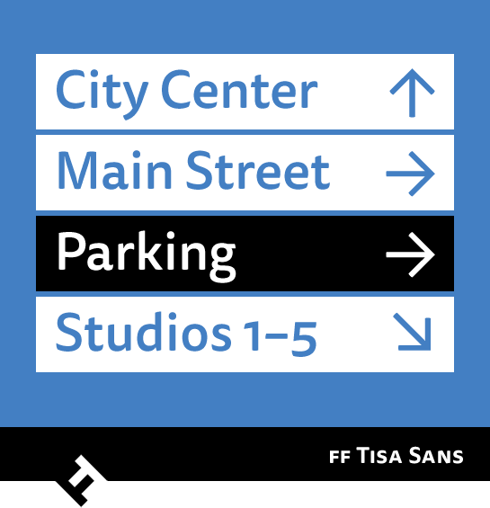 The starting point and inspiration for FF Tisa were wood-cut slab serif fonts from the 19th century. Miklavčič was able to give them a more dynamic, softer appearance. The asymmetrically designed serifs, for example, have very slight rounding on the sides. A trick that, in the many places that would otherwise have a sharp edge, serves to give the font a warm and gentle appearance. The primarily slanted line ends and the elements of handwriting (in the base of the “k” or “R”, for example) add additional dynamics to FF Tisa. Spacious, open counters and a large x-height guarantee good readability, even in small font sizes. And last but not least, the somewhat exaggerated ink traps make for another striking detail, particularly in the display sizes.

FF Tisa is available in eight carefully graded weights, from the nearly monolinear Thin to the extremely powerful Black. Each weight has a true italic – not only do the letters have added dynamic emphasis, the lower-case “a” changes to the closed form and the “g” to the single-story form. The “f” has a descender and the “e” a clearly more rounded form.
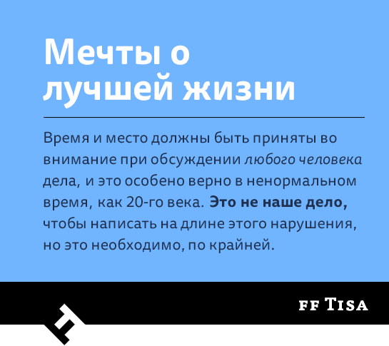
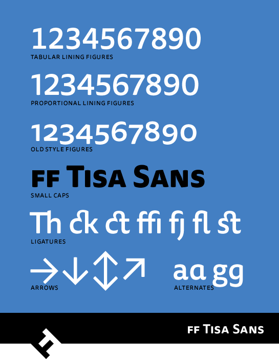
 All styles have small caps and various numeral sets with old-style and upper-case numerals. There are also a number of beautifully designed ligatures available. In addition to the Latin characters, the font includes Cyrillic letters, which cover languages like Turkmen and Kazakh.
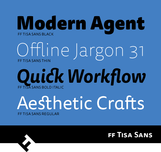 The letters of FF Tisa Sans share the same basic shape of FF Tisa. Like in the slab serif, the line ends in the sans are slanted and rounded very slightly. The same is true for the handwritten elements, such as the foot of the lower-case “l”.
 The ink traps known from the slab serif, on the other hand, have been reduced somewhat. Whoever wants to can also use the closed, single-story version of the lower-case “a” and “g” as an alternative to the standard Antiqua shape.
 The options for FF Tisa Sans are the same as for FF Tisa. There are the same eight weights, each with an italic. In this case, the more curving shape of the altered letters and the round, extended line ends make for a dynamic character. As in FF Tisa, small caps and various number sets are available, as well as a number of ligatures atypical for a sans. Furthermore, Cyrillic language support is available. FF Tisa Sans also offers countless symbols with arrows, which underlines its potential as a signalization font.
 FF Tisa and FF Tisa Sans are also perfectly coordinated, complement one another and can be used together easily. The high degree of legibility, originally developed for magazine typesetting, also pays off for use as a web font. The extended family is also well suited to multimedia projects.
The TDC also recognized the quality of FF Tisa, awarding the font at TDC2 in 2007. FF Tisa Sans won an award from CommArts in 2013.
