Fruitygreen
A biologically inspired, very contemporary font with a high recognition factor
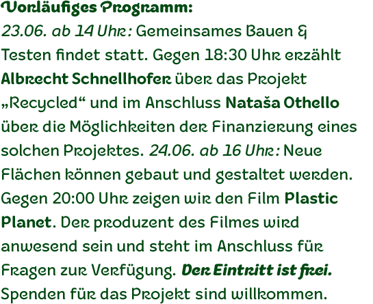
Fruitygreen is Indonesian designer Andi AW. Masry’s second typeface following Coomeec™. Idiosyncratic but appealing forms are the signature feature of Fruitygreen™ and provide this new typeface with its truly distinctive character that you can utilize for your projects – and not just in headlines. The unique forms of fruits are not only individually fascinating, but are just as captivating when they are brought together, for example as decoration on a dining table. For Masry, these can be compared with an alphabet whose letters spell out in combination different words and with this as his inspiration, he based his designs for Fruitygreen on the versatile forms of fruits. However, it was not the whole fruits as such but rather small sections of their curves and ends that he decided to use.
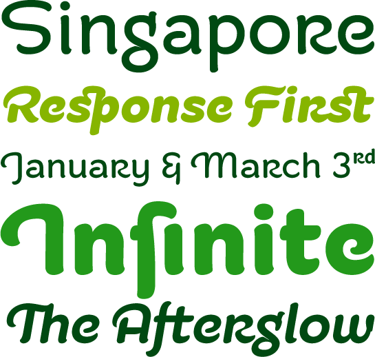
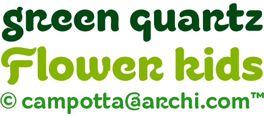
It is not only because of the characteristic line terminals that the rounded characters of Fruitygreen seem at first glance reminiscent of a brush-written calligraphic typeface; these are traces of the creation process, in which Masry used a digital brush. At the same time, Fruitygreen is by no means simply a brush font. Its dynamic characters reference biological forms and there is definitely something amoeba-like about them, particularly in the bolder variants, and they exude the same serenity and harmony that is inherent to organic structures. The many unconventionally shaped characters also provide for optical contrast. There is, for example, the very scaled down “g”, the open “q” and the lowercase “r”, which has the form of the capital letter. Other letters, such as the sinuous “k” and the rounded uppercase “F” impart an exotic touch to Fruitygreen. Similarly remarkable is the “@”, that has only a semi-circle.
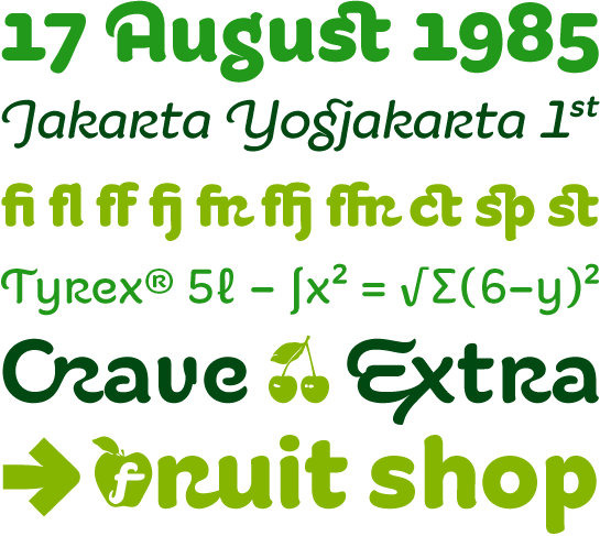
 Available to the designer are other characters that can be used to accentuate a design, such as swash capitals and numerous ligatures. And, last but not least, there are also various numeral sets with oldstyle and lining figures for setting proportional text and table columns together with a selection of symbols, such as arrows and, appropriately, fruits.
 Fruitygreen is available in OpenType format in the three weights Regular, Bold and Black, whereby there are corresponding italics for all variants. In the slightly narrower italic versions, the “a” has a closed form while the “f” has a descender.
 There can be little doubt that Fruitygreen is not the kind of font that should be used to set extensive passages of text. However, its legibility even in small point sizes is still remarkably good, so that there is no reason why it shouldn’t be used for shorter sections. But this font is much more at home in headlines, titles or in logo designs. Its highly individual characters have a high recognisability quotient and the numerous alternative glyphs and ligatures provide the designer with a wide range of typographic options.
