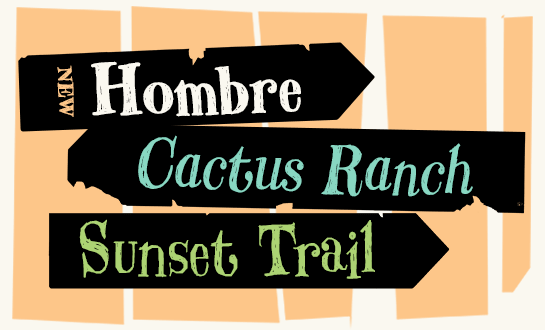
Hombre
Hombre - a rough Western font by Thomas Oldfield
With its rough, hand-painted letters, the serif Hombre™ by Thomas Oldfield catches the viewer’s eye. Its clear contrast and distinctive serifs are reminiscent of typical Western fonts. Hombre is more than that, however: the weather-tanned and partly random shapes represent the outdoors, camping and action. Use Hombre on posters, for example, in magazines, packaging designs or for web banners.

Oldfield based his font loosely on an old Western font from the 19th century, which he significantly expanded and revised. Hombre is available in two weights, each with a true italic. Regular and Bold differ not only in the strength, but also in their expression. While Regular is defined by sharp edges, many notches and partly straight, almost geometrical lines, the Bold has much softer shapes. Here, the letter forms and line ends are dominated by curves.
The linguistically well-equipped family feels most comfortable in larger font sizes. This lets the font best show off its irregular shapes, the dancing letters and the internal structure. In posters, advertising, packaging design – as well as digital applications – Hombre brings the flair of the big wide world, the feeling of wind in your face, and the smell of the warm campfire into your designs. Regardless of whether you write using Latin, Cyrillic or Greek characters.
The linguistically well-equipped family feels most comfortable in larger font sizes. This lets the font best show off its irregular shapes, the dancing letters and the internal structure. In posters, advertising, packaging design – as well as digital applications – Hombre brings the flair of the big wide world, the feeling of wind in your face, and the smell of the warm campfire into your designs. Regardless of whether you write using Latin, Cyrillic or Greek characters.