About Hope Sans
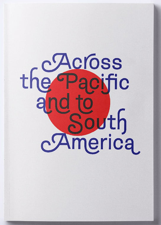
With the aim of designing a lively sans serif, Charles Nix combined the popular sans serif fonts of the 1950s and 60s with handwritten stylistic elements. As a result, very slightly grooved stems and the hint of a curve in the line ends reduce the formal character of the grotesque fonts. Supported by oval points, the new
Hope Sans has a friendly, slightly dynamic character.
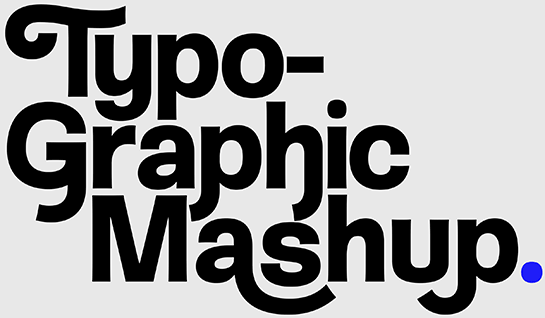
Charles Nix goes one step further and, inspired by the swashes of
Bookman® and
Caslon, designs up to six different swash variations for the uppercase letters. Alternative characters for the lower-case letters as well as line ends and ligatures round out the font, offering you an extensive “paintbox” for very individual headlines and logos. The italics, which are available in every weight and have boldly drawn letters and extended line ends, can be perfectly incorporated into your dynamic designs as an additional design variant.
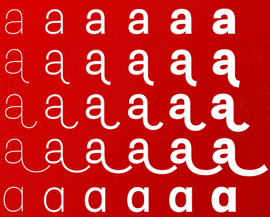
Hope Sans is available in six finely graded weights from Ultra Light to Bold, each with an italic. While the Light and Bold styles are especially useful for designing headlines and logos in large sizes, the medium weights cut a fine figure in text – not least thanks to their open, easy-to-read forms. In the display sizes in particular, the numerous alternative letters and swash variants help you to design individual headlines, logos and magazine titles.

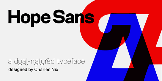 Featuring numerous swash capitals, ligatures and alternate characters, the unusual sans serif Hope Sans™ by Charles Nix attracts plenty of attention in headlines and logos or on packaging. The numerous lively details of the font ensure a friendly atmosphere in the small font sizes, as well.
 Charles Nix goes one step further and, inspired by the swashes of Bookman® and Caslon, designs up to six different swash variations for the uppercase letters. Alternative characters for the lower-case letters as well as line ends and ligatures round out the font, offering you an extensive “paintbox” for very individual headlines and logos. The italics, which are available in every weight and have boldly drawn letters and extended line ends, can be perfectly incorporated into your dynamic designs as an additional design variant.
 Hope Sans is available in six finely graded weights from Ultra Light to Bold, each with an italic. While the Light and Bold styles are especially useful for designing headlines and logos in large sizes, the medium weights cut a fine figure in text – not least thanks to their open, easy-to-read forms. In the display sizes in particular, the numerous alternative letters and swash variants help you to design individual headlines, logos and magazine titles.
