Discover legacy content from linotype.com, preserved for your reference.
ITC Legacy Square Serif & Serif Condensed
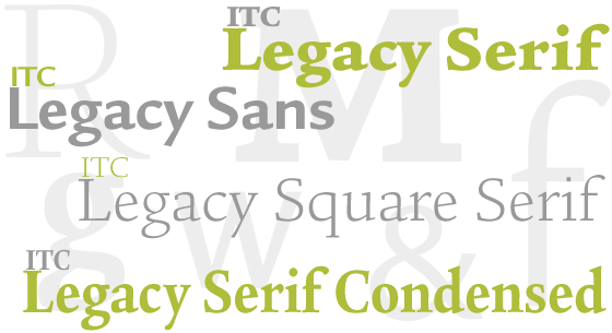
The ITC Legacy® Square Serif and ITC Legacy Serif Condensed designs make the ITC Legacy family a typographic tour de force. These two designs join the ITC Legacy Sans and ITC Legacy Serif suites of typefaces to create a remarkably handsome and versatile extended typeface family.
 |
“The idea of designing a square serif Legacy was the result of a ‘Eureka!’ moment,” says Ron Arnholm. “It suddenly came to me, out of the blue, that a square serif design was needed to round out the ITC Legacy family.”
 |
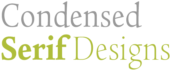
When asked about the condensed serif designs, Arnholm replies, “These are the first condensed serif typefaces I’ve drawn. I’m delighted that they turned out to be natural complements to the normal weights and the sans serif condensed faces I drew earlier.”
 |
Humble Beginnings
As with all his earlier designs, Arnholm began by making pencil sketches of the basic alphabet. “This is the only way for me to get a feel for a letterform,” he says. “It provides me with a constant, tactile feedback of the design process. In some ways, I find that paper and pencil are more important tools in creating typefaces than the design software in my computer.”
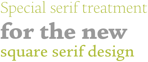
Many of the lowercase foot serifs in the 1470 Nicholas Jenson typeface, which Arnholm used as a foundation for the Legacy family are asymmetrical. Their slab serif shapes are longer on the right, with minimal bracketing, while those on the left are much shorter, are tapered and have much more bracketing. Arnholm continued this design metaphor in his new square serif design. This serif treatment, while it resembles that of the Jenson model, is actually crisper because the serifs have square corners. At small sizes, the corners appear to soften, and as a result, the design does not assert itself as a “square serif” style at small sizes. This makes it an ideal text face that melds with the other Legacy family fonts in perfect harmony. As the type approaches display sizes, however, its distinct personality shines through. Arnholm was also careful to match the overall color, weight, and humanist diagonal stress of his earlier sans and serif versions of the family.
 |
A Design Challenge
The design of the italic was a particular challenge for Arnholm in that he did not want a copy of the Legacy Serif italics but still wanted to maintain the Renaissance influence in the new designs. His experience as a calligrapher helped him to overcome this hurdle. The resulting design is a cursive old style italic containing a vestige of the 16th-century Garamond italics. It is a robust design, and yet the lowercase words flow beautifully at all sizes.
The design of the italic was a particular challenge for Arnholm in that he did not want a copy of the Legacy Serif italics but still wanted to maintain the Renaissance influence in the new designs. His experience as a calligrapher helped him to overcome this hurdle. The resulting design is a cursive old style italic containing a vestige of the 16th-century Garamond italics. It is a robust design, and yet the lowercase words flow beautifully at all sizes.
Condensed Complements
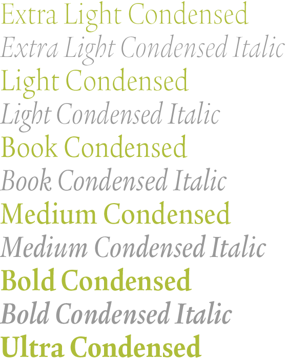
As he did with the square serif design, Arnholm began working on the serif condensed faces by producing sketches with pencil on paper. These showed him that an across-the-board character width reduction was not going to work. Many characters also needed to be redesigned; shapes had to be modified, or counter sizes adjusted. The heavier weights also required more condensing than the lighter designs. “The process was a balancing act,” recalls Arnholm.
As he did with the square serif design, Arnholm began working on the serif condensed faces by producing sketches with pencil on paper. These showed him that an across-the-board character width reduction was not going to work. Many characters also needed to be redesigned; shapes had to be modified, or counter sizes adjusted. The heavier weights also required more condensing than the lighter designs. “The process was a balancing act,” recalls Arnholm.
 |
A master typeface designer in the truest sense of the words, Arnholm melds uncanny drawing skills, an exceptional sensitivity to the nuances of letterform design, and an uncompromising commitment to excellence. He is also a consummate and dedicated educator who has trained, influenced, mentored, challenged and shaped hundreds of type designers, typographers and graphic designers.
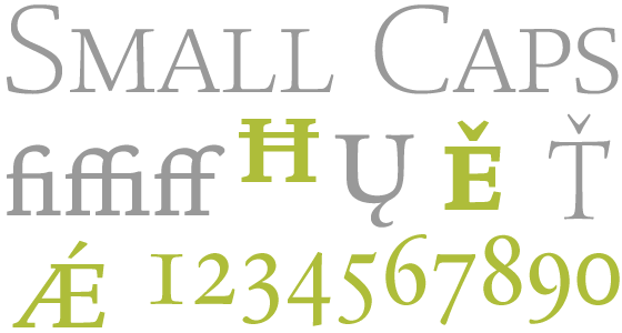
Like the other designs in the ITC Legacy family, ITC Legacy Square Serif and ITC Legacy Serif Condensed are available as OpenType Pro fonts. Graphic communicators can work with these versatile designs while taking advantage of OpenType’s capabilities, including the automatic insertion of old style figures, ligatures and small caps. In addition, the Legacy Pro fonts offer an extended character set supporting the English and Romance languages, as well as most Central European and many Eastern European languages.
Like the other designs in the ITC Legacy family, ITC Legacy Square Serif and ITC Legacy Serif Condensed are available as OpenType Pro fonts. Graphic communicators can work with these versatile designs while taking advantage of OpenType’s capabilities, including the automatic insertion of old style figures, ligatures and small caps. In addition, the Legacy Pro fonts offer an extended character set supporting the English and Romance languages, as well as most Central European and many Eastern European languages.
 |