Discover legacy content from linotype.com, preserved for your reference.
ITC New Esprit
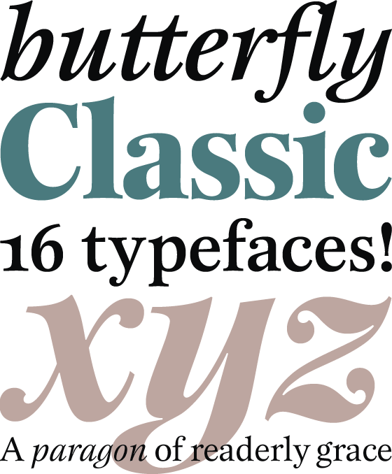
ITC New Esprit, sculpted elegance in a beautiful typeface family

Originally drawn in 1985, Jovica Veljović had intended to add a few kerning pairs and make some minor refinements to the letterforms. However, his work lead him to take a fresh look at the family. Veljović recalls, “… I soon realized that some characters could benefit by more refined shapes and proportions. By the time I was done, I had worked on just about every character in the original design.”
 |
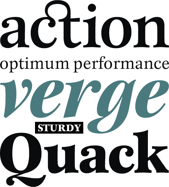
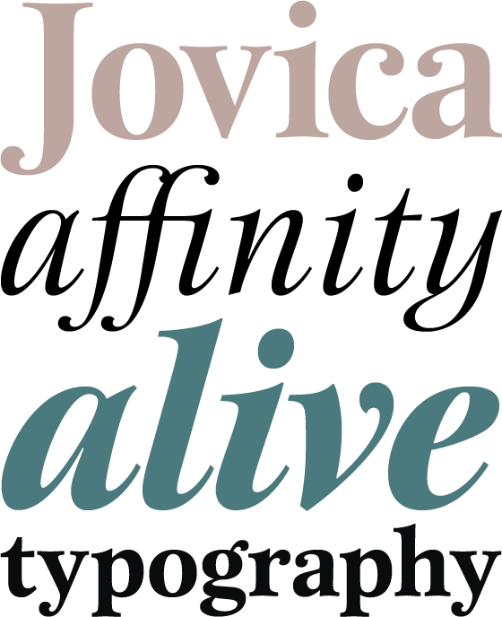
In fact the end result is two systems: one optimized for extended texts; the other for display settings. The original elegance of the design is not lost, but the new design brings with it letterforms that are altogether more harmonious and balanced. The roman is dynamic and spirited, just oozing character. The italic by contrast is a little more restrained, but nonetheless an elegant and fitting accompaniment.
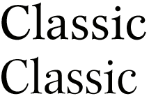
Comparison of ITC New Esprit and ITC New Esprit Display
| ITC New Esprit Regular (above) and ITC New Esprit Display Regular (below) |
 |
| ITC New Esprit Regular (above) and ITC New Esprit Display Regular (below)
|
 |
The text-optimized fonts come with a generous x-height, and slightly less contrast; though its marginally wider proportions let in the light, making it very legible even at small sizes. ITC New Esprit® is a versatile family, brought to you in four weights from regular to black. OpenType features like small caps, alternates, and a broad character set make this a welcome addition to everyone’s font library. Whether you want elegant and legible text, or dynamic and personable headlines, then you’ll want to click through to see more of ITC New Esprit.
 |
Online publication
Available is an online brochure on ITC Esprit that you can read directly from your screen. The new typeface of the Elbphilharmonie!Together with DIN, ITC New Esprit is the part of the new corporate identity of the Elbphilharmonie in Hamburg.